- Sakarit Gunkhan (Chankaew) is a Brooklyn-based Graphic/Web Designer & Visual/Concept Artist


A contemporary redesign of Womanifesto’s branding and digital archive, enhancing visibility for women-led art initiatives through refined identity, enriched web content, and expanded global reach.
The Challenge
To translate Womanifesto’s mission into a cohesive, modernized brand identity and web archive. To design a sleek visual system and digital platform that amplifies underrepresented women artists and expands the initiative's global reach.
Dedicated to celebrating women artists and amplifying underrepresented voices, Womanifesto is a women-led, biannual international art exchange program. Through workshops, talks, events, exhibitions, and online archives, it builds vital connections across the global art community.
I had the opportunity to partner with Womanifesto to reimagine its online presence and expand its reach. Together, we modernized the visual identity, enriched the web archive, and produced impactful artwork and digital assets that bring the initiative’s mission into a sleek, contemporary space.
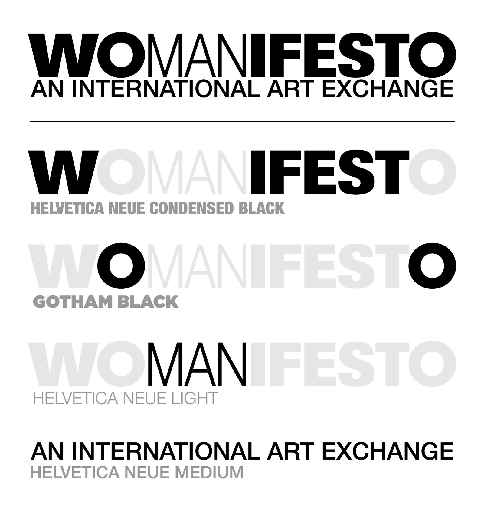
Brand Framework & Typographic Architecture

"W....IFESTO"
Helvetica Neue Condensed Black
Visual Treatment: Bold, condensed, uncompromising, and heavy.
Conceptual Meaning: This forms the core anchor of the name (MANIFESTO transformed into WOMANIFESTO). By setting W….IFEST in a heavy, condensed weight, we create an undeniable physical presence on the page or screen. It symbolizes the weight, resilience, and unshakeable presence of women artists, specifically demanding recognition in a Global South context where women’s artistic labor has historically been sidelined or underrepresented.

The "O"
Gotham Black
Visual Treatment: Round, grounded, stable, and expansive.Conceptual Meaning: Adding a circular, geometric O breaks the tall, vertical rhythm of Helvetica Neue Condensed and pulls the eye to the center. The circle stands for wholeness, community, and the earth, connecting to Global South solidarity. Its soft, geometric shape adds warmth and balances the strong, authoritative look of the other letters.

The "MAN"
Helvetica Neue Light (Scaled Down)
Visual Treatment: Significantly reduced scale, thin stroke weight, secondary visual hierarchy.
Conceptual Meaning: Subverting the historical patriarchal bias in language and art history. By shrinking and thinning “MAN,” we visually dismantle the assumption of male dominance as the default standard. It acknowledges the syllable within the word without letting it dictate the narrative, relegating patriarchal structures to a diminished, quiet background.
"AN INTERNATIONAL ART EXCHANGE"
Helvetica Neue Medium
Visual Treatment: Clean, balanced, legible, set in medium weight.
Conceptual Meaning: While the main title makes a strong political statement, the subtitle creates a steady, neutral base. Its Medium weight feels balanced and open, pointing to equality and accessibility. This suggests us that the exchange is built on global collaboration, mutual respect, and decentralized dialogue.
Sora: A Typographic Catalyst for Reclaiming Space
Typography in activist design is never neutral; it sets the tone for who is speaking and how loudly they are heard.
Sora, meaning “sky” in Japanese, was designed by Jonathan Barnbrook and Julián Moncada. Originally commissioned for the Sora decentralized economy to support socially beneficial, community-driven initiatives, the typeface carries an inherent ethos of collective empowerment.
For Womanifesto, Sora becomes more than a font. It serves as a visual symbol bridging a rich history of supporting underrepresented voices with bold, contemporary advocacy. Rooted in a lineage of subversive graphic design, Sora provides the structural presence needed to amplify women artists while offering the functional versatility required for an international digital platform.

Activist Craft & Counterculture Legacy
Designed by Jonathan Barnbrook & Julián Moncada: Barnbrook is legendary for his politically charged, anti-establishment graphic design (Adbusters, cultural critique typography). Using a typeface born from a lineage of social justice and subversion aligns perfectly with an organization dedicated to dismantling patriarchal standards in the art world.
Structural Strength: Sora’s sturdy, low-contrast geometric construction projects authority and permanence, the qualities that physically embody women’s power rather than passive, delicate aesthetics.
Human Presence & Deliberate Action
Distinct Personality: Unlike neutral or sterile corporate fonts (like Helvetica or Arial), Sora possesses wide proportions, unique terminals, and distinctive letterform quirks that feel human, expressive, and curated.
Bridge Between History & Contemporary Action: Designed specifically to perform seamlessly across both low-res digital displays and high-end print, Sora gives historic, overlooked narratives a crisp, modern voice that bridges past archives with future digital activism.

Functional & Editorial Flexibility
High Legibility for Archival Work: Wide counters and generous x-height make long-form biographical text, artist statements, and exhibition wall text effortless to read across mobile platforms, web archives, and print.
Expansive Variable Weight Range: Scales effortlessly from thin, delicate callouts for quiet artistic quotes to extra-bold, heavy display weights for commanding campaign headlines.
Human Presence & Deliberate Action
Free & Open Font License: Distributed via Google Fonts, Sora eliminates costly software licensing barriers for non-profits and grassroots international art exchanges.
Aligning with Global South Solidarity: Open‑source software reflects a spirit of mutual aid and shared ownership. By choosing a fully accessible typeface, Womanifesto makes its brand and archival materials easy to download, adapt, and share worldwide — letting grassroots artists and cultural workers use them without closed tools or paid subscriptions.


The Challenge
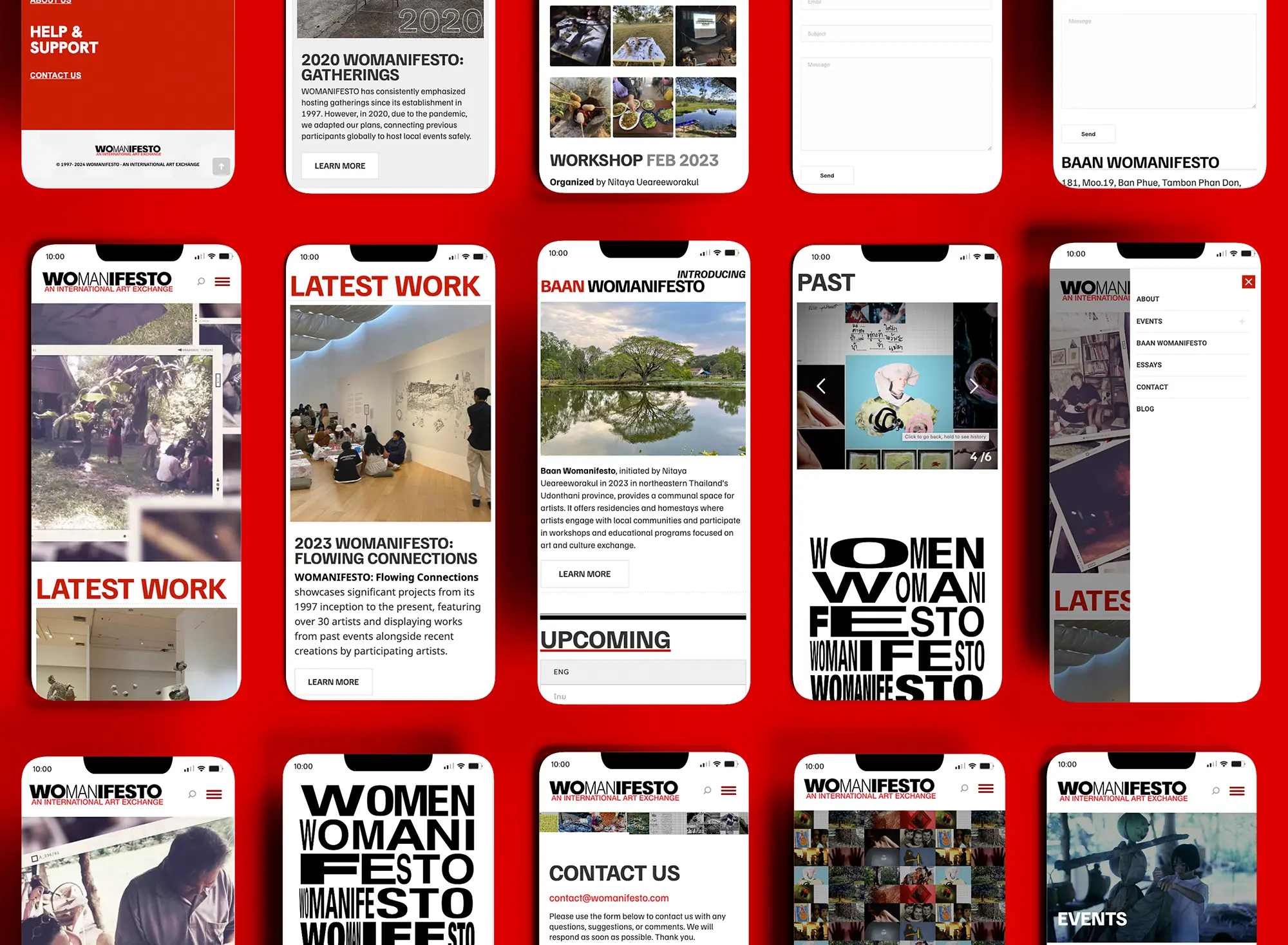
What UI/UX challenges arise when creating an archival and editorial site with dense information and a large amount of video and image content?
Creating an archival and editorial site with dense information and rich media comes down to balancing artistic impact with functional clarity.
The core UI/UX challenges are:
- Visual Hierarchy: Keeping high-contrast branding and dense archival text clean and readable, especially on small mobile screens where space is tight.
- Content Layout: Structuring large photo and video collections into clean, easy-to-browse formats (like swipeable galleries or preview cards) so users don’t get overwhelmed by endless scrolling.
- Simple Navigation: Organizing deep art archives so users of all ages can filter, search, and explore without getting lost.
The goal is finding that sweet spot where a striking, activist visual identity meets smooth, functional utility.
Black Olive
| Hex | #3A3A3A |
| RGB | 58, 58, 58 |
| CMYK | 0, 0, 0, 77 |
| HSL | 0, 0%, 23% |
| Pantone | 447 C (#373A36) |
Old Silver
| Hex | #868686 |
| RGB | 134, 134, 134 |
| CMYK | 0, 0, 0, 48 |
| HSL | 0, 0%, 53% |
| Pantone | Cool Gray 8 C (#888B8D) |
Boston University Red
| Hex | #C90202 |
| RGB | 201, 2, 2 |
| CMYK* | 0, 99, 99, 21 |
| HSL* | 0, 98%, 40% |
| Pantone* | 2347 C (#E10600) |
Red (Pigment)
| Hex | #ED1C1C |
| RGB | 237, 28, 28 |
| CMYK* | 0, 88, 88, 7 |
| HSL* | 0, 85%, 52% |
| Pantone* | 485 C (#DA291C) |

High-Contrast & Intentional Palette
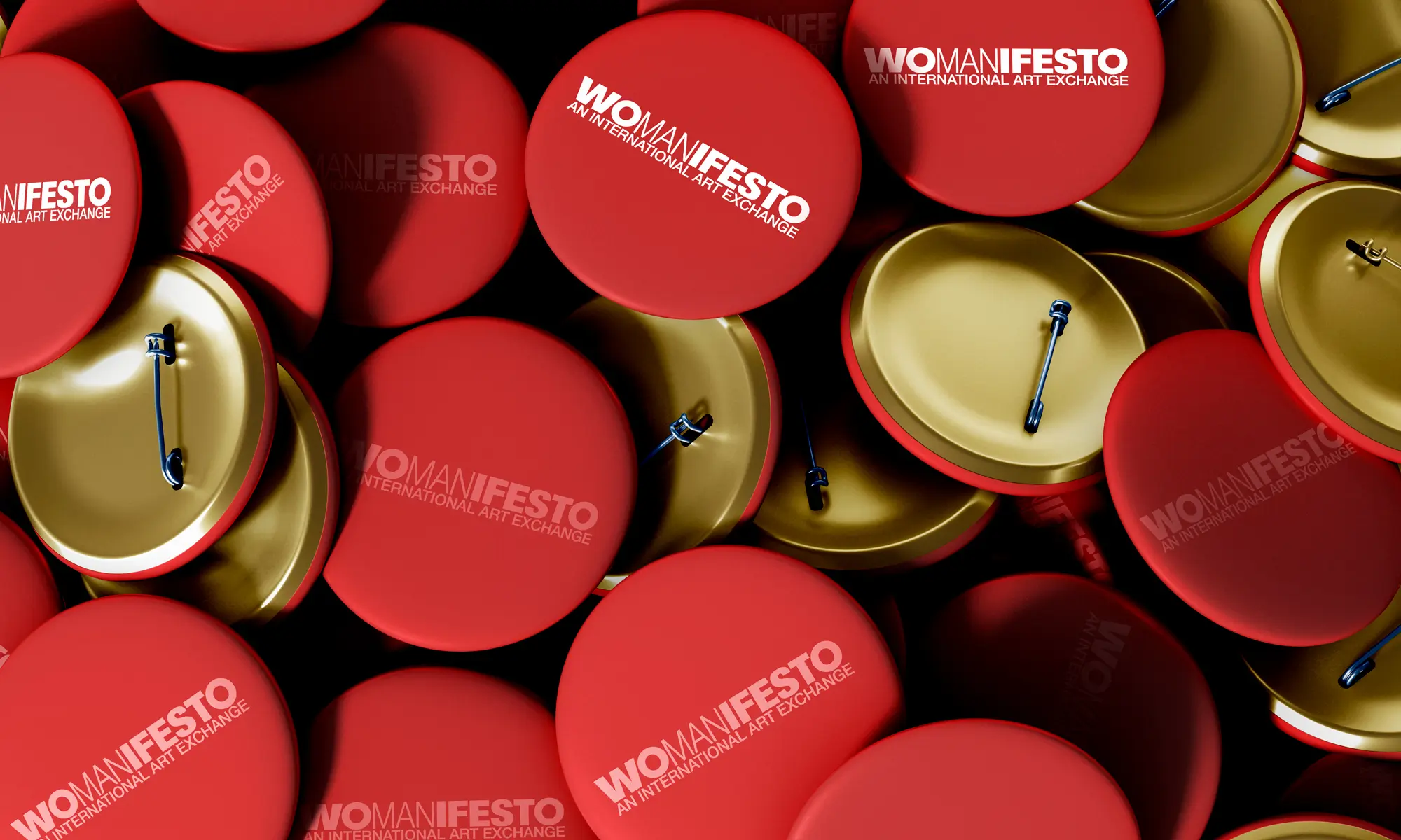
Color as Identity: The dominant, energetic red acts as a powerful anchor across the entire presentation, creating immediate brand recognition.
Functional Hierarchy: High-contrast black-and-white elements on the screens prevent color fatigue and keep the content readable, letting the red serve purposefully for key callouts, headers, and navigation states.
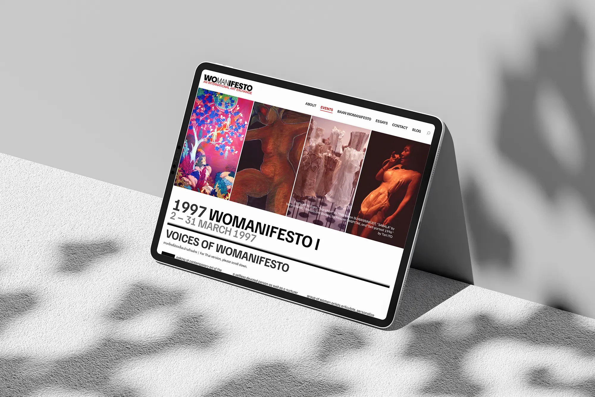
Strong Typographic Hierarchy
Expressive Scale: Using massive, tightly tracked, stacked typography for headers gives Womanifesto’s layout an archival, art‑publication character rather than the feel of a generic corporate site.
Clear Content Hierarchy: Large, all-caps section titles (“1997 WOMANIFESTO I”, “LATEST WORK”, “PAST”, “CONTACT US”) and menus make scanning quick and effortless for mobile users.
Dynamic Grid & Content Density
Rhythm & Variety: The design avoids monotony by alternating between large hero imagery, dense thumbnail grids, text cards, and pure typographic statements.
Editorial Framing: Photographed element such as the framed polaroid aesthetic in the archive sliders give digital screens a tactile, human, and curated quality.
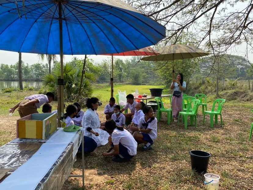
Baan Womanifesto is a community-centered art residency, homestay, and educational platform located in the rural Udonthani province of Northeastern Thailand.Initiated in 2023 by artist Nitaya Ueareeworakul on her own living land, it serves as a physical home and creative sanctuary where artists, groups, scholars, researchers, students, and the local community gather to share living and working spaces, and contribute to its public educational programming.




Next Project
Kawaii: A World of Cuteness