Sakarit is a Graphic Designer & Visual Artist, based in Brooklyn, NYC | E: [email protected]
Musa Banana Peel
Transient & Organic Font
Project Information
Creative Brief
Objective:
To introduce and showcase the Banana Peel font as an evocative and versatile typeface that embodies the Wabi-Sabi philosophy of embracing imperfection, transience, and organic beauty.
The project highlights the font’s ability to add depth, character, and a unique aesthetic to various design contexts, from branding and apparel to creative merchandise and artistic projects.
The goal is to position it as an ideal choice for brands and creators seeking authenticity, bold expression, and meaningful artistic impact. By emphasizing its organic form and versatility, the project invites exploration across diverse applications, celebrating a harmonious blend of functionality and creativity.
Key Features:
- Inspired by Wabi-Sabi principles of imperfection and transience.
- Unique organic forms that create striking visuals.
- Adaptable for book titles, displays, patterns, branding, apparel, and creative merchandise.
Target Audience: Brands, designers, and creators looking for authenticity, bold artistic expression, and versatile typography for a range of design applications.
Approach
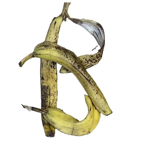
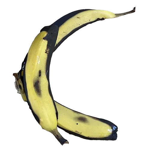
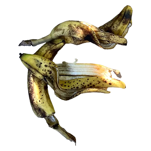
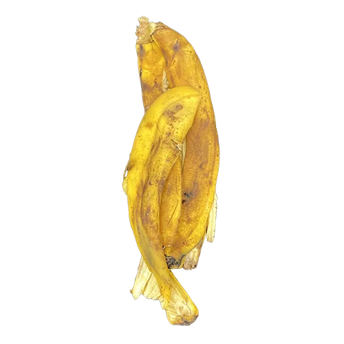
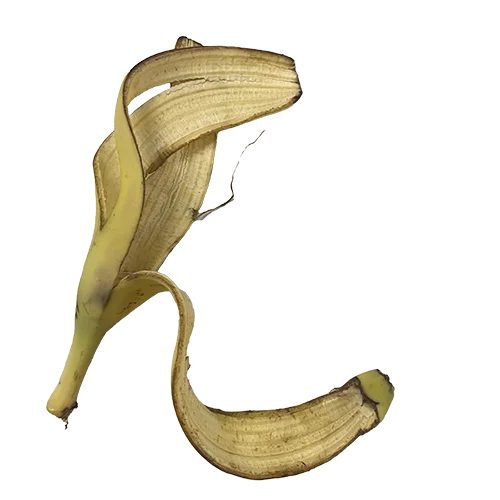
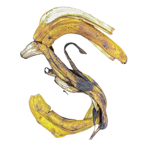
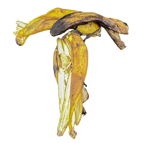
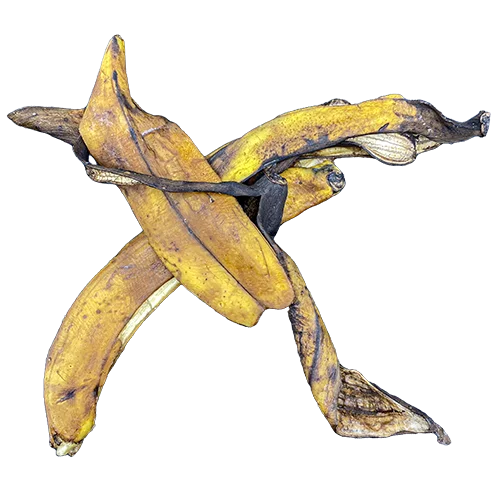
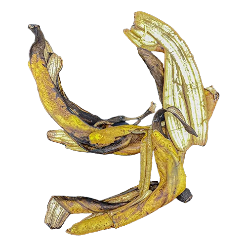
The design process begins with physically peeling bananas and arranging the peels into fluid, organic shapes. These arrangements serve as the foundation for the font’s visual and emotional language.
Results
The design process begins with physically peeling bananas and arranging the peels into fluid, organic shapes. These arrangements serve as the foundation for the font’s visual and emotional language.
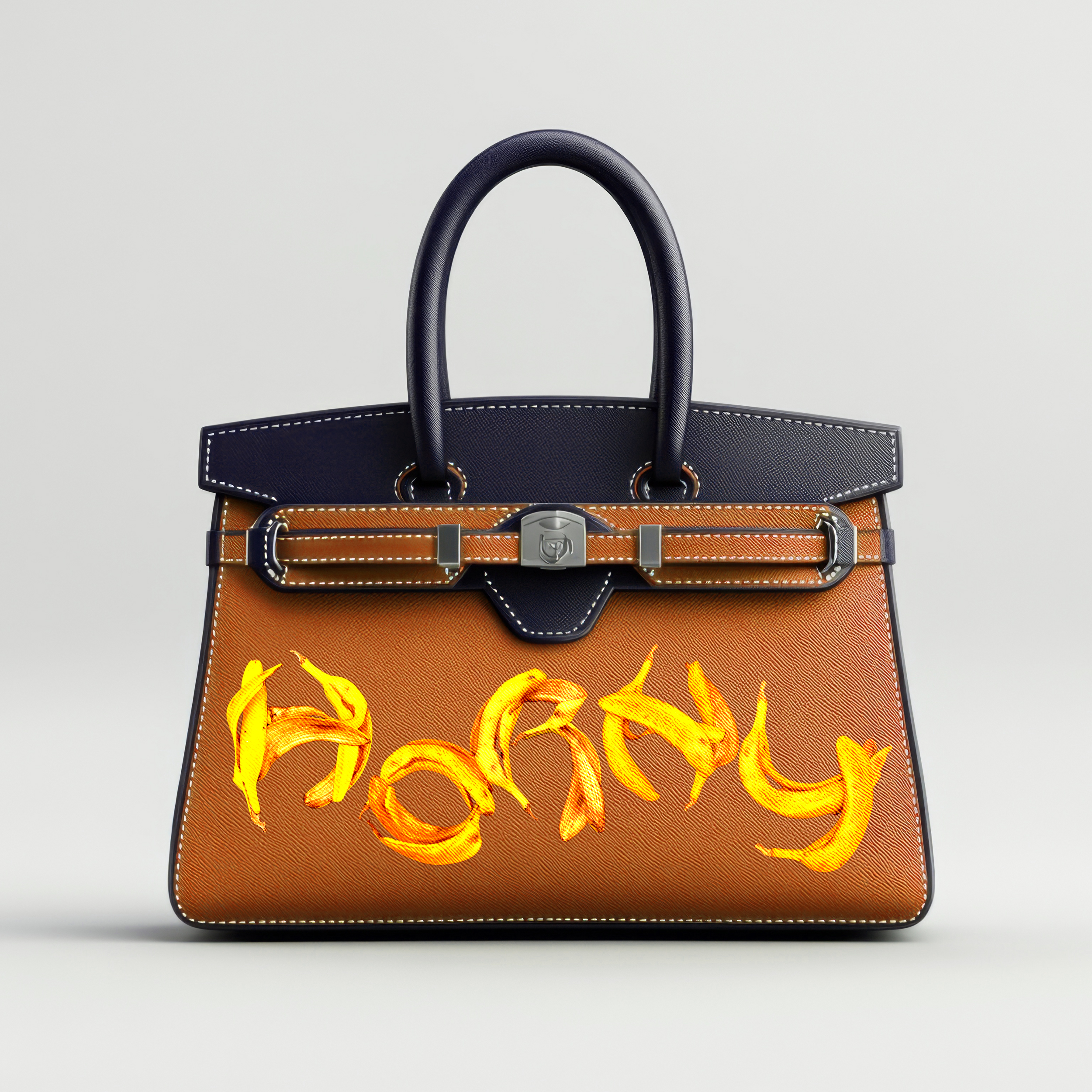
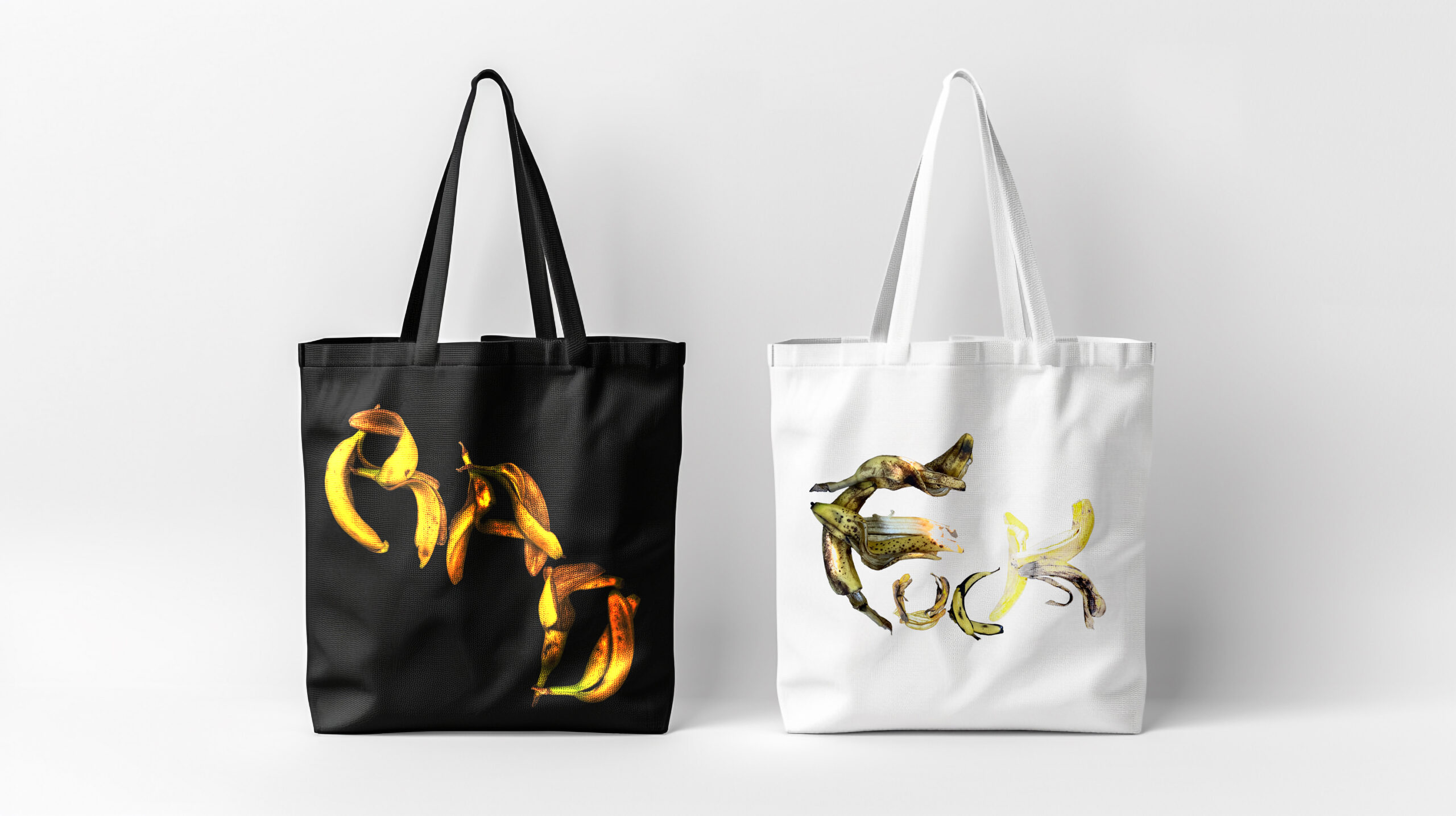
The font is visualized across various applications, such as tote bags and other merchandise. Some designs play with contrasts, combining raw and refined elements, blending vulgarity with a hint of luxury.
Tools & skills
- Adobe Illustrator
- Adobe Photoshop
- Conceptual Thinking
- Artistic Experimentation
- Visual Storytelling
- Attention to Detail


