• Sakarit Gunkhan (Chankaew) is a Brooklyn-based Graphic/Web Designer & Visual/Concept Artist

Typorganik Display: From Typography to Wearable Art

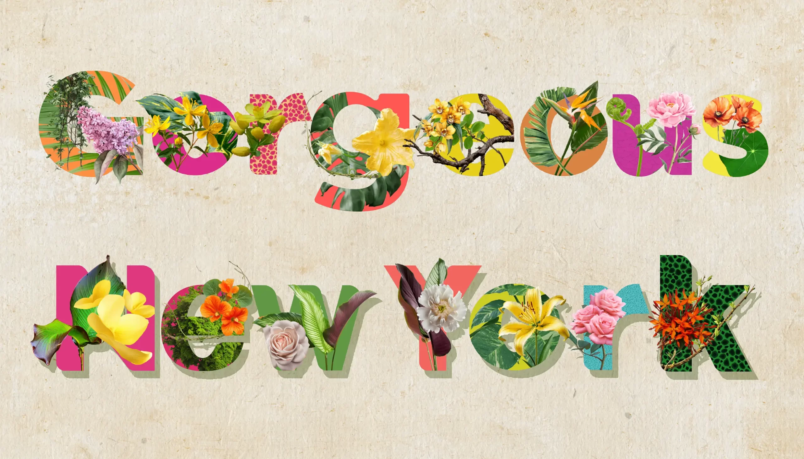
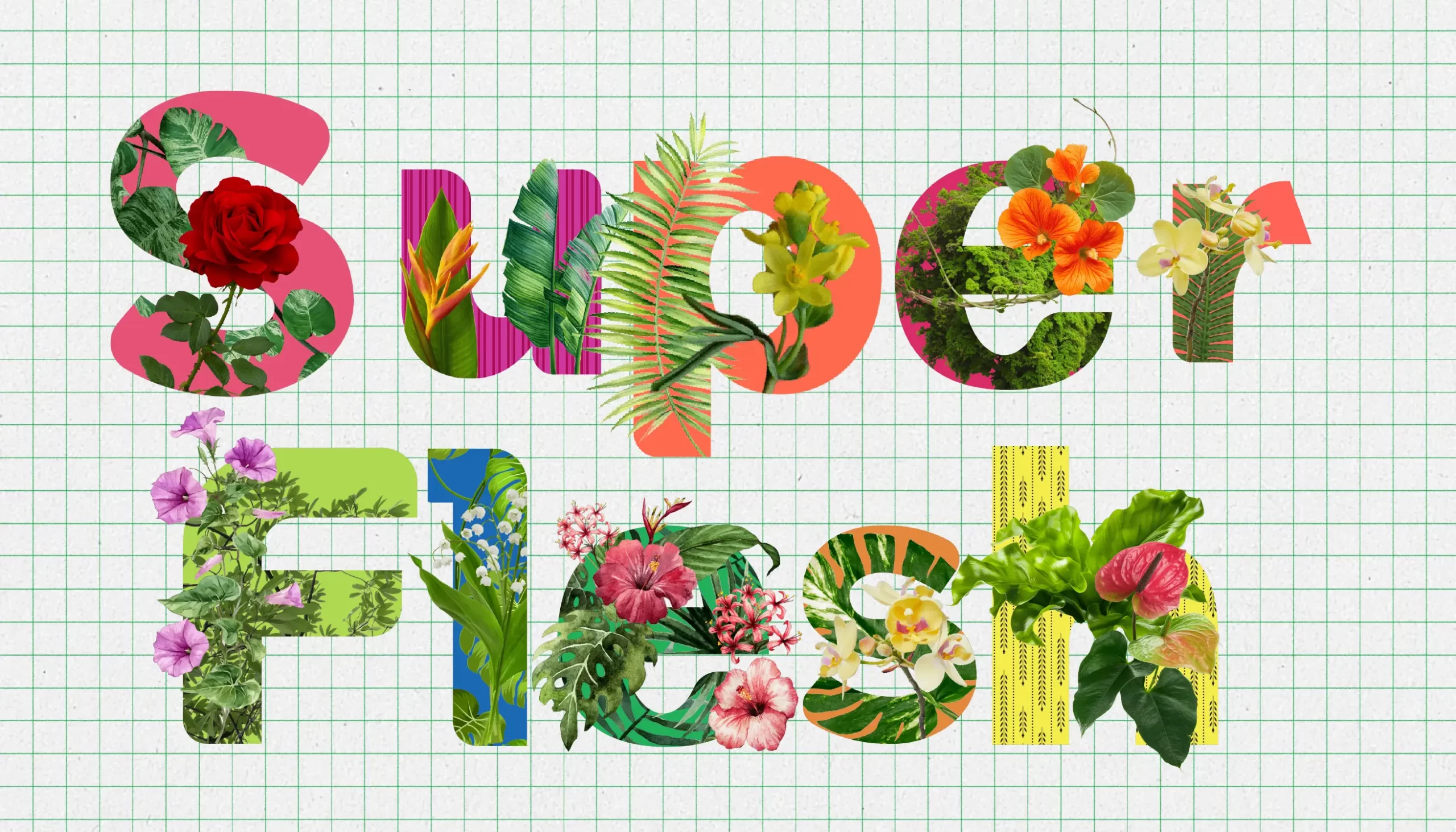
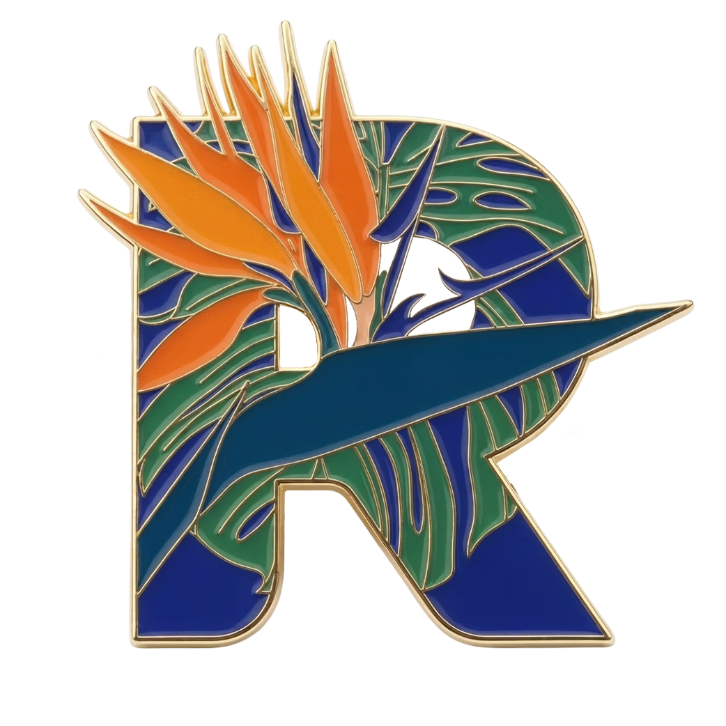
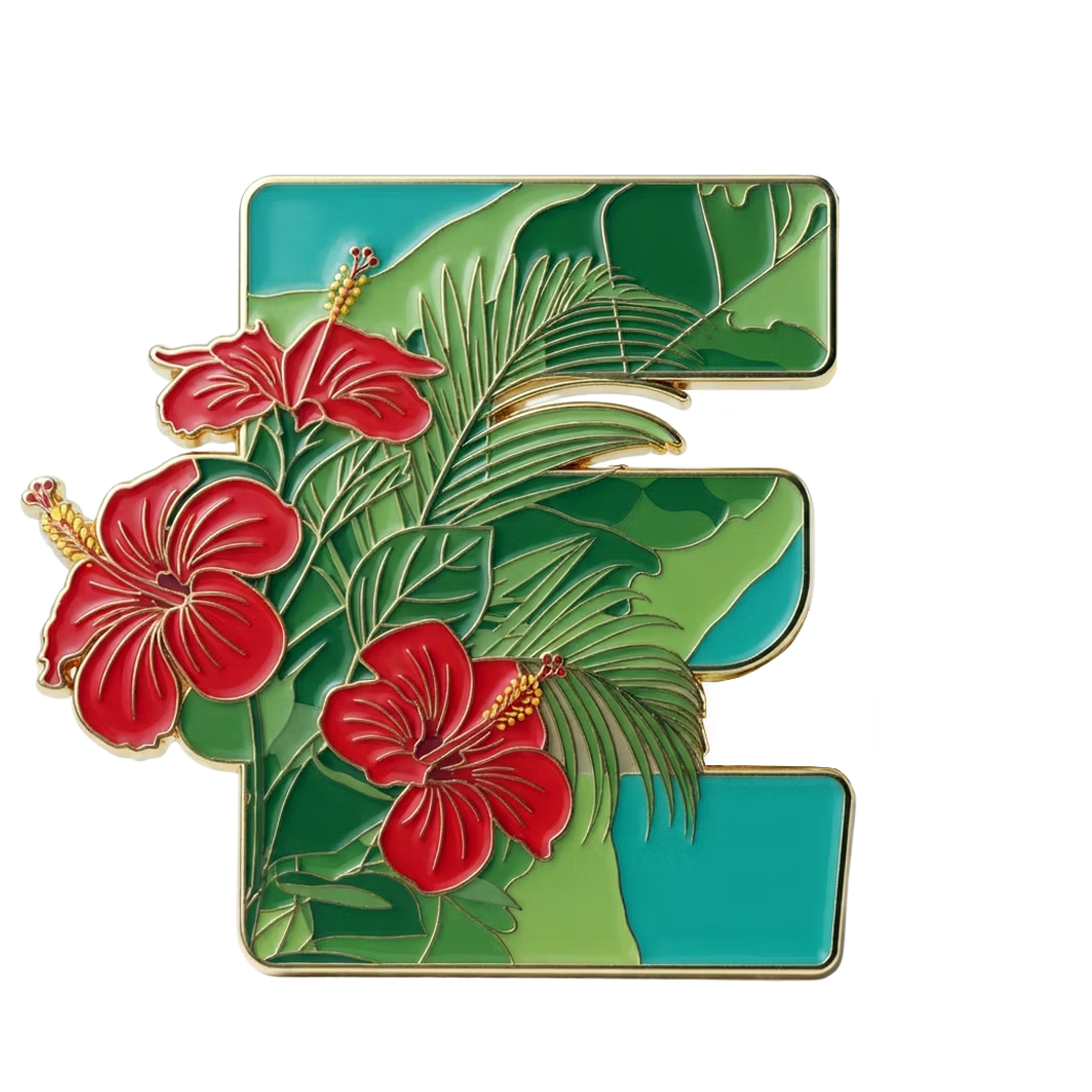
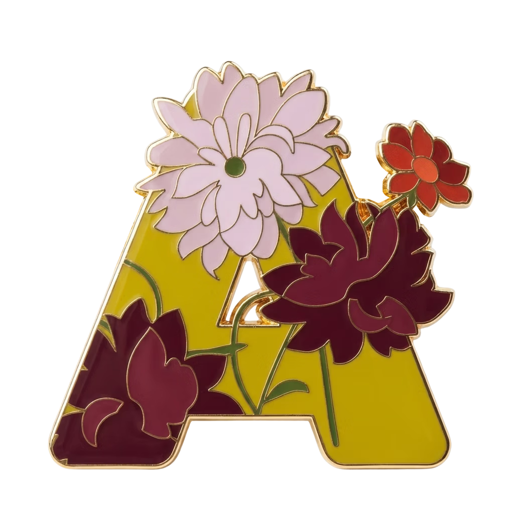
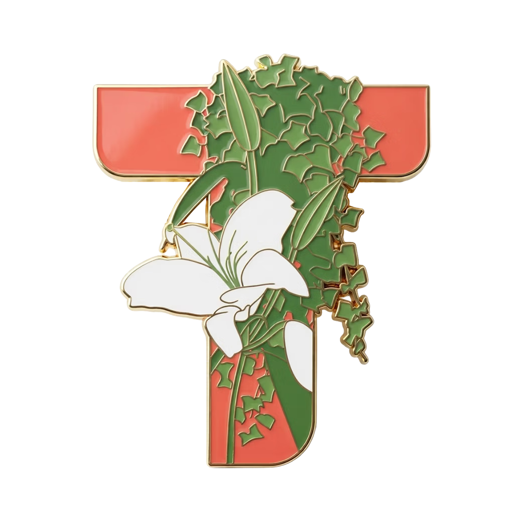
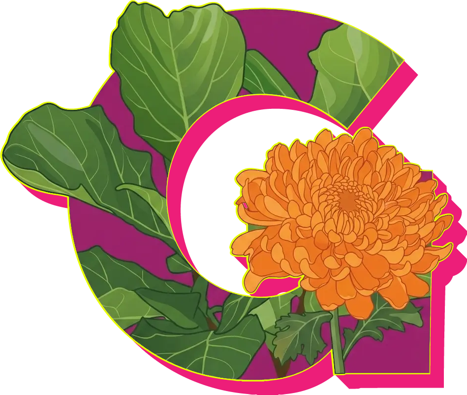
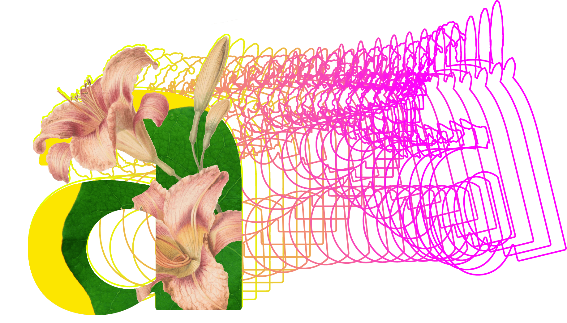
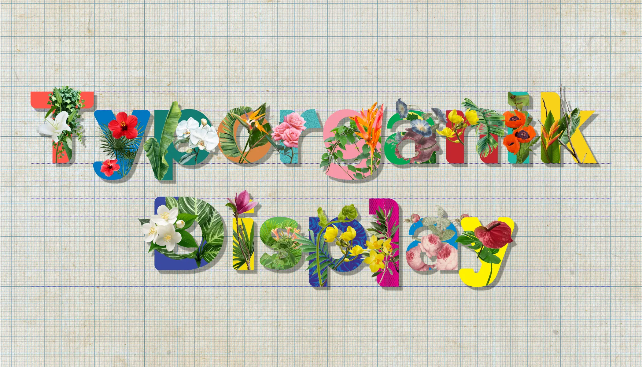
Typorganik Display is a creative typography project focused on designing a sans-serif display alphabet that fuses rigid geometric letterforms with overflowing natural flora.

Task

To design a sans-serif display alphabet that merges rigid typography with botanical elements, flora, or natural structures. It requires using trompe-l'œil illusions to make botanical elements like vines, moss, and petals realistically erupt and spill past the structural edges of each letterform. Ultimately, the goal is to break traditional typographic boundaries by creating visual friction between geometric design and natural elements.
Press play for the full experience!

The music here isn’t just background noise. It’s pure energy meant to bring the visuals to life and make the whole experience feel more playful and alive. I know music is personal, but for this project, the sound is a huge part of the story. Turn it up and enjoy the vibe!

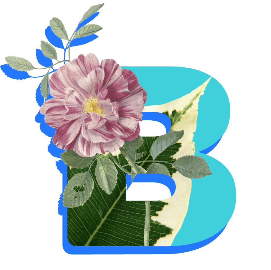
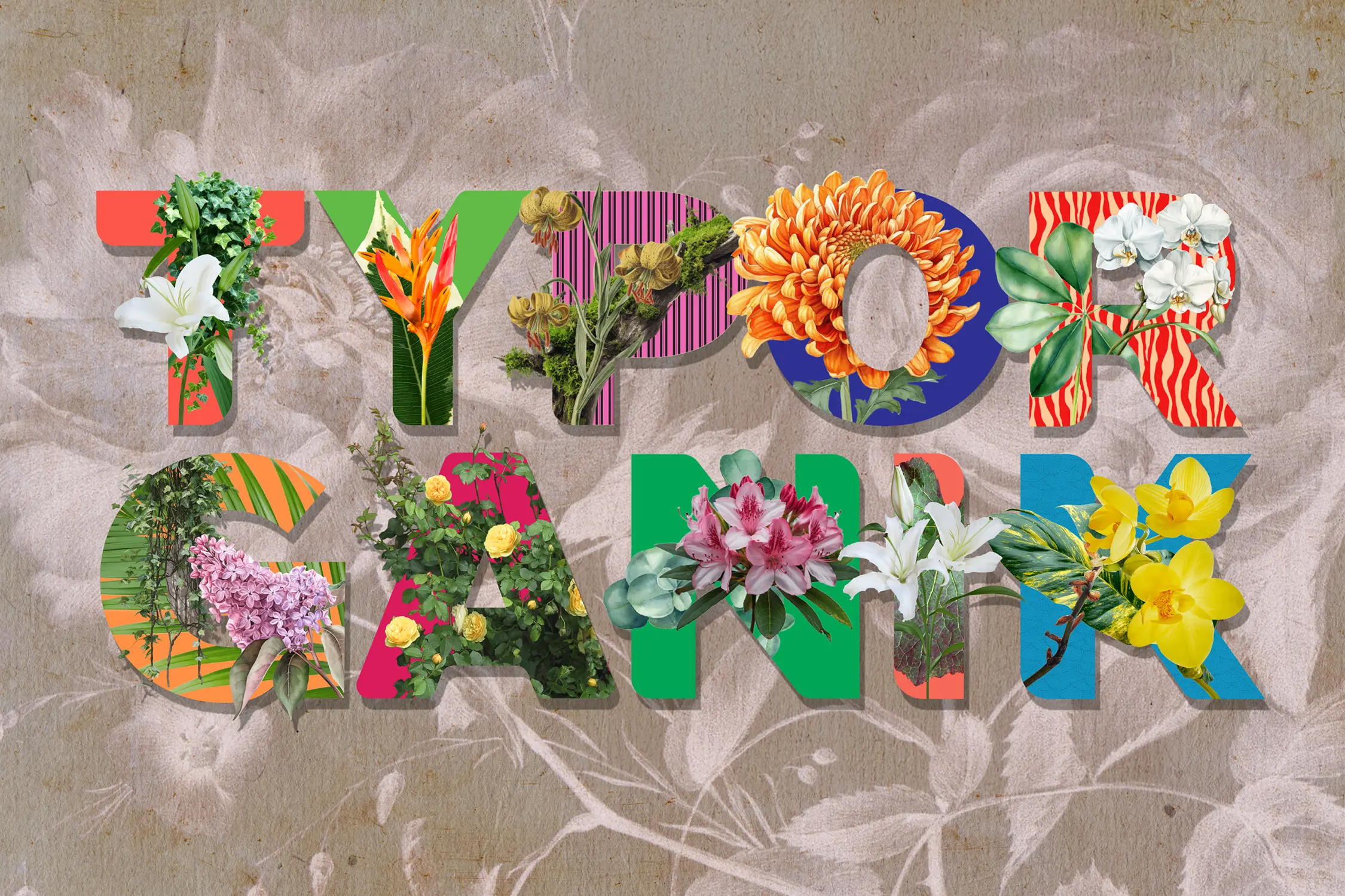
№{{current_slide_index}}/{{total_slide_count}} Typorganik Display typeface spelling 'Typorganik' in uppercase; each letter integrates Trompe-l'œil botanical elements, intertwined vines, layered foliage, and blooming forms, that embody the fusion of typography and organic growth, presenting the typeface’s name as a living manifesto.
The Challenges

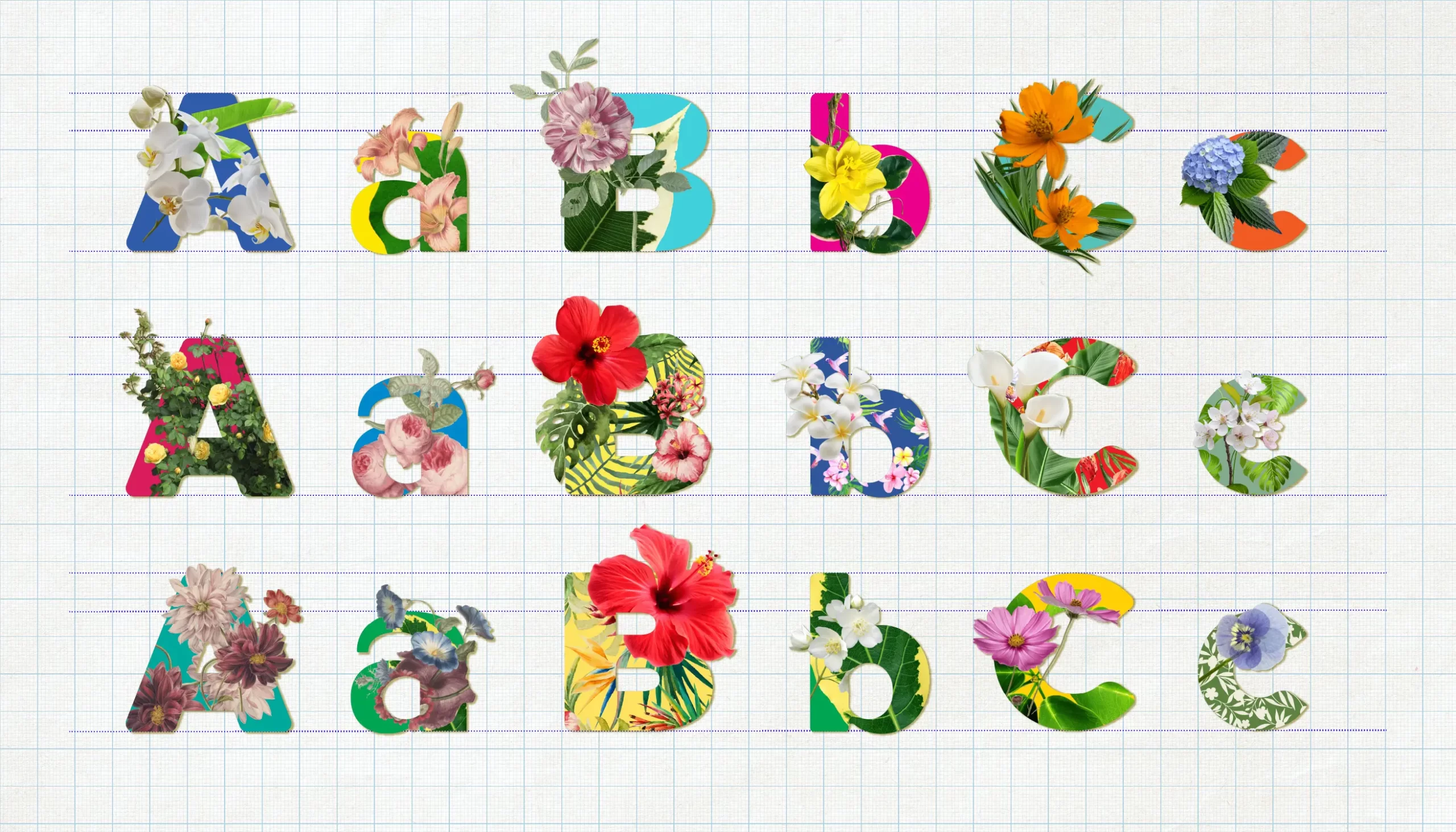
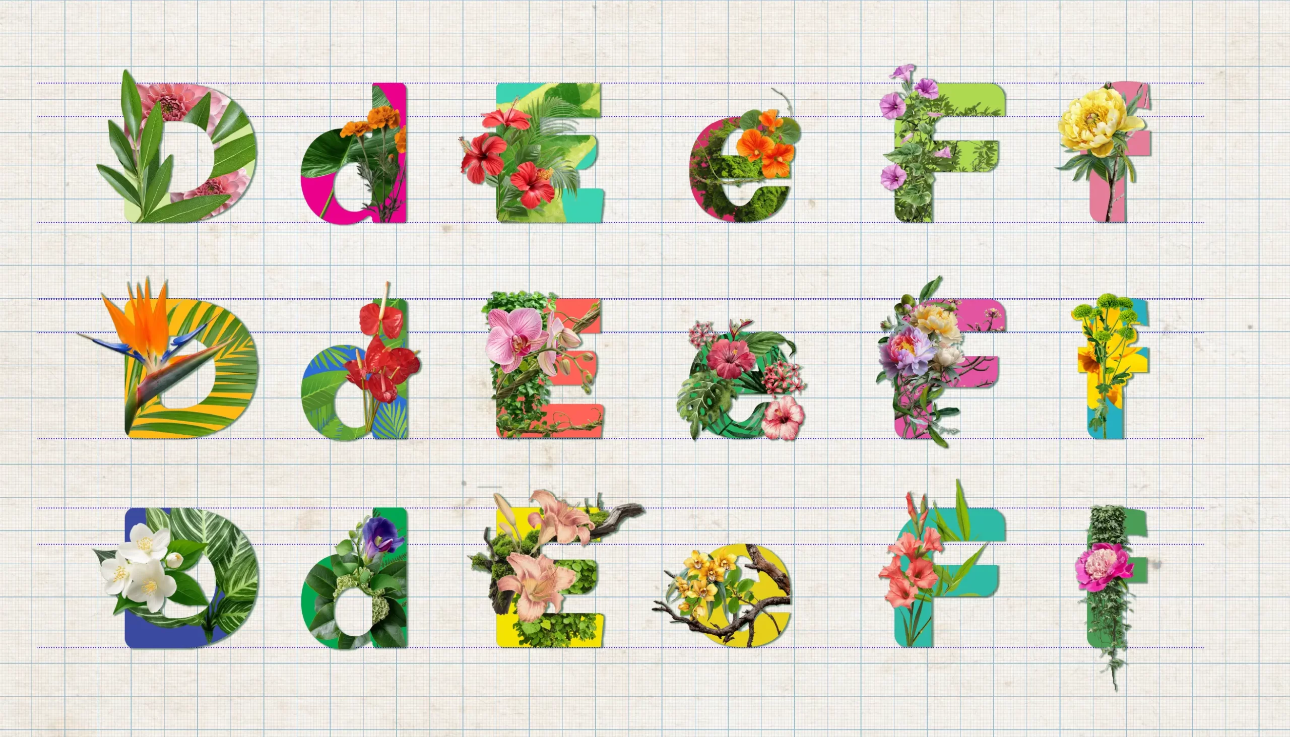
How do you construct a comprehensive, elaborate 208-glyph typographic ecosystem that balances pure utility with high-impact art? By pairing 52 essential sans-serif letters alongside 156 foliage-infused display variations, how can this full spectrum be deployed across posters, apparel, and merchandise to establish a bold, compelling brand identity?

The main challenge was building a 208‑letterform type system that balances practical, everyday use with detailed, organic artwork. For the 156 expressive display letters, the hardest part was making sure the vines, petals, moss, lichens, leaves, branches, and more looked lively without covering or weakening the basic shapes of each letter.

To give the letters fascinating depth, I drew inspiration from trompe-l’œil techniques and the 6 elements of floral design (foliage, line flowers, focals, secondary, filler, and accent twigs). I layered each glyph like an Ikebana arrangement so the plants appeared to grow naturally out of the letterforms. To ensure the system stayed practical for any campaign, I paired these 156 expressive styles with 52 clean, traditional sans-serif letters for simpler, everyday text. Finally, I made sure these delicate details printed nice and clean across both large posters and physical merchandise.

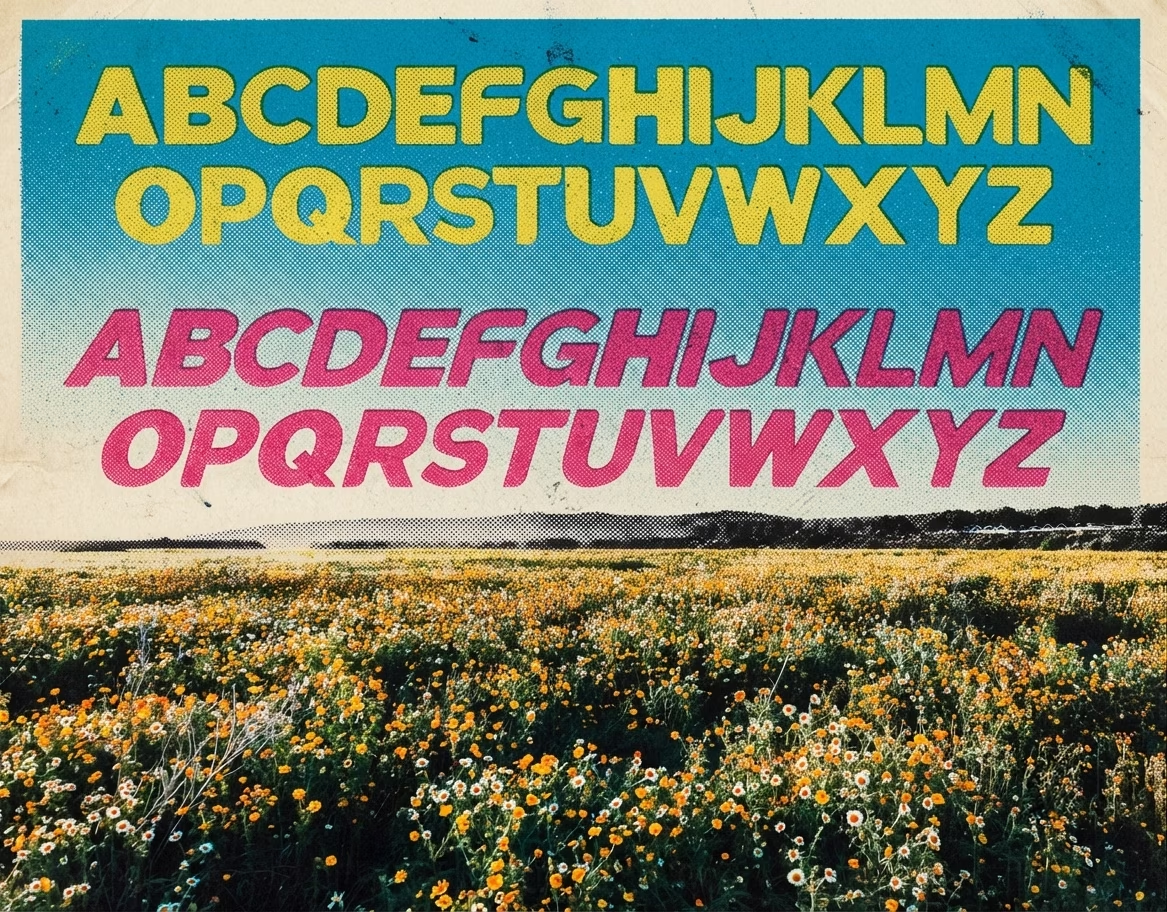
A retro-style typographic specimen poster featuring two complete sets of the uppercase English alphabet displayed over a scenic backdrop.
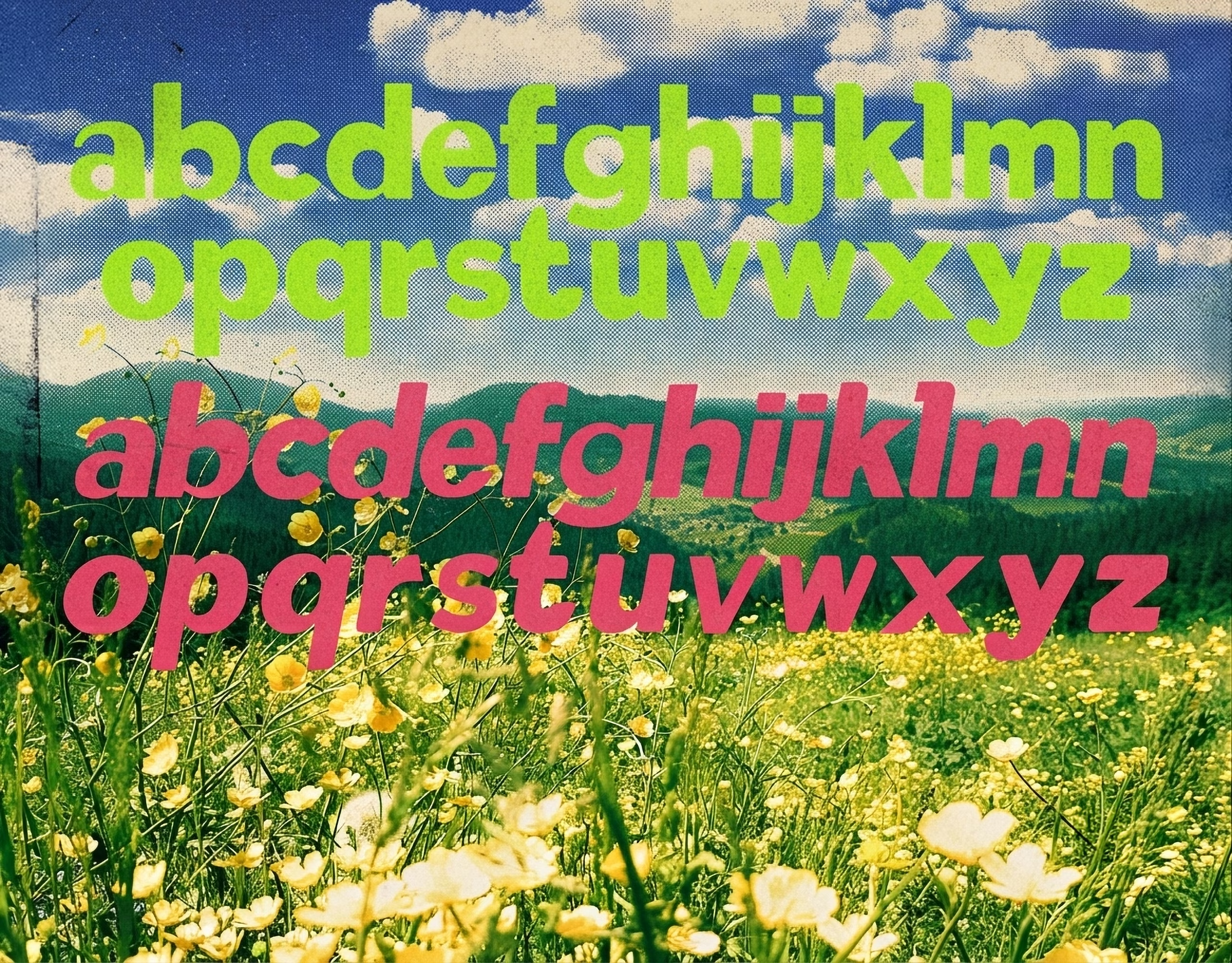
This graphic design layout showcases the lowercase English alphabet from a to z sequentially arranged into two distinct, vertically stacked text blocks. The typeface utilized is an ultra-bold, heavily condensed sans-serif display font characterized by extra-thick geometric strokes, tightly squeezed counters, and remarkably minimal letter-spacing. The top sequence of letters is styled in a vivid neon chartreuse green, while the mirrored bottom alphabet sequence stands out in a vibrant hot pink magenta. Both text treatments are superimposed over a textured, halftone-filtered photographic background depicting a lush field filled with blooming yellow buttercup wildflowers stretching toward a vibrant blue sky filled with scattered white clouds.

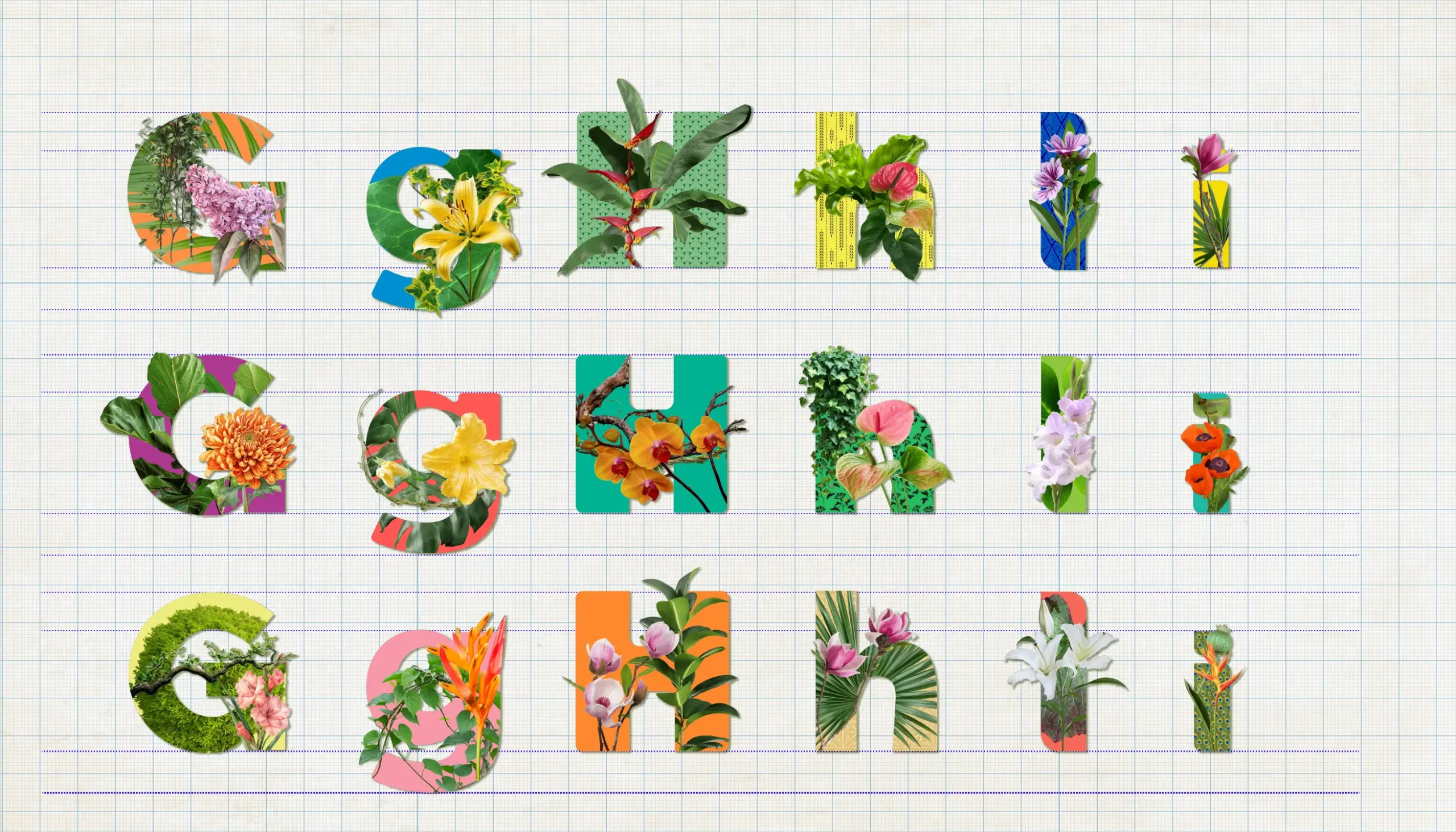
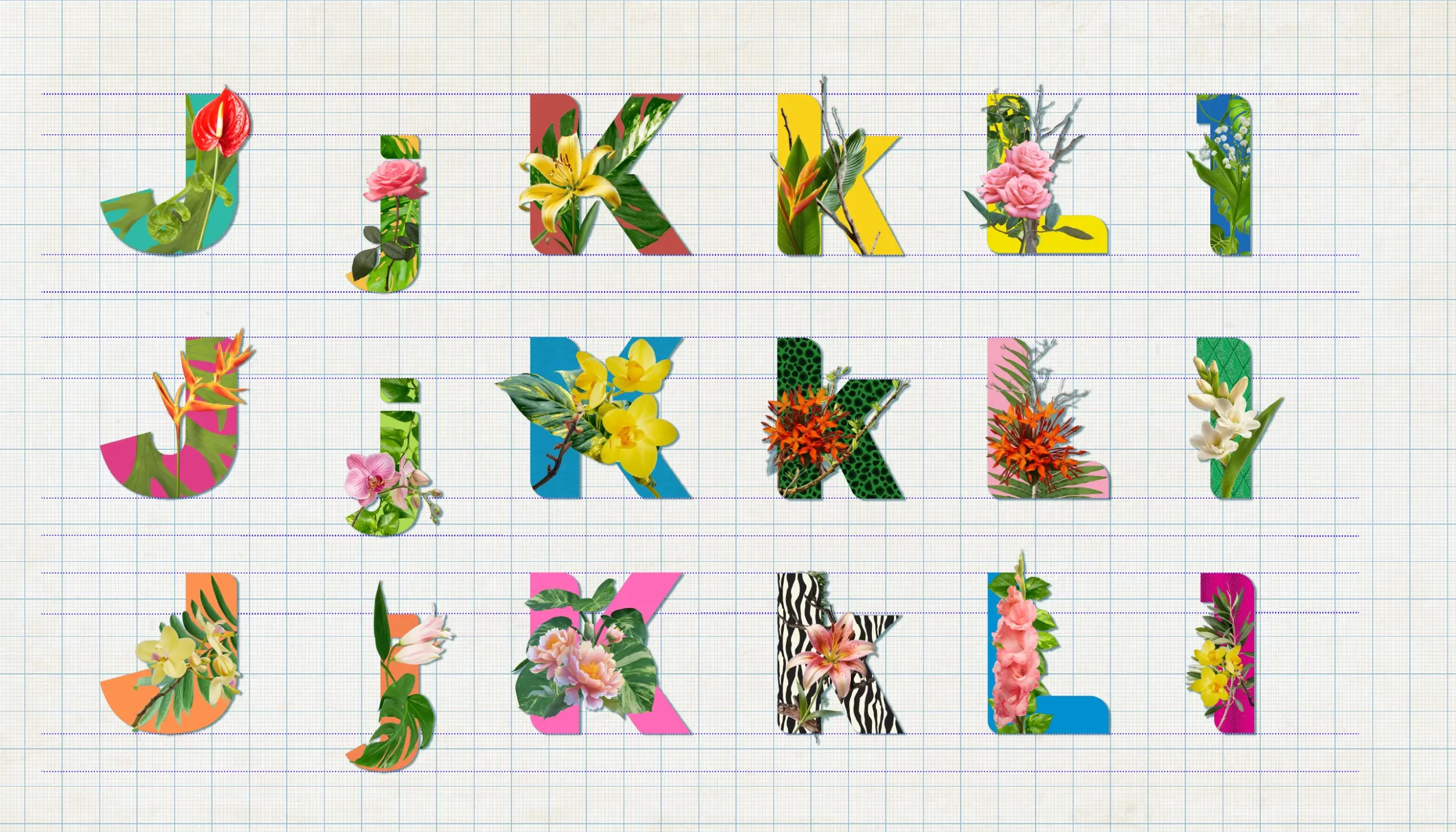
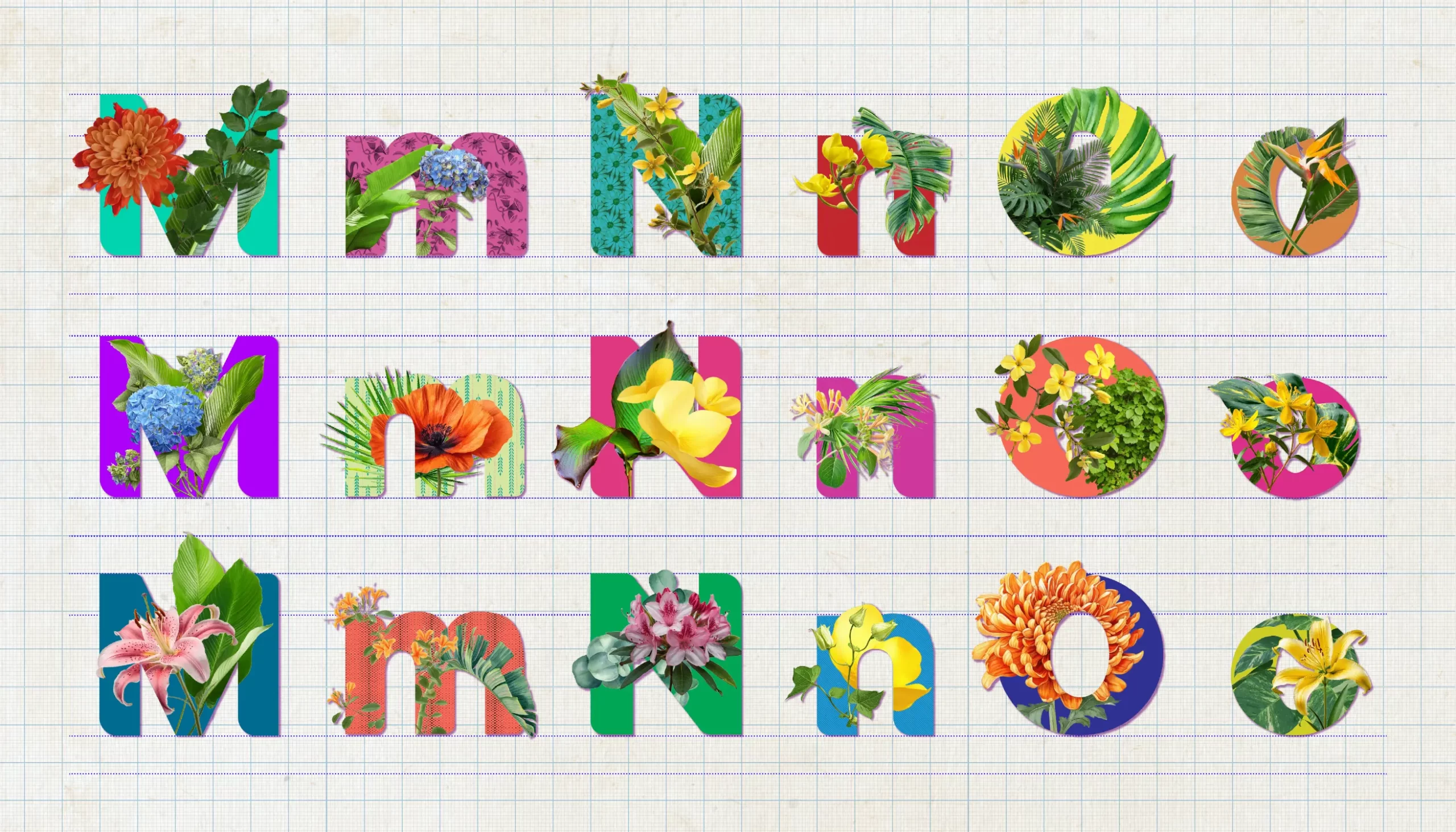
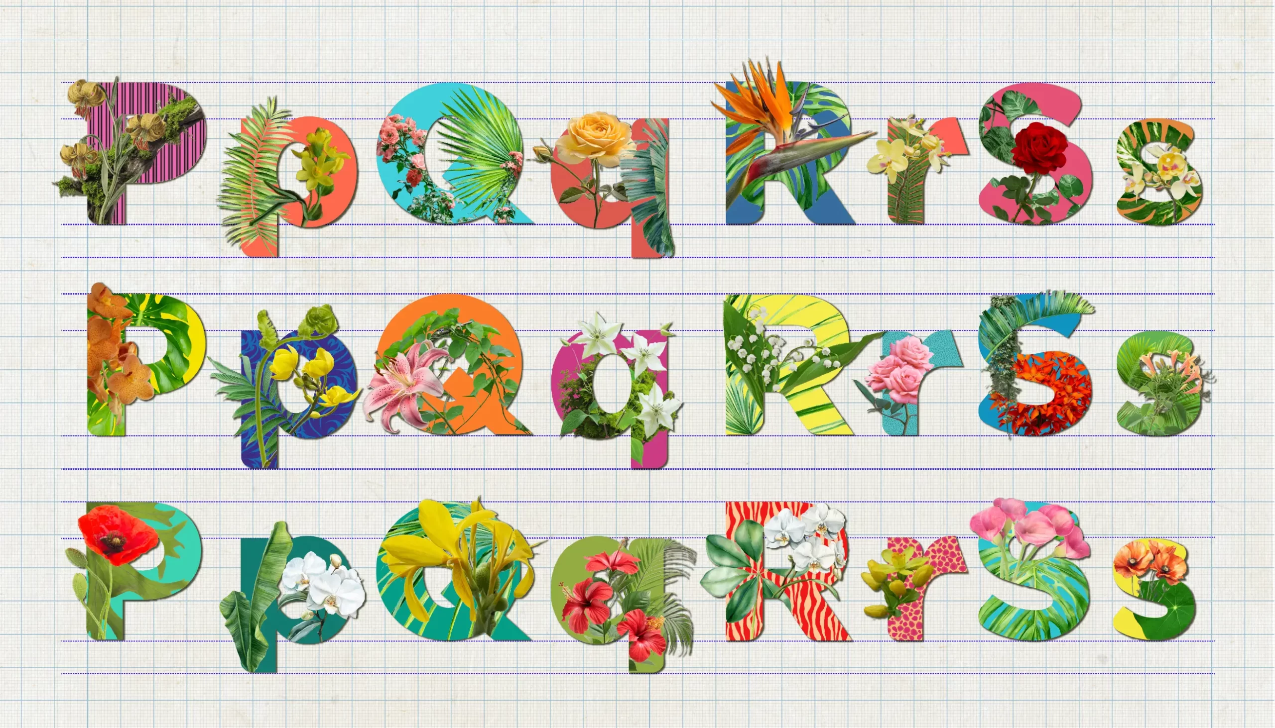
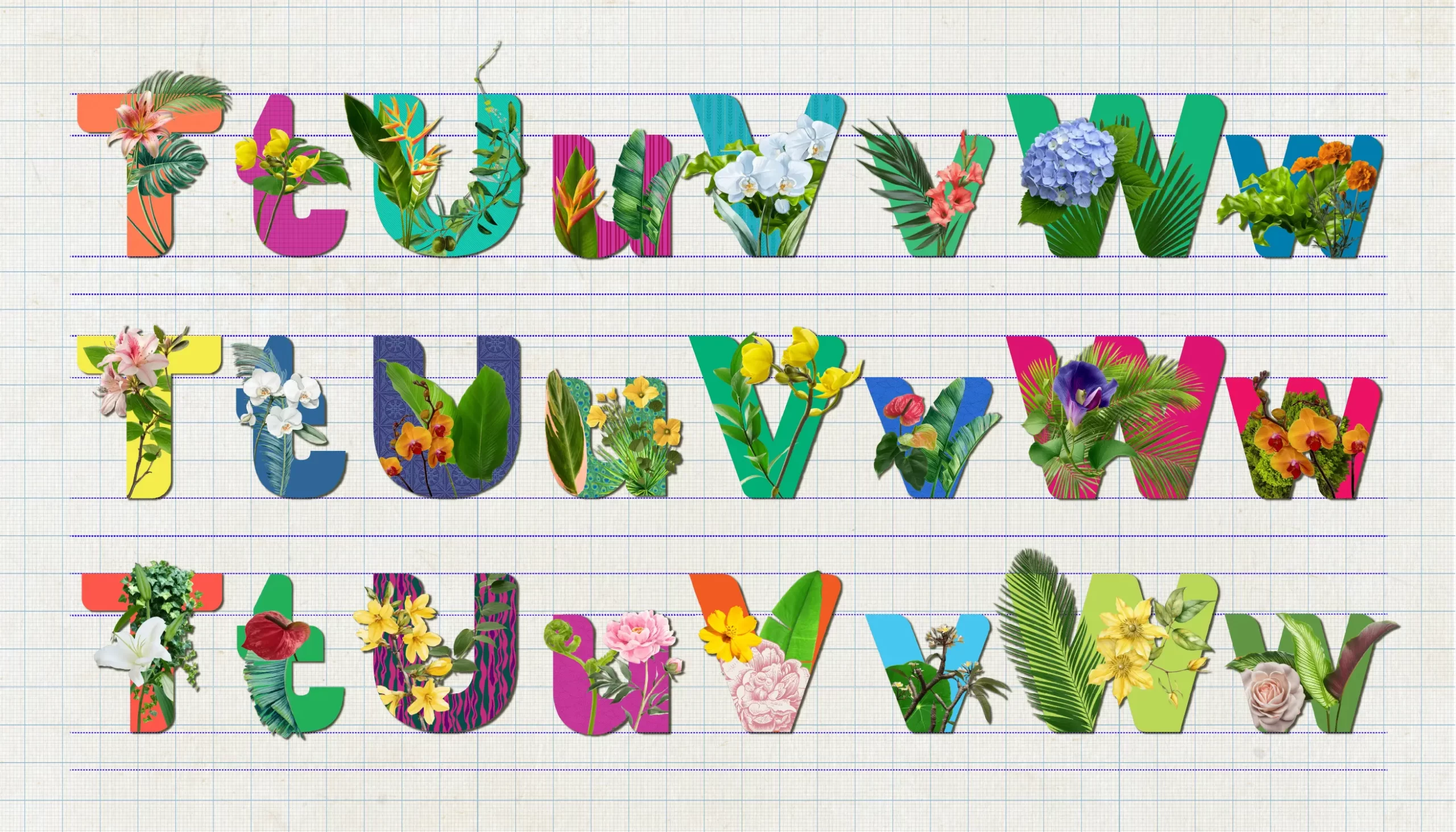
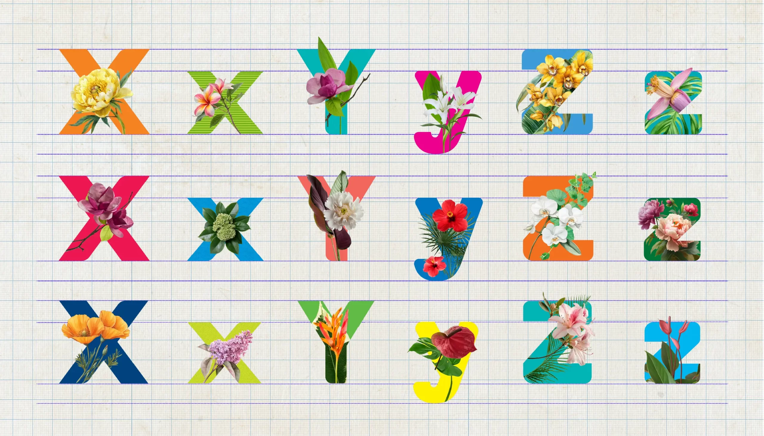
With the floral and trompe-l'œil-inspired variations on both uppercase and lowercase letters, this display font uses variety to tell a story. It brings structure and natural shapes together, making the letterforms feel active and alive.

Immersive Experiential Design
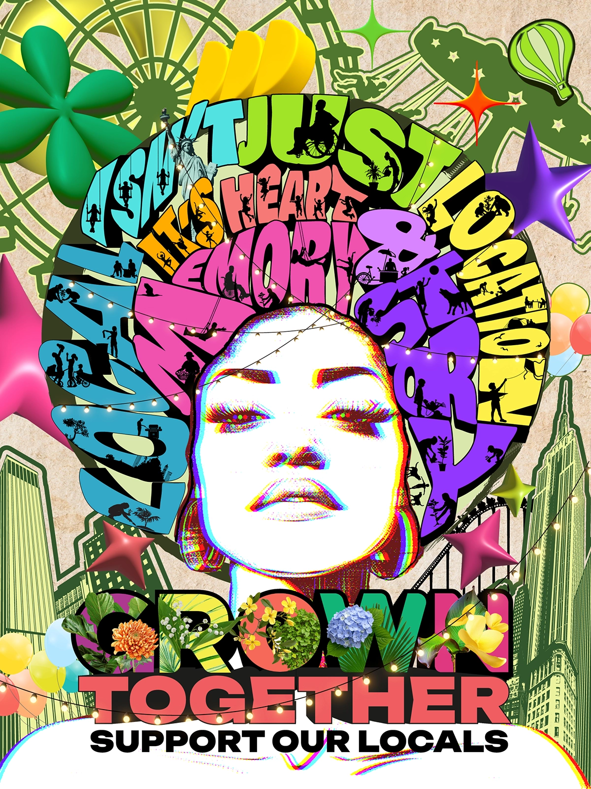
The image contains the main slogans "GROWN TOGETHER" and "SUPPORT OUR LOCALS" at the bottom, while the text inside the circular hair silhouette reads "LOCAL IS NOT JUST A LOCATION" and "IT'S HEART, MEMORY & HISTORY."

Typorganik in the Wild Design Beyond The Page

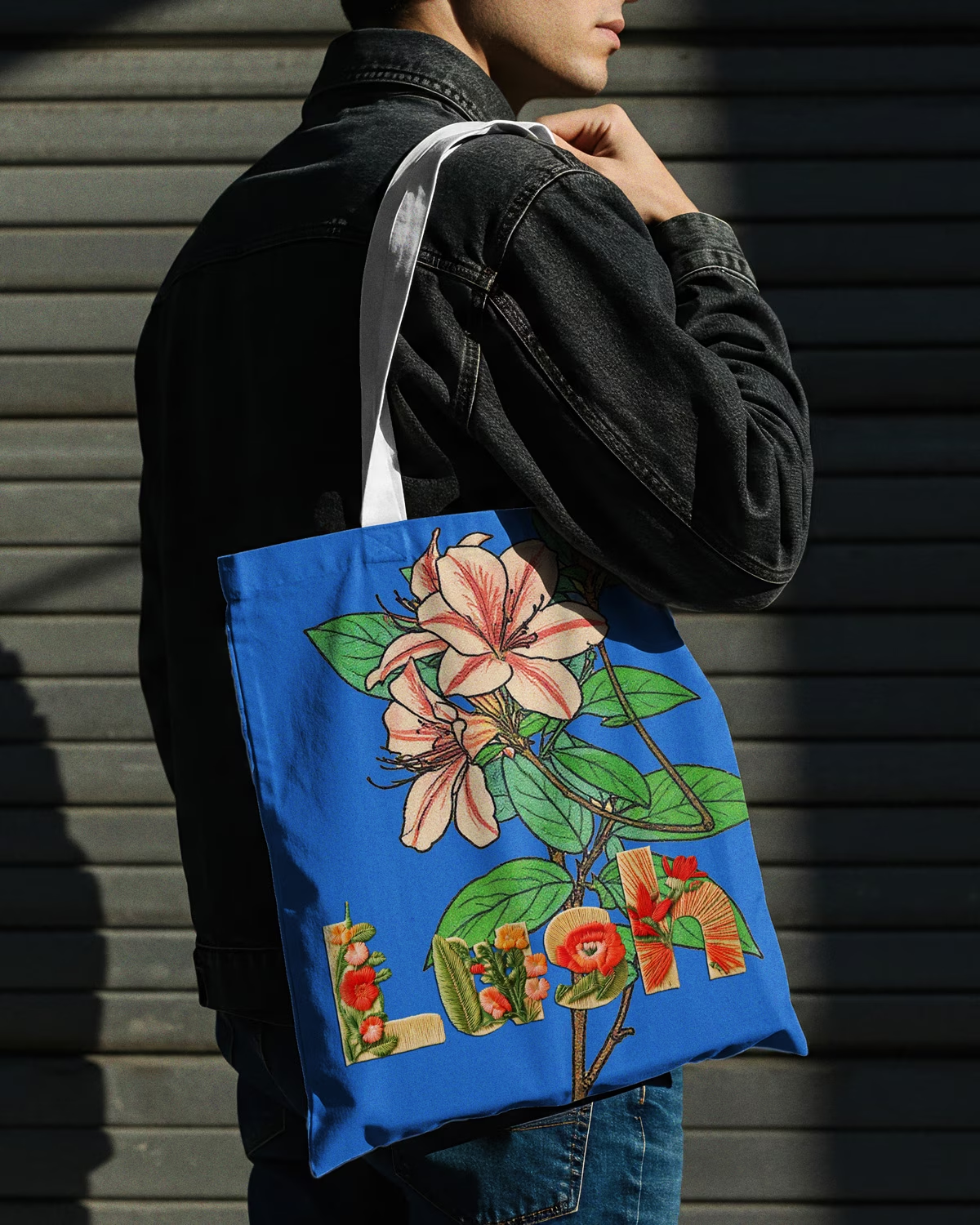
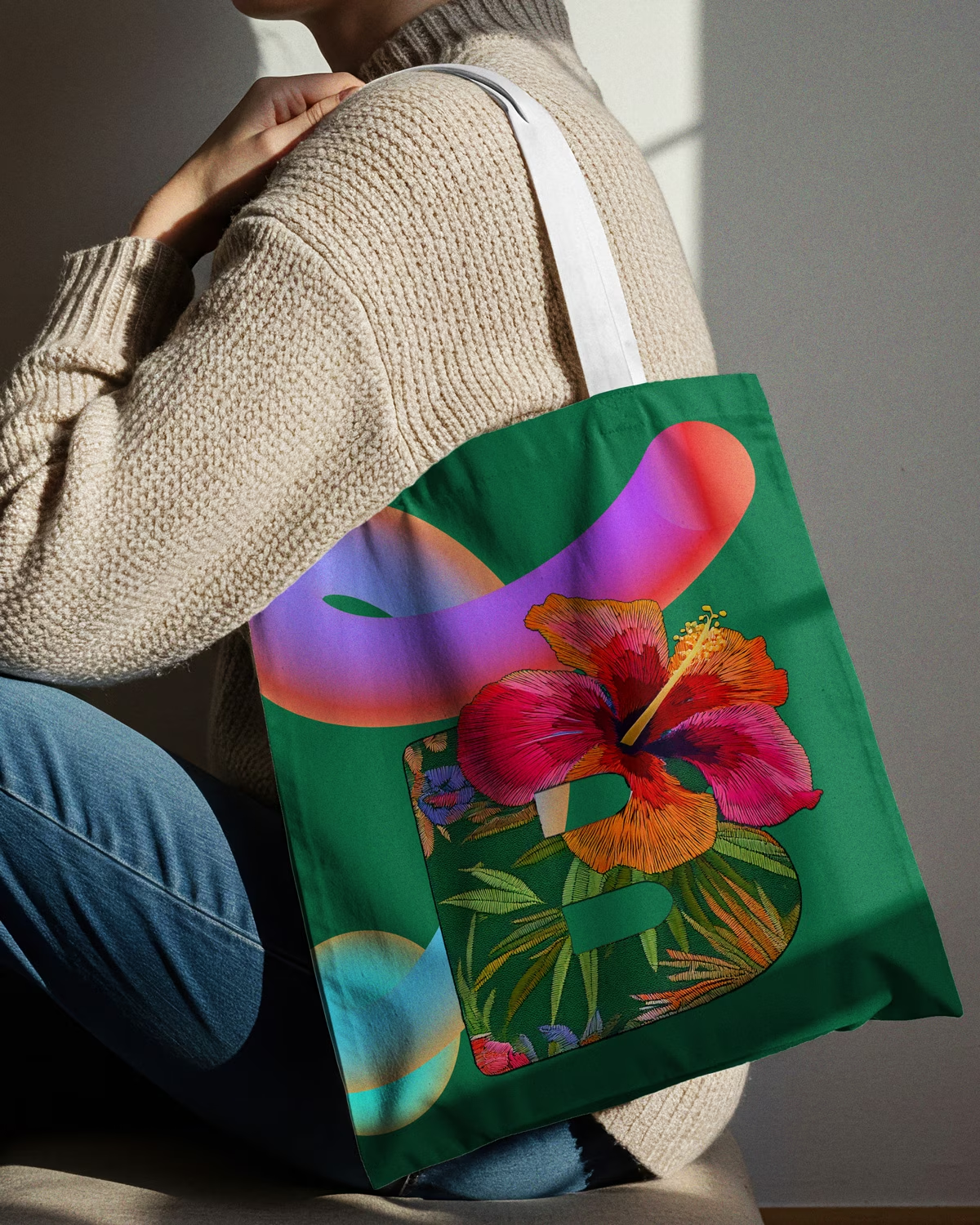
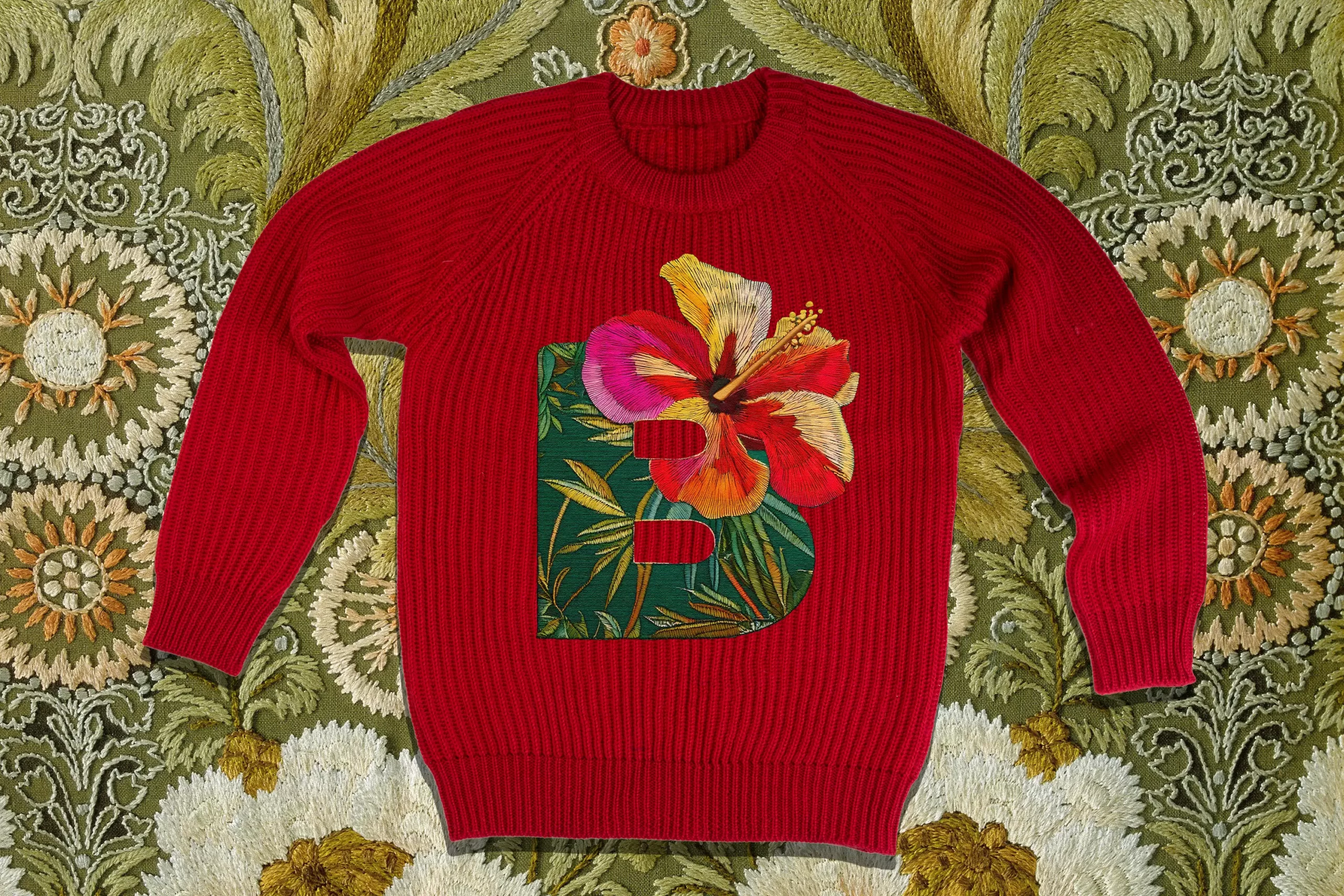
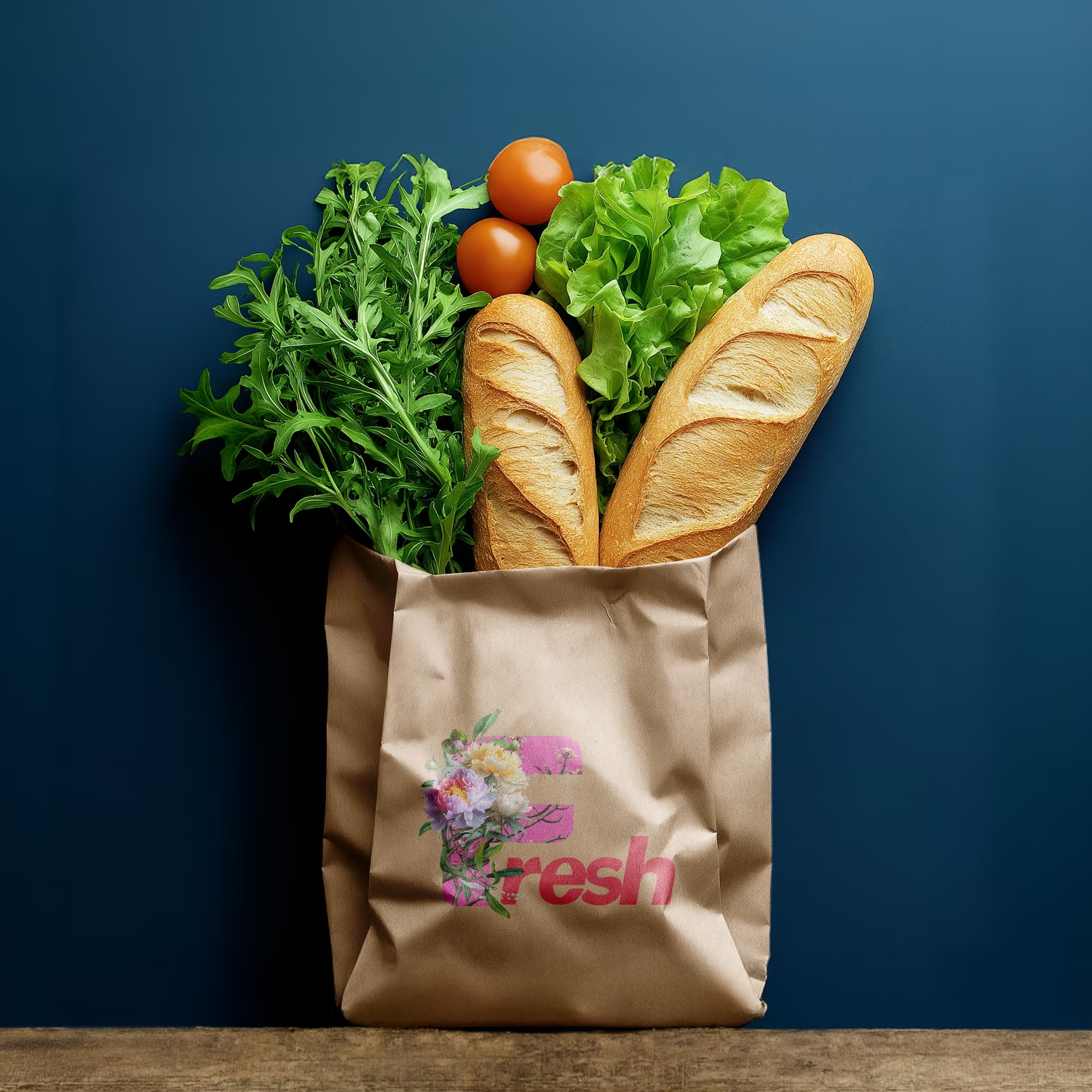
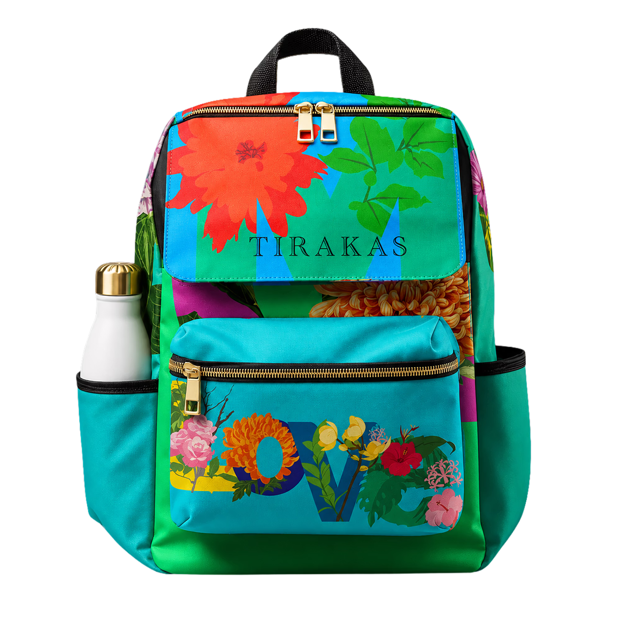
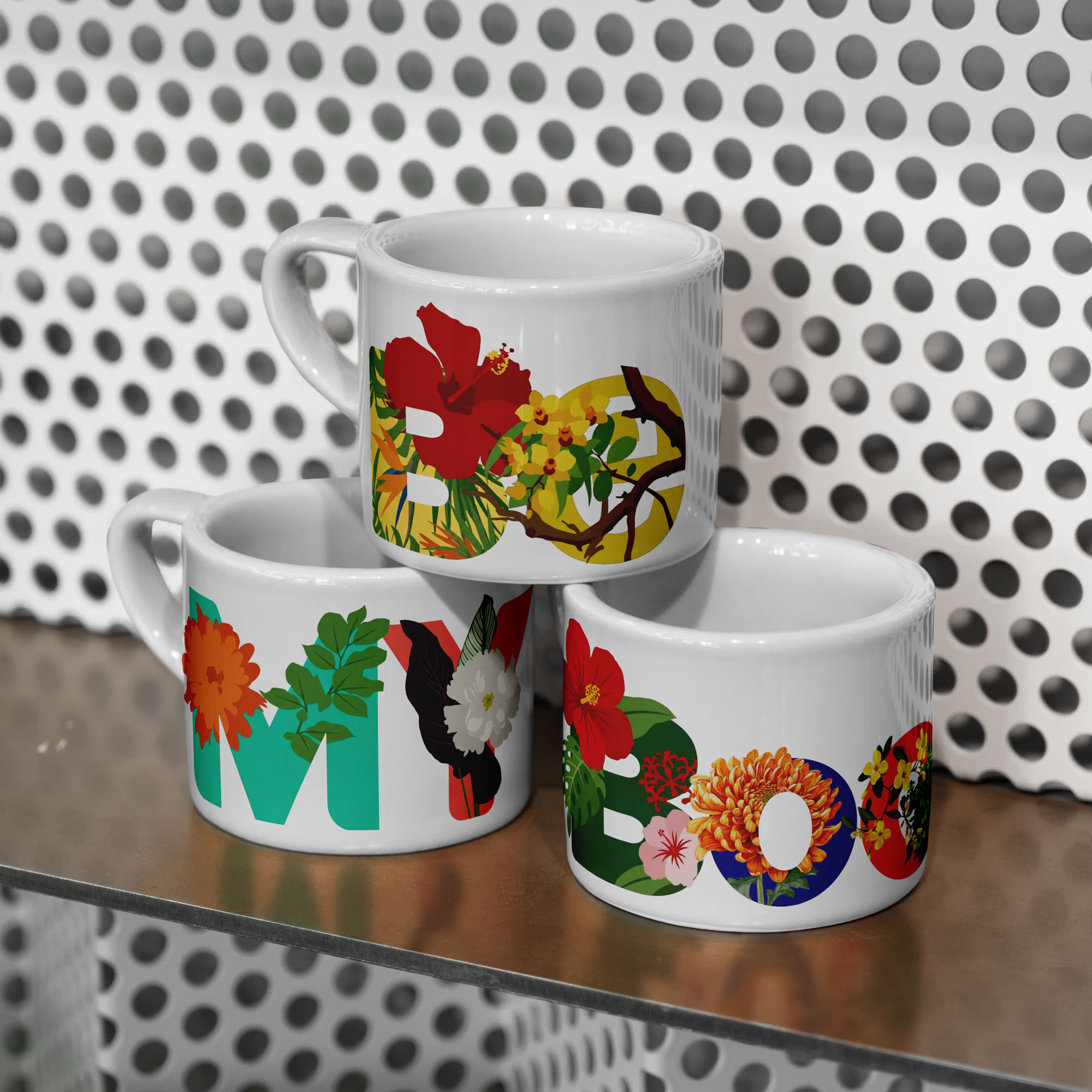
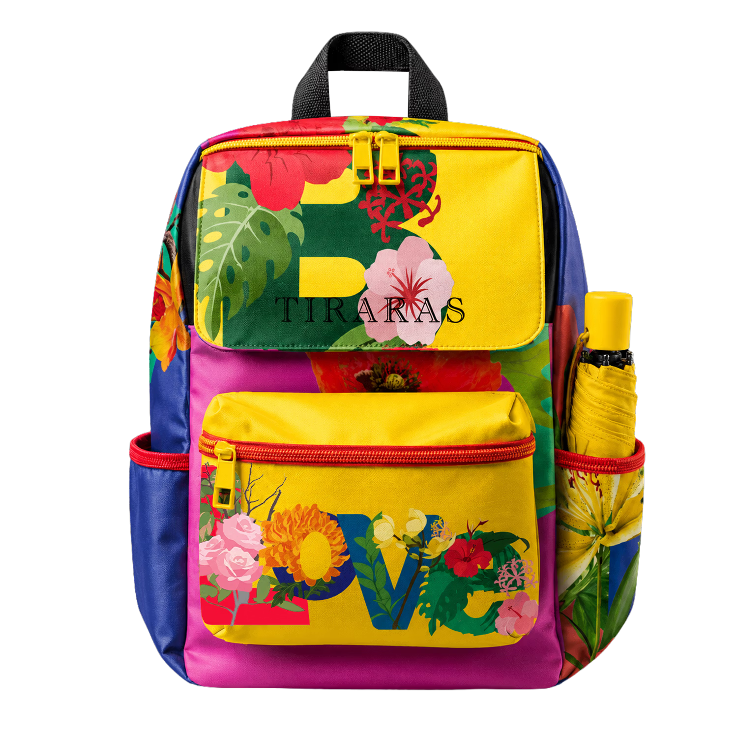
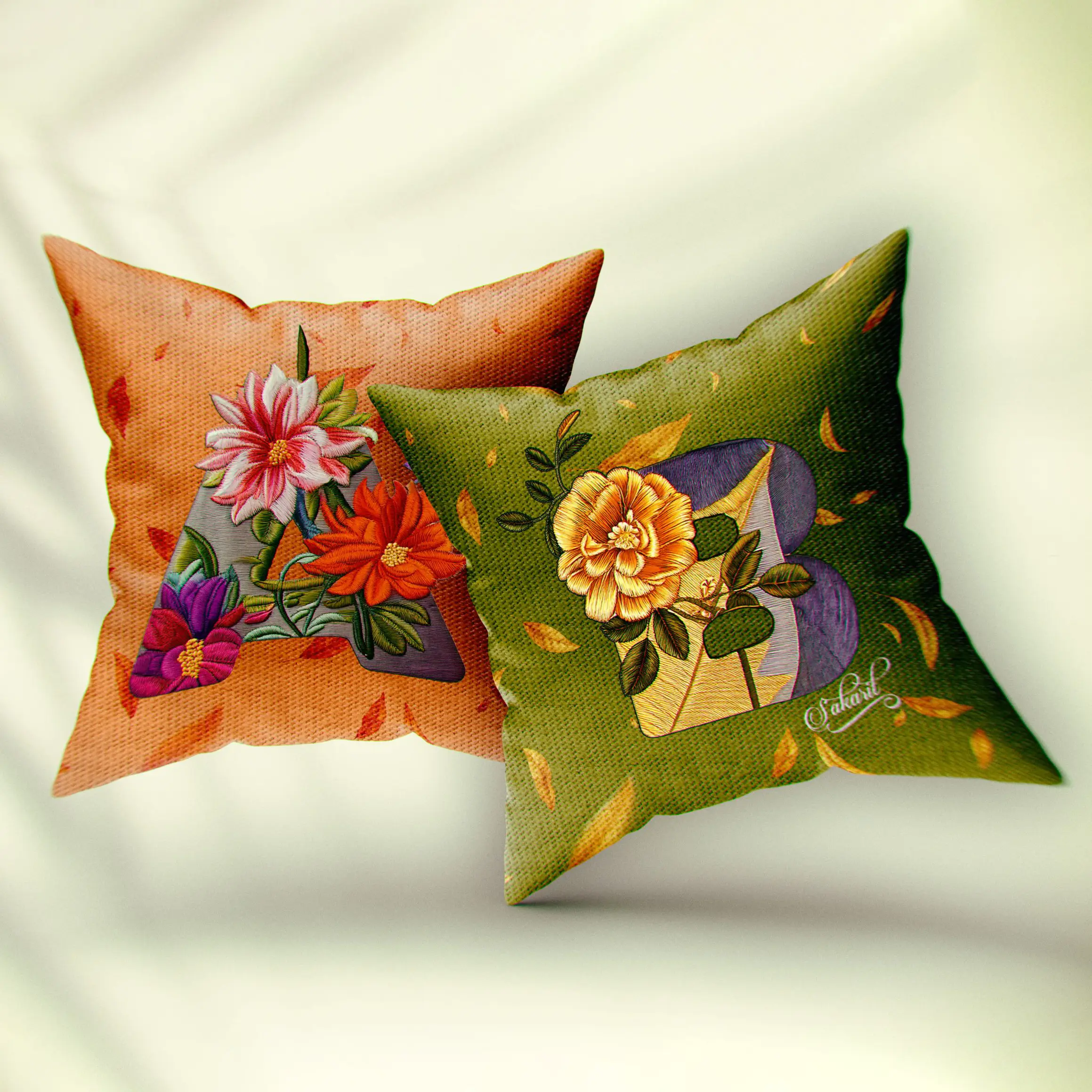
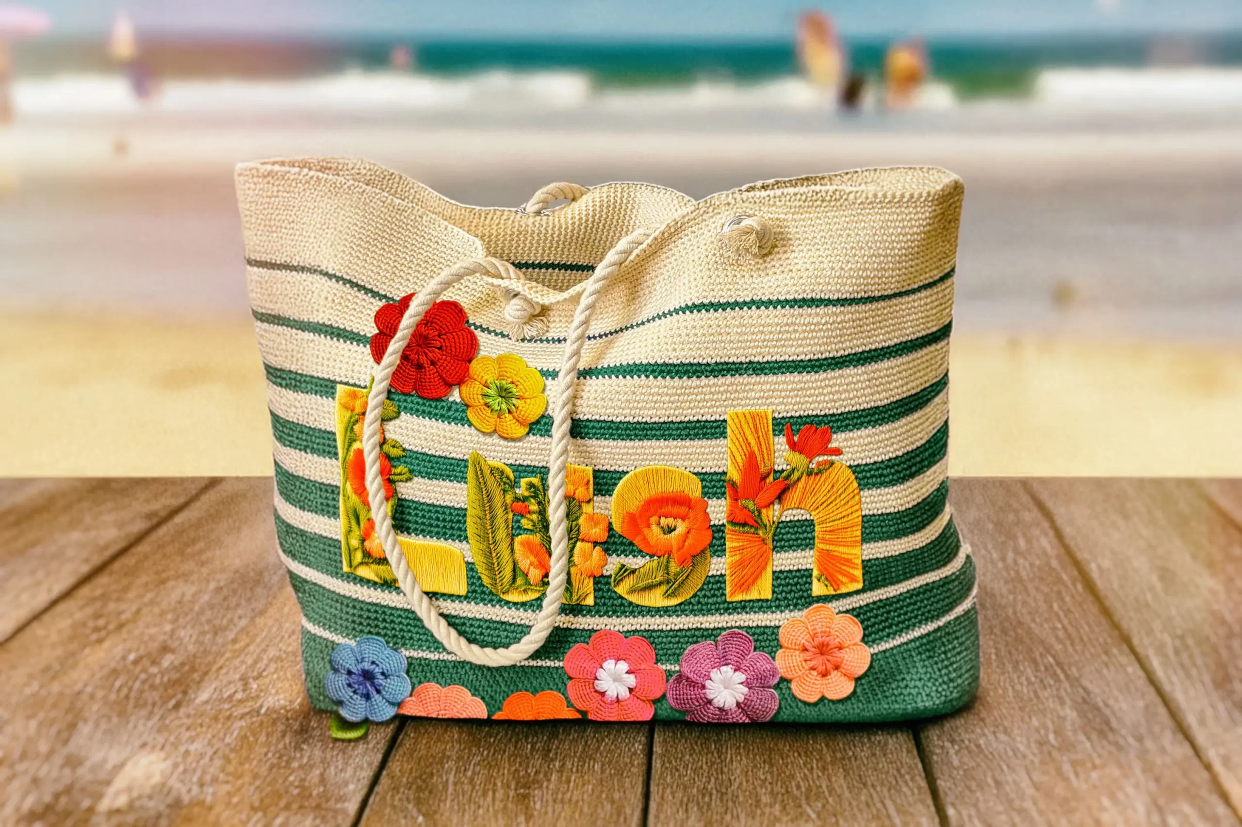
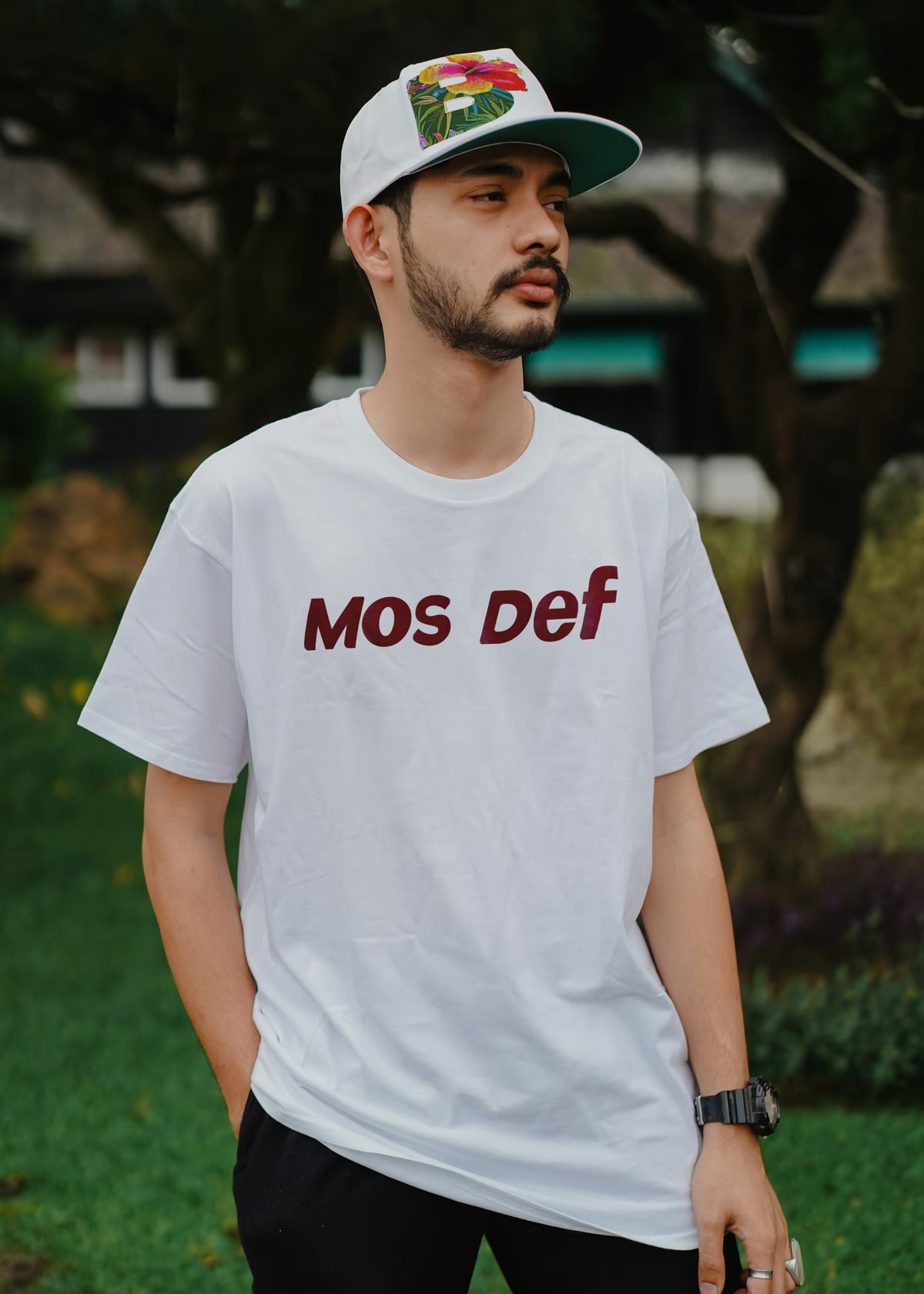
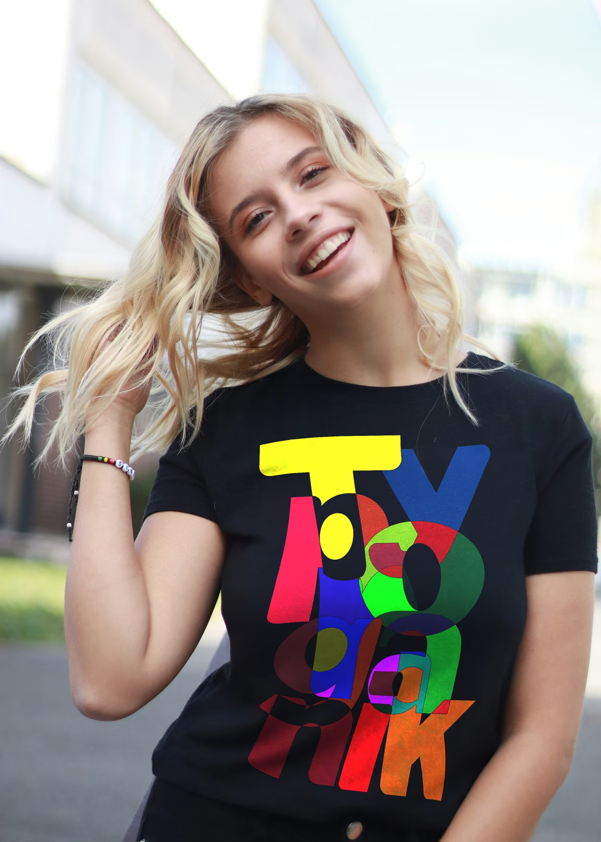
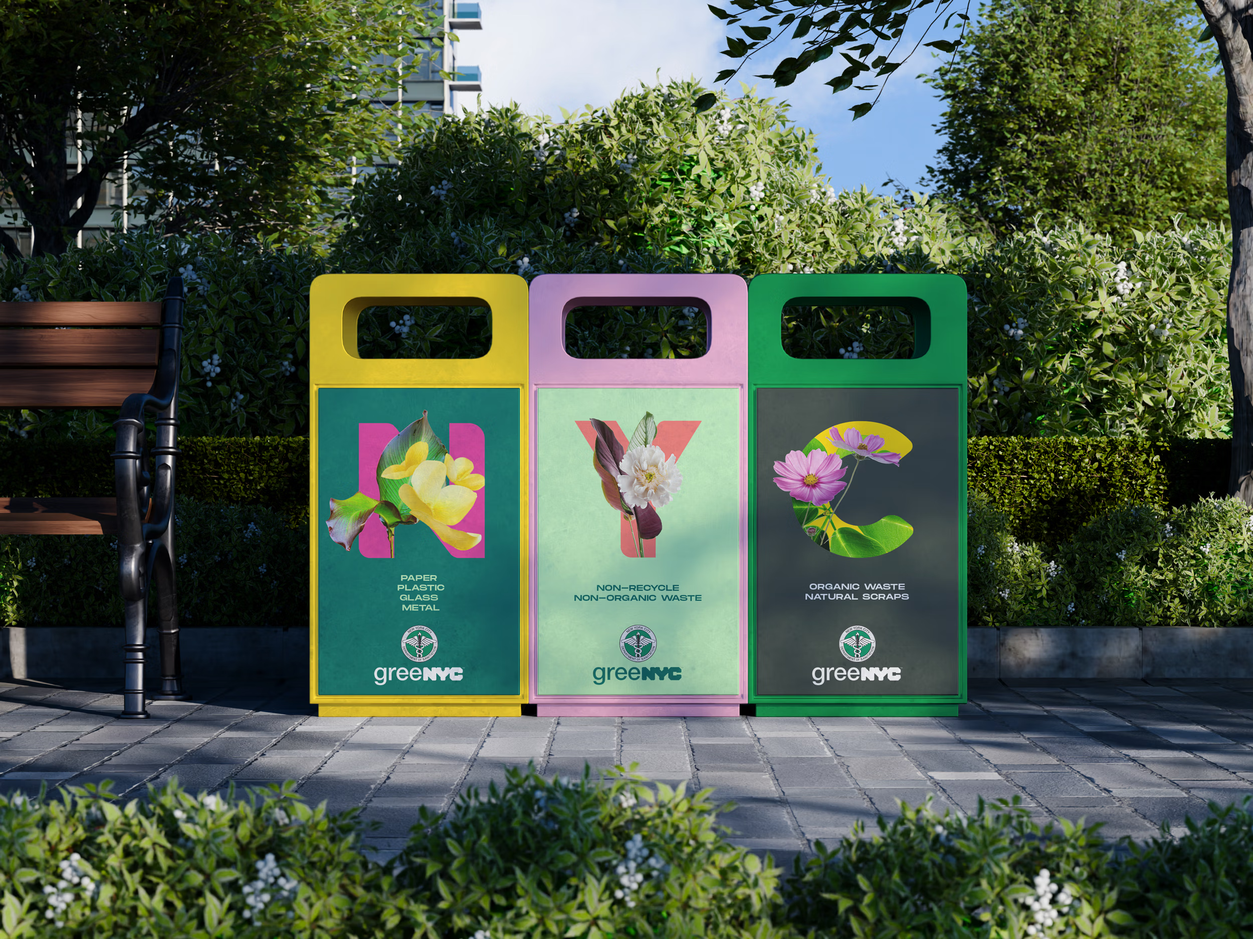
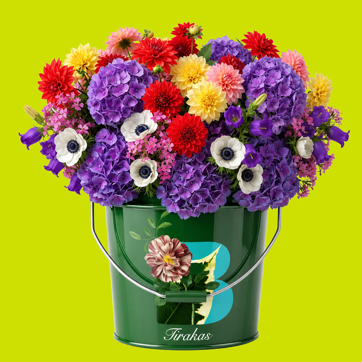
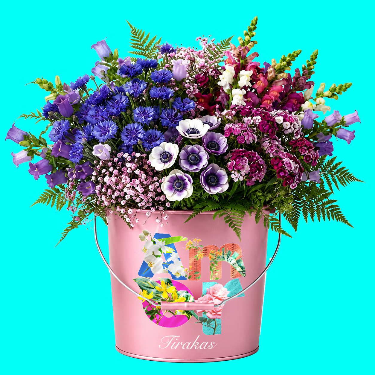
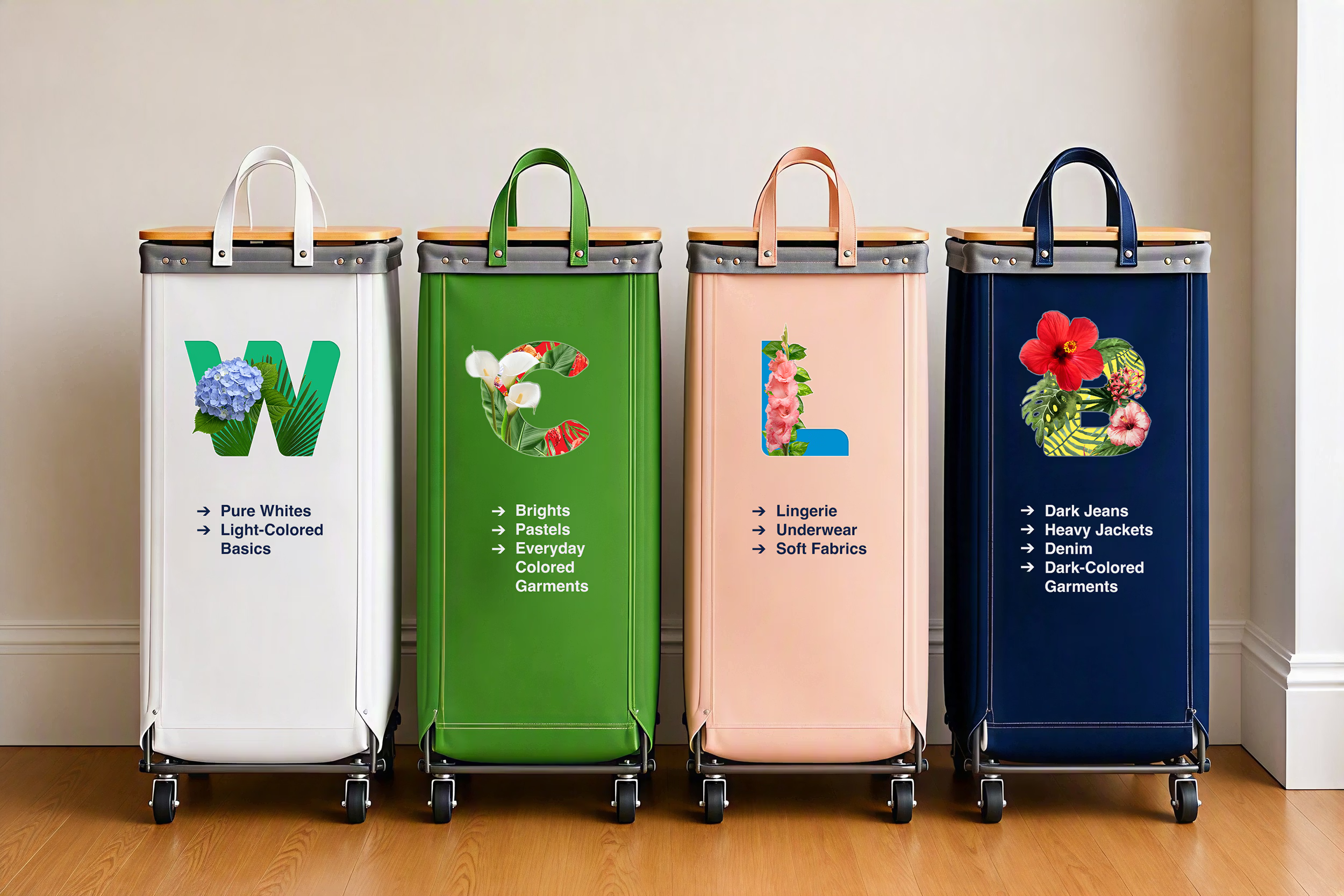
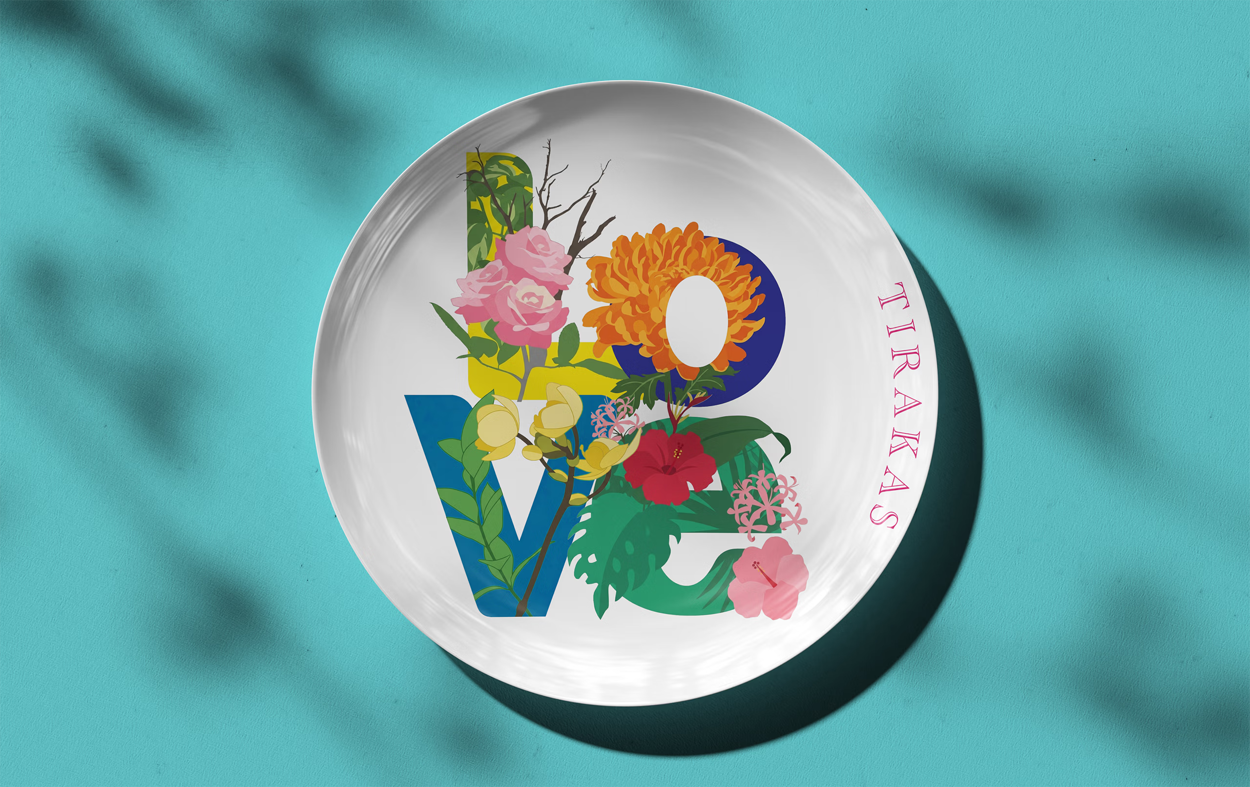
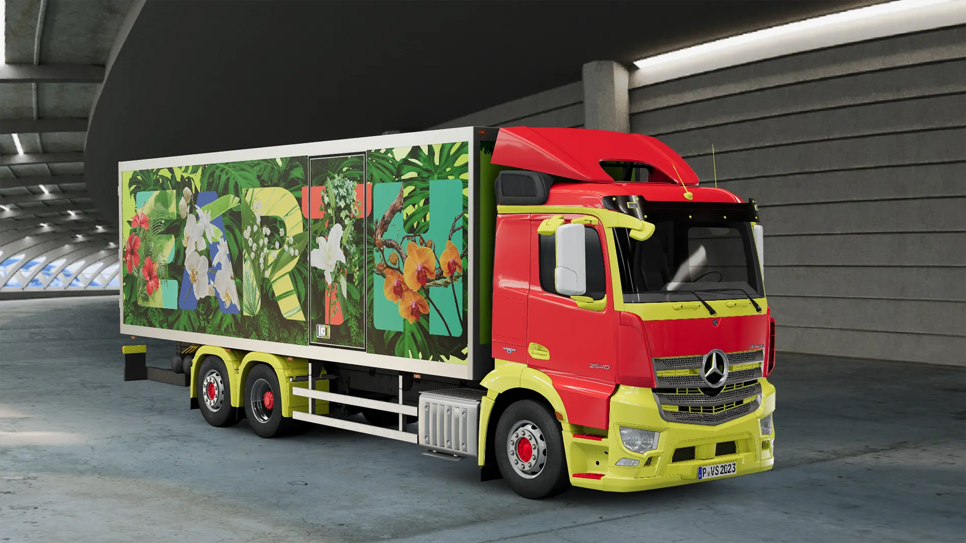
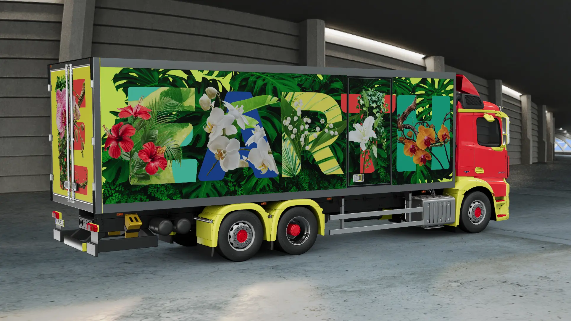
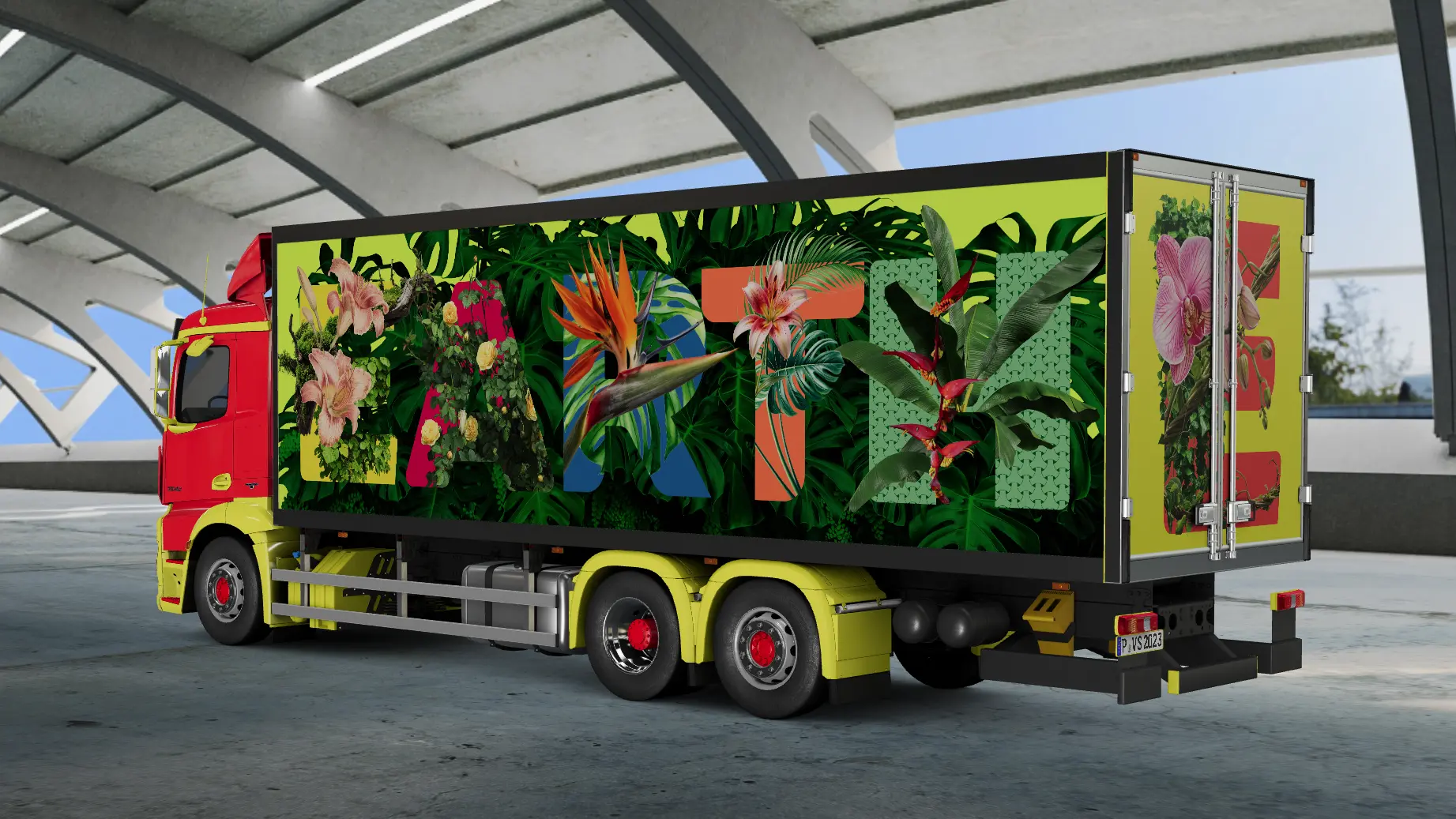
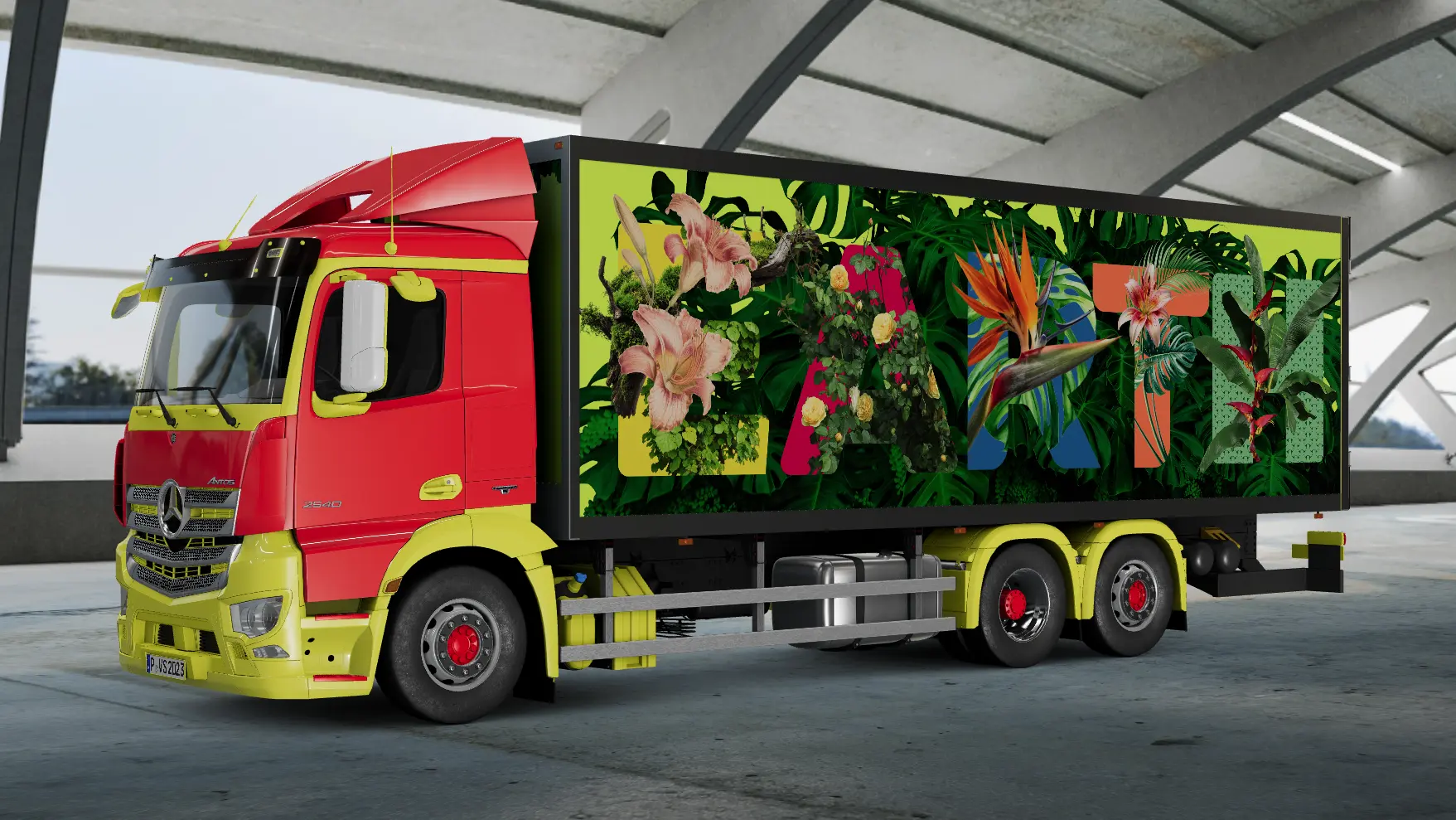
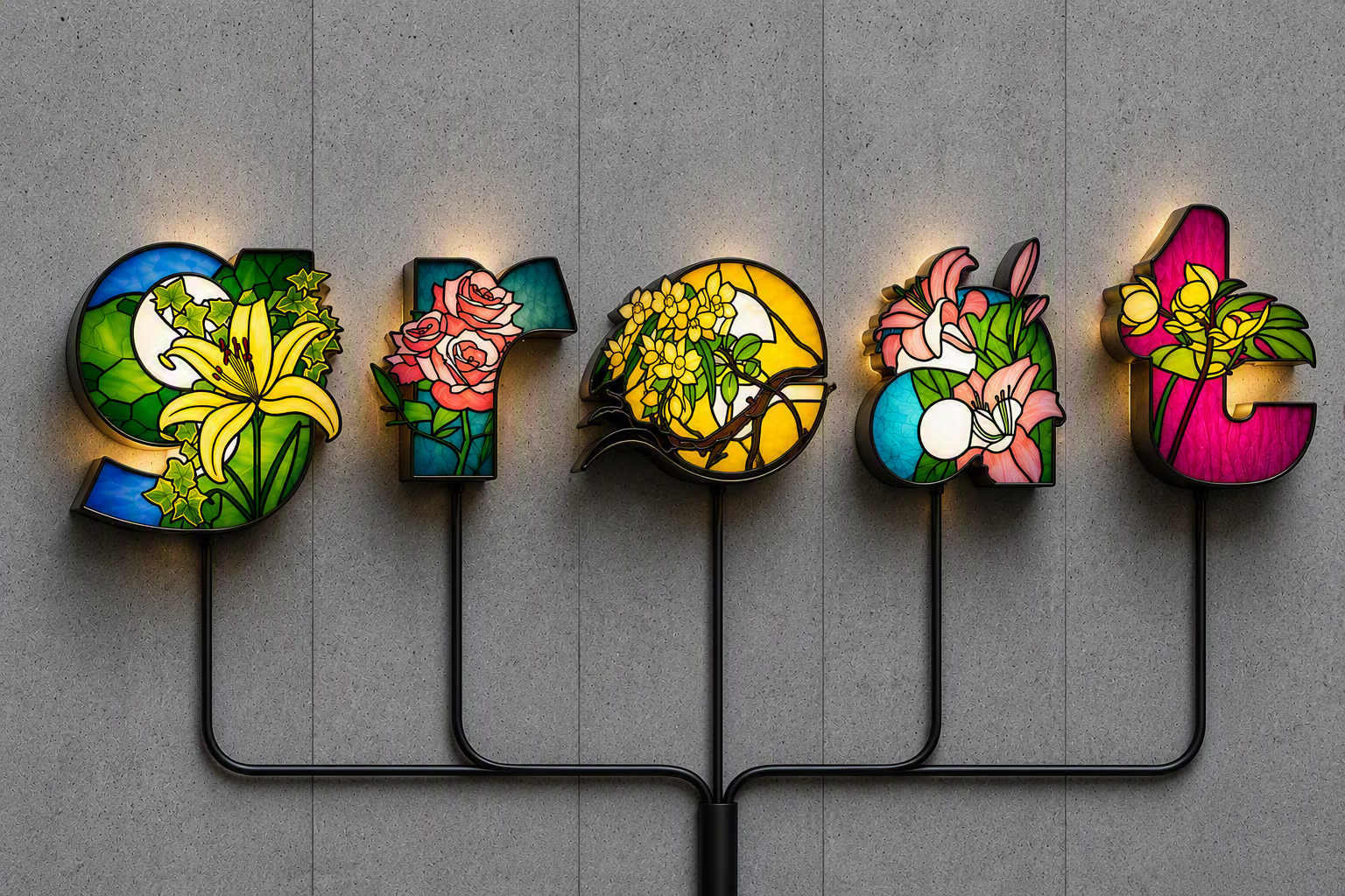
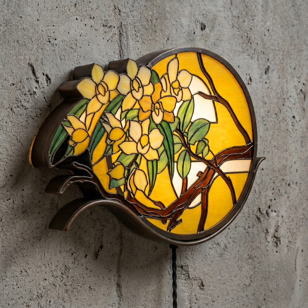
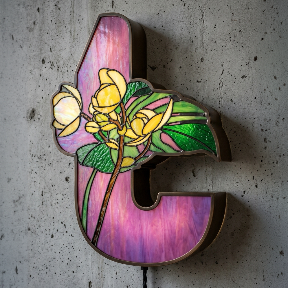
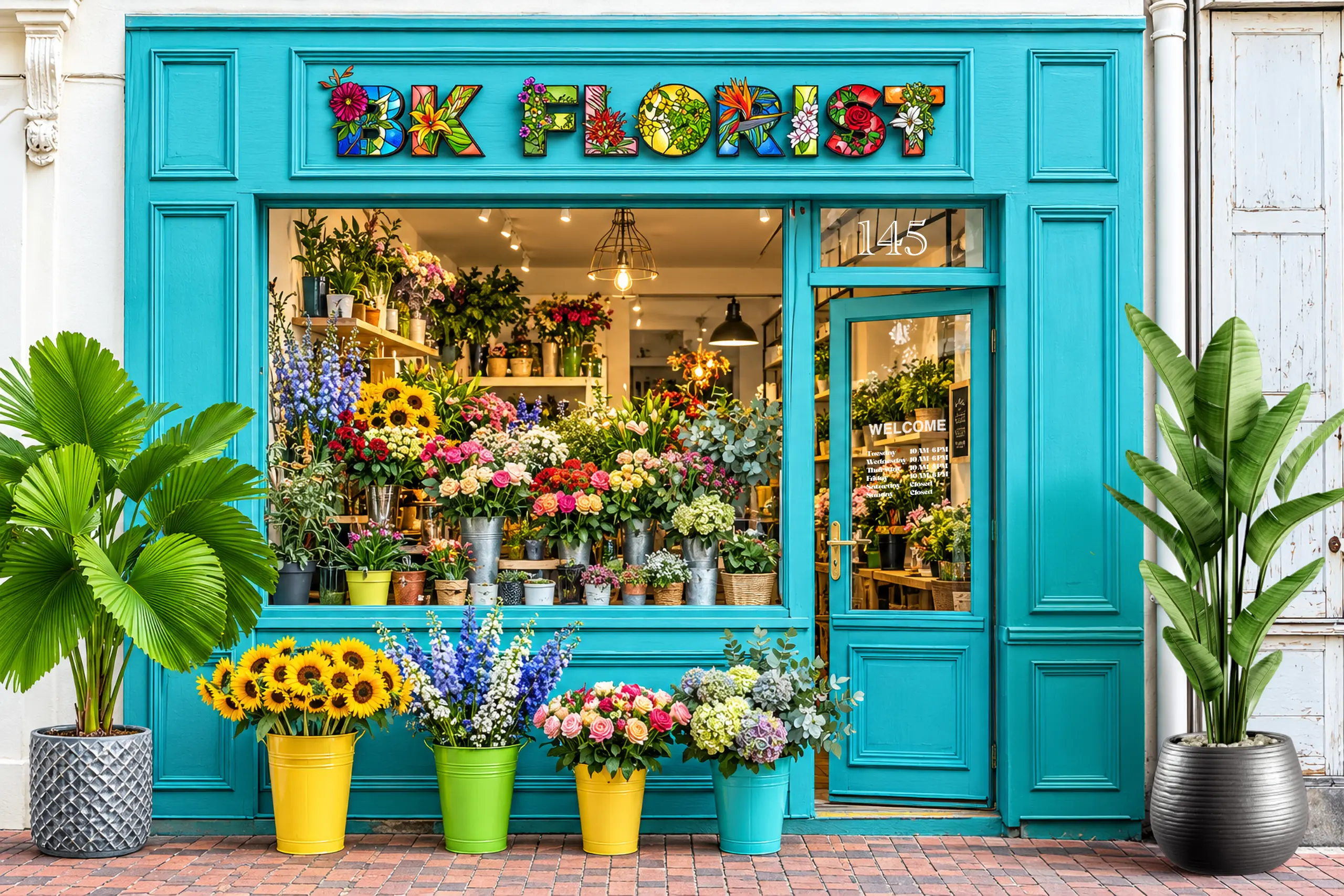
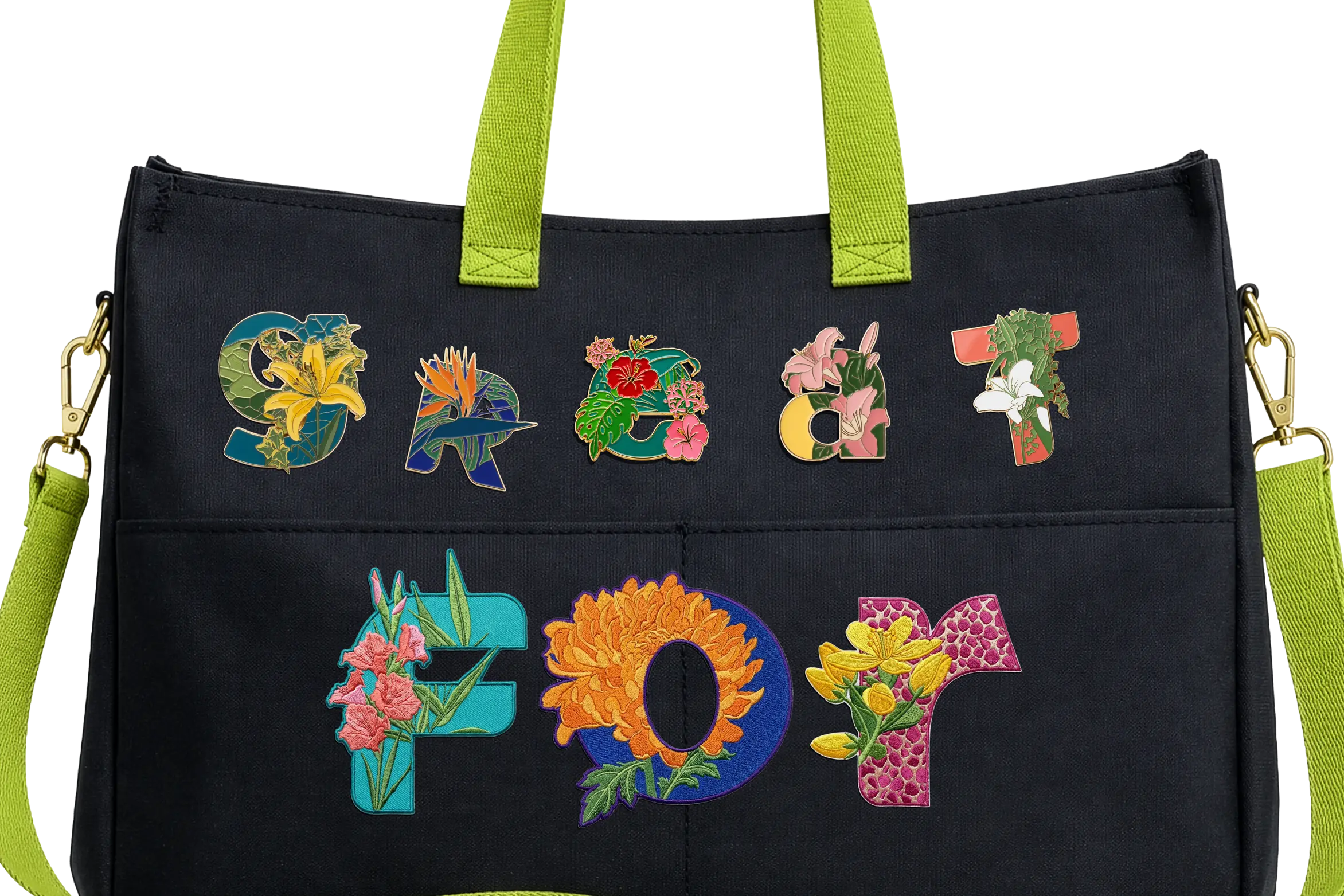
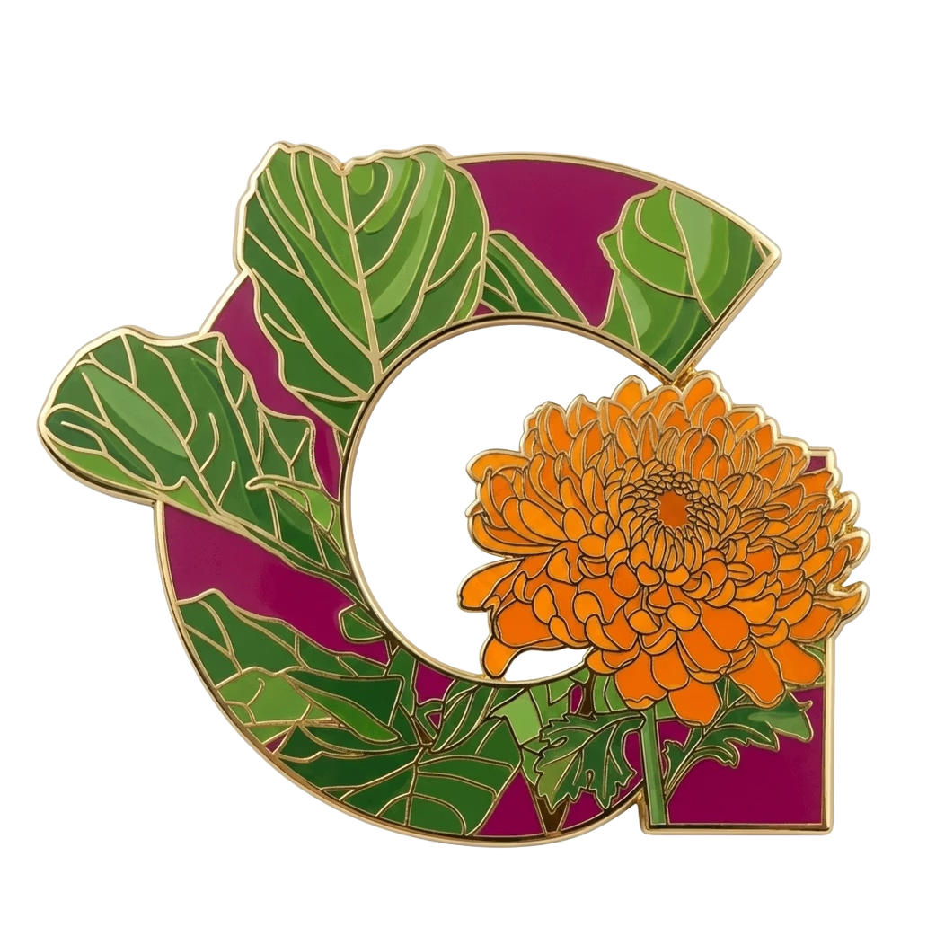
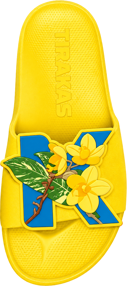
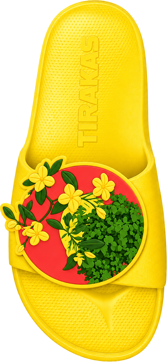
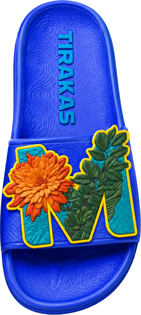
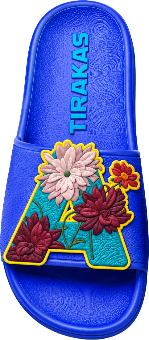
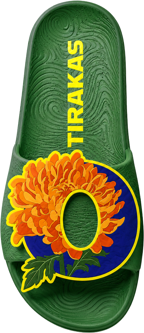
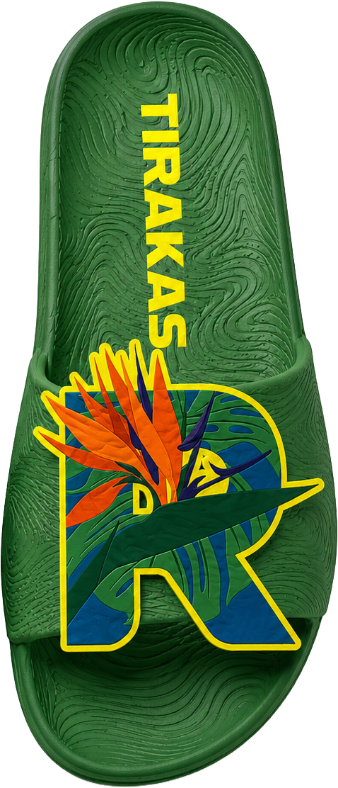
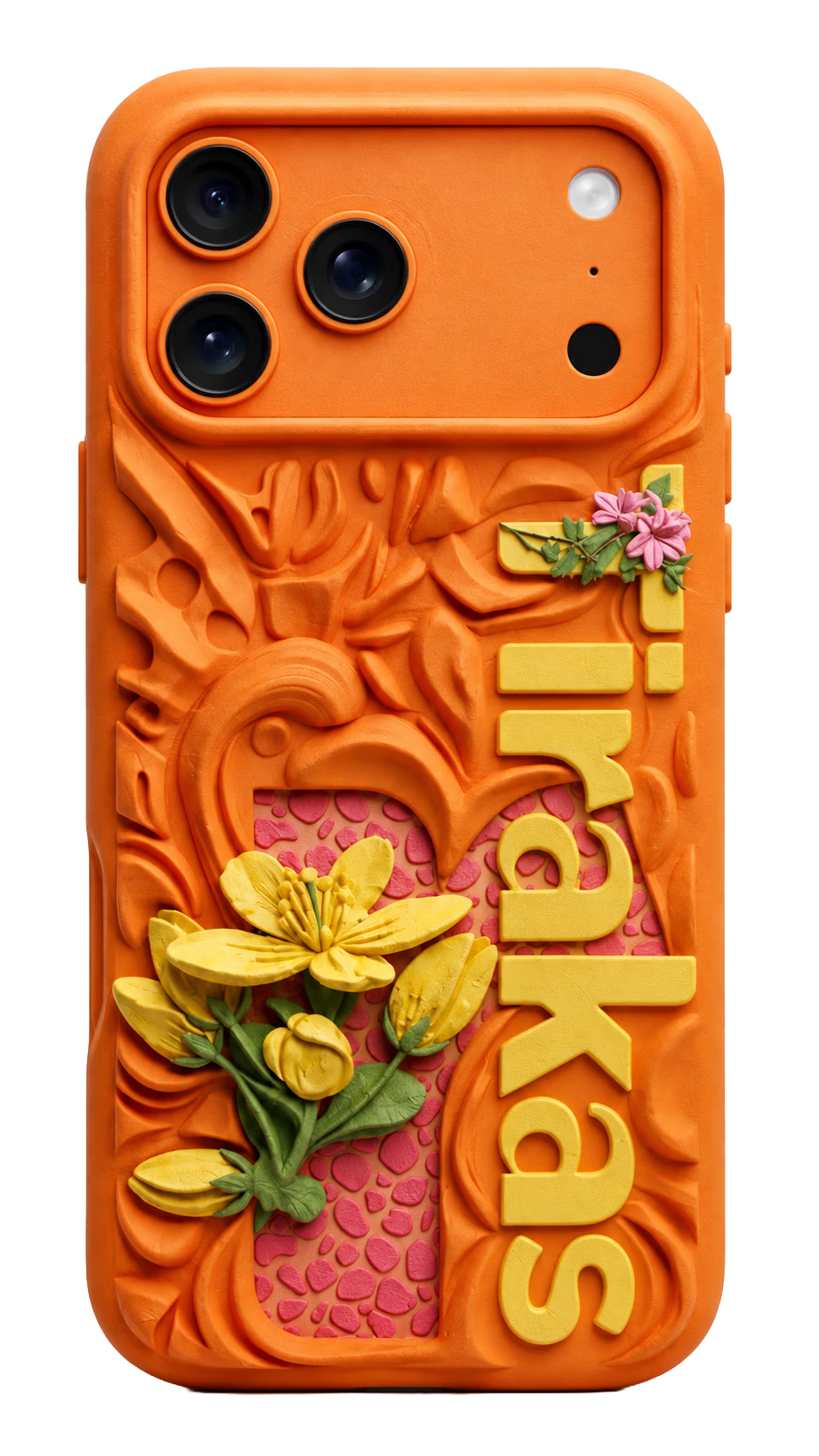
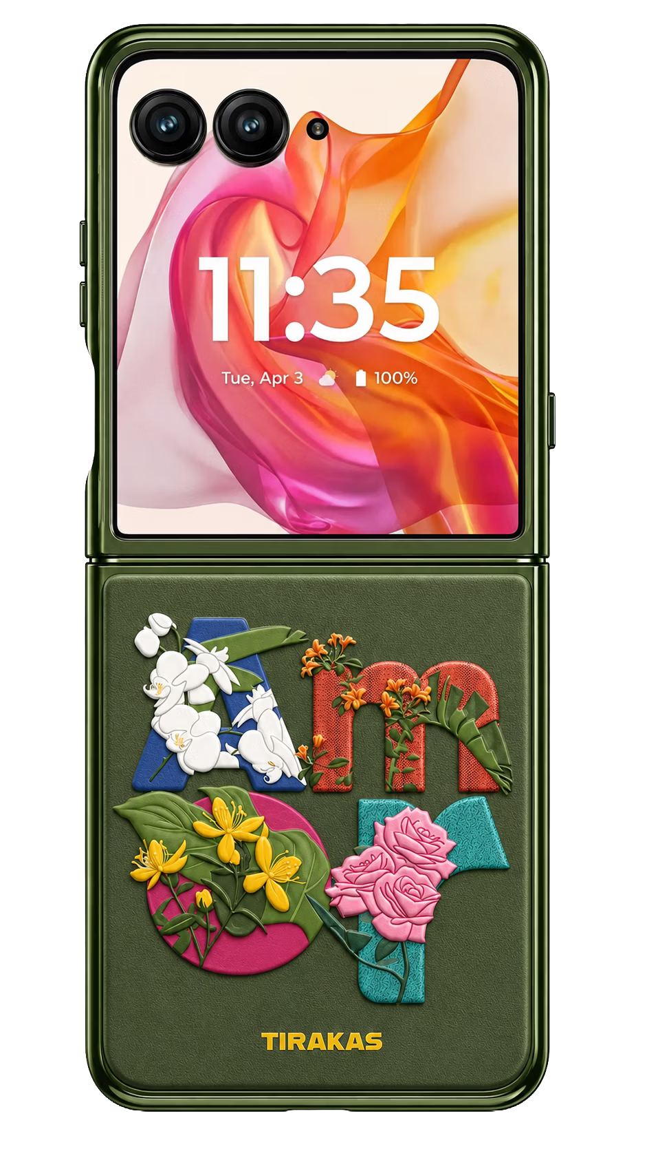
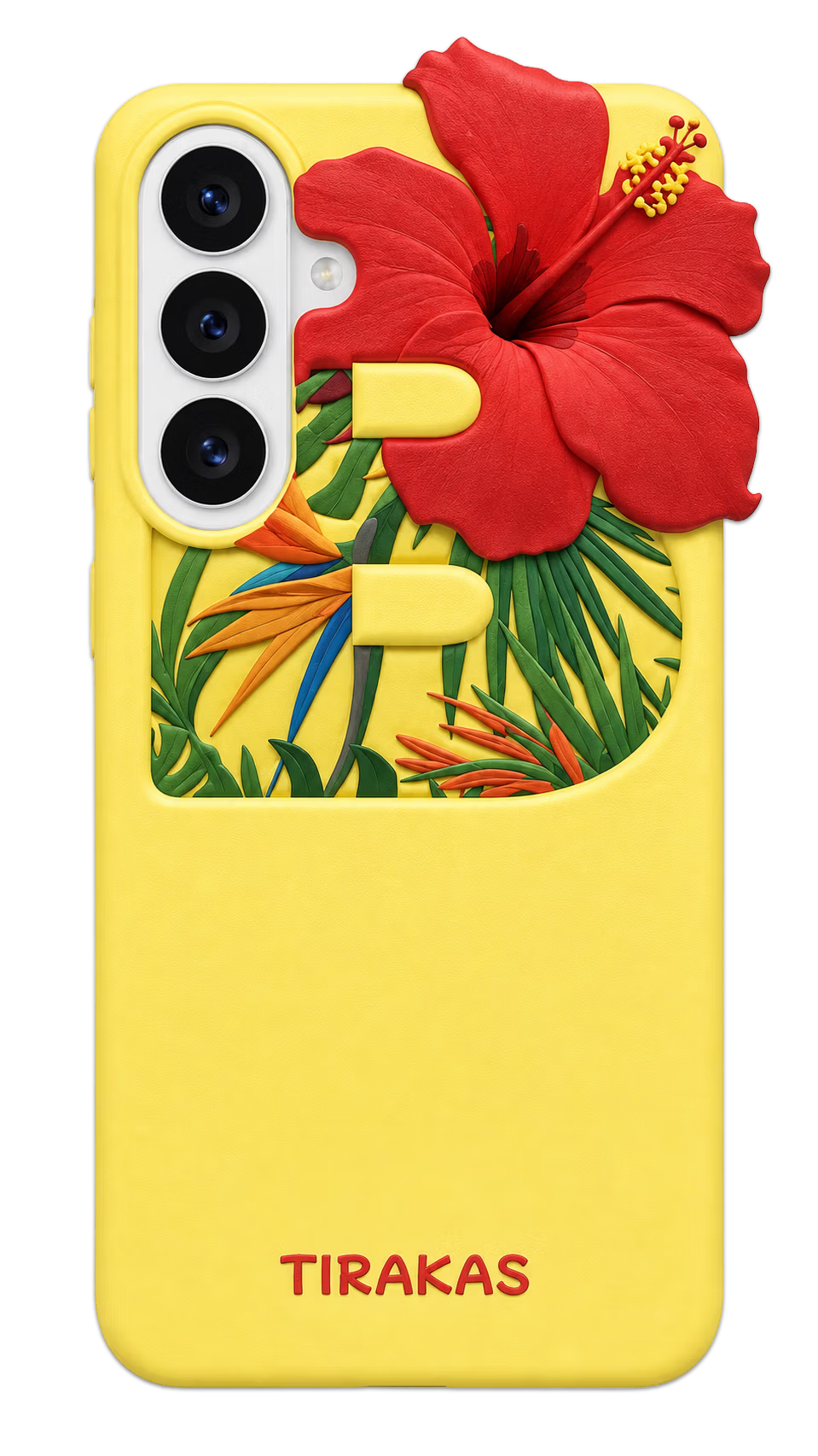
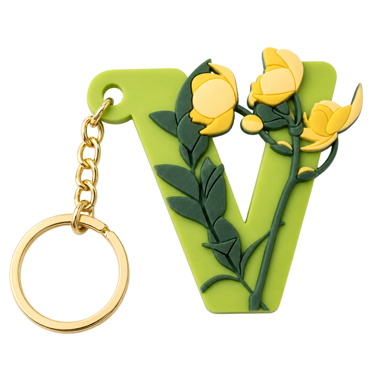
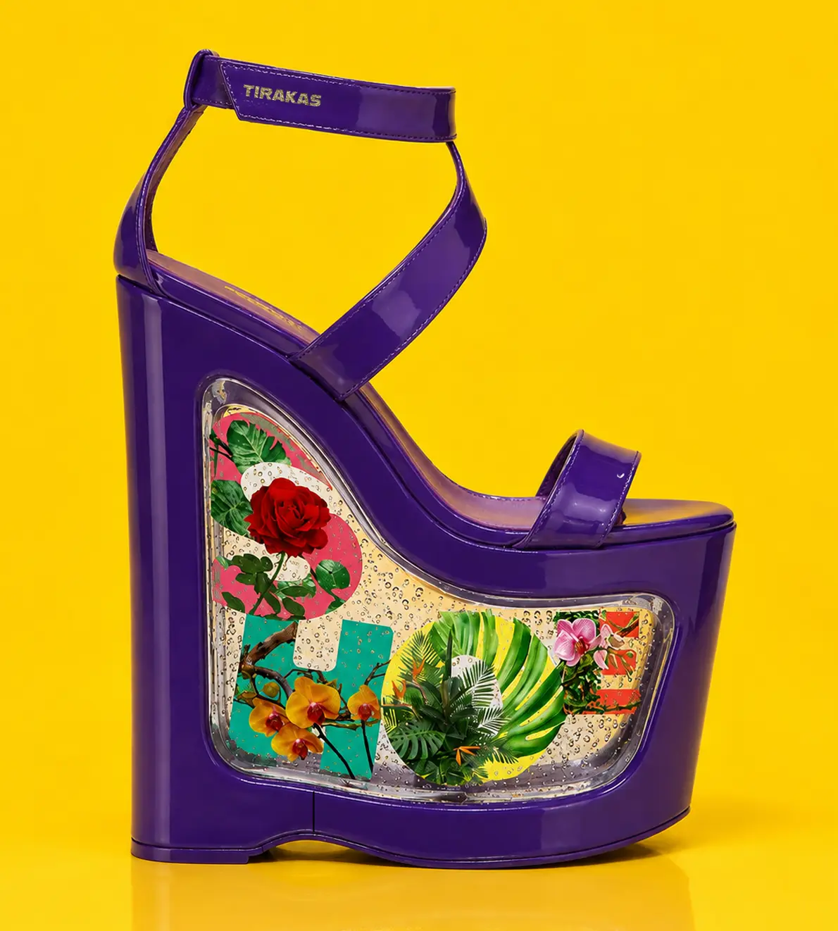
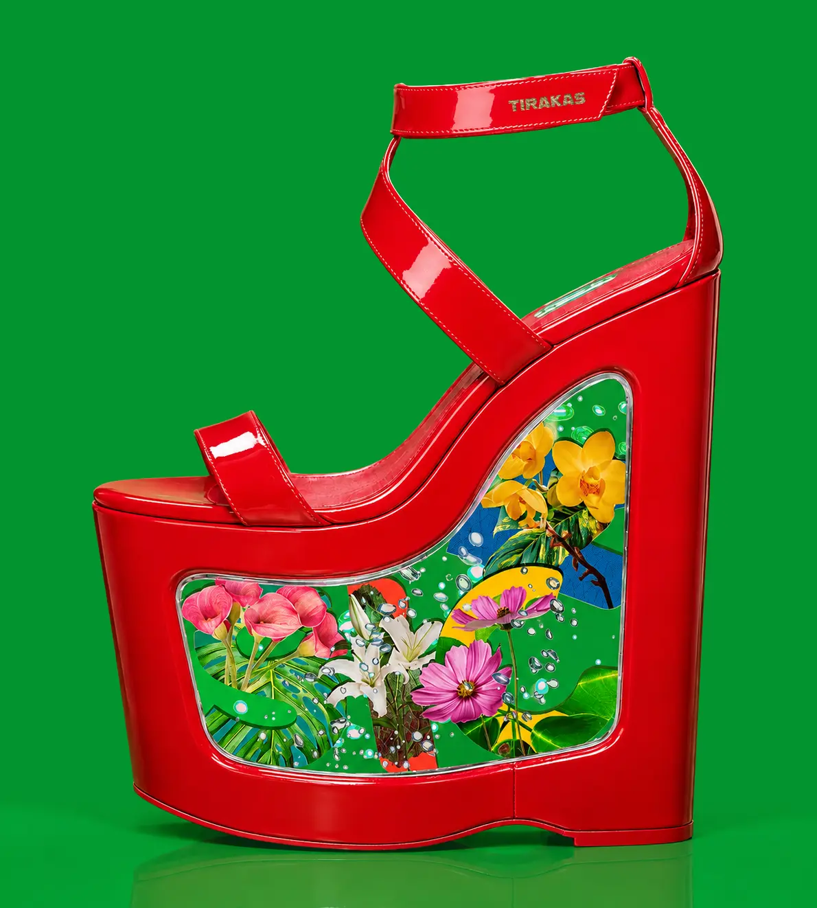
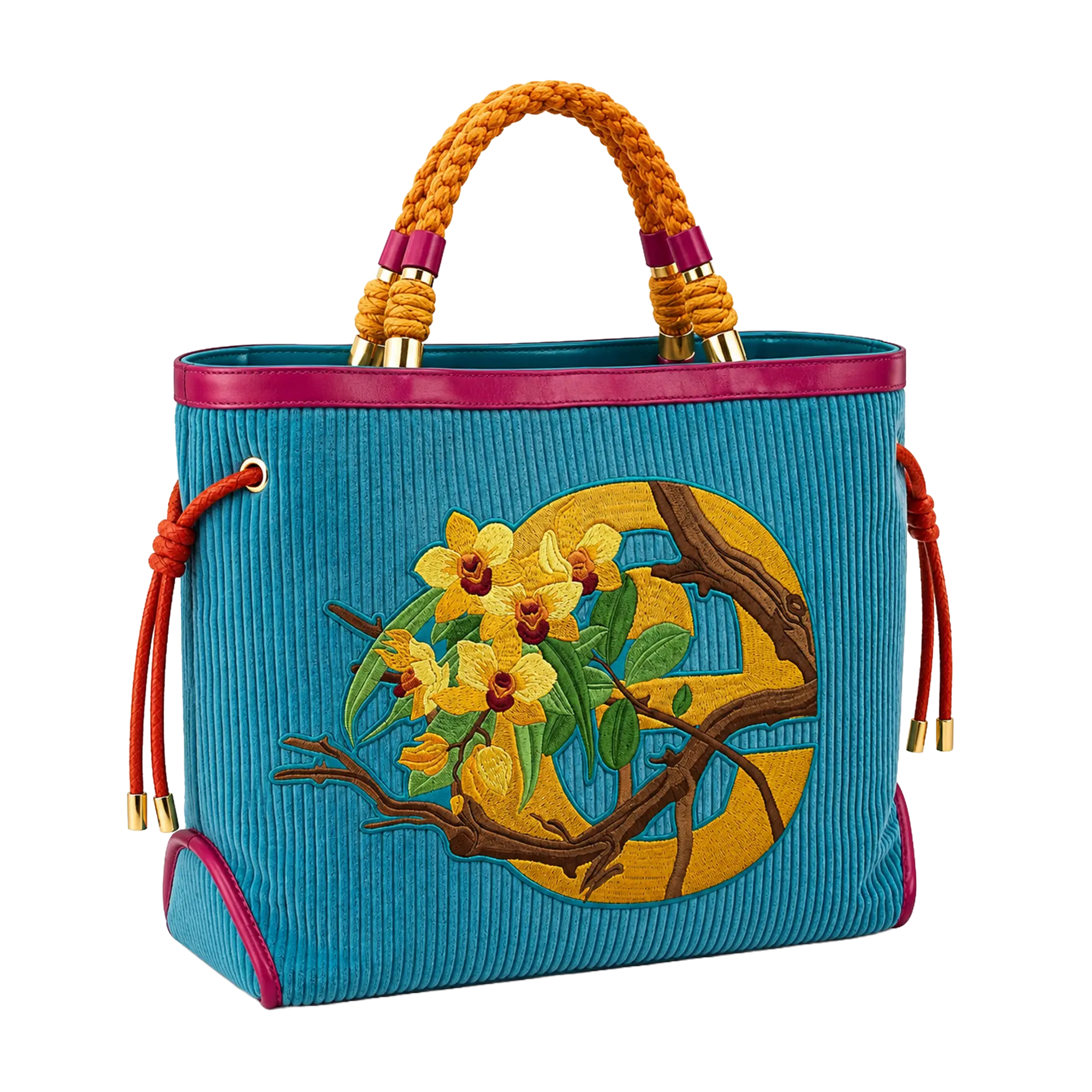
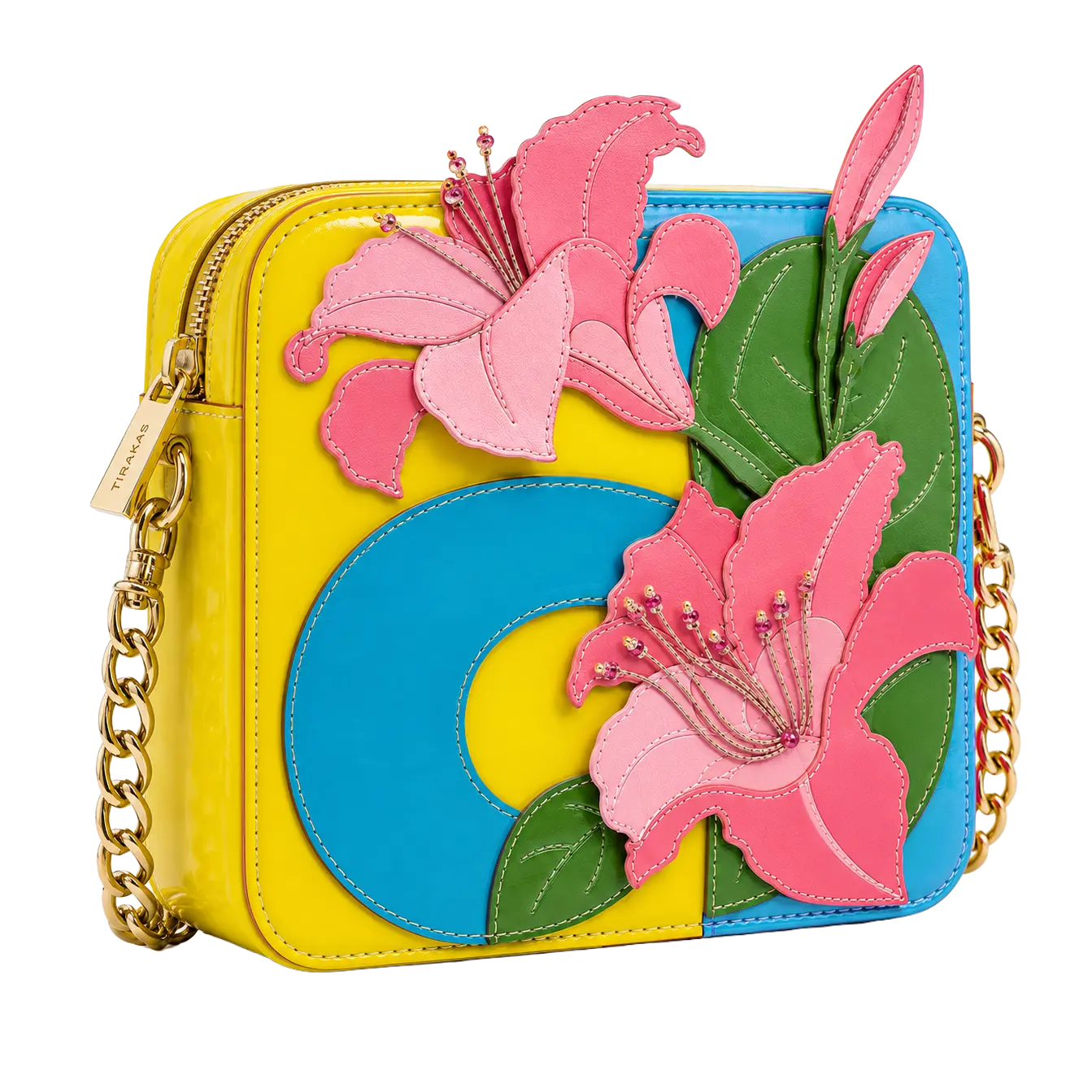
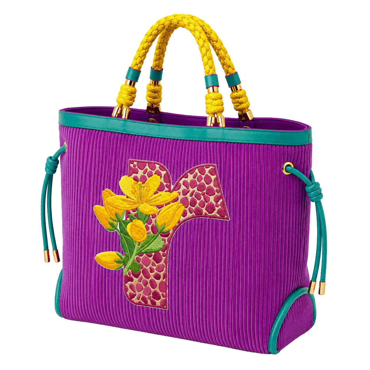
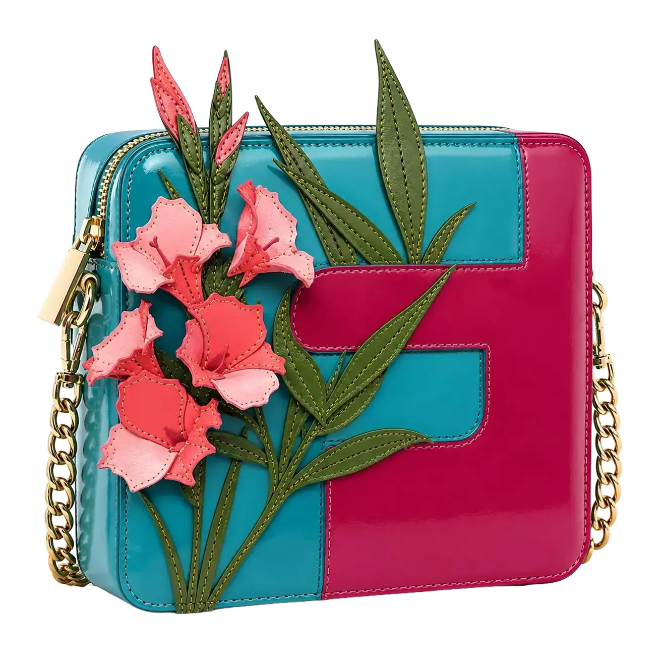
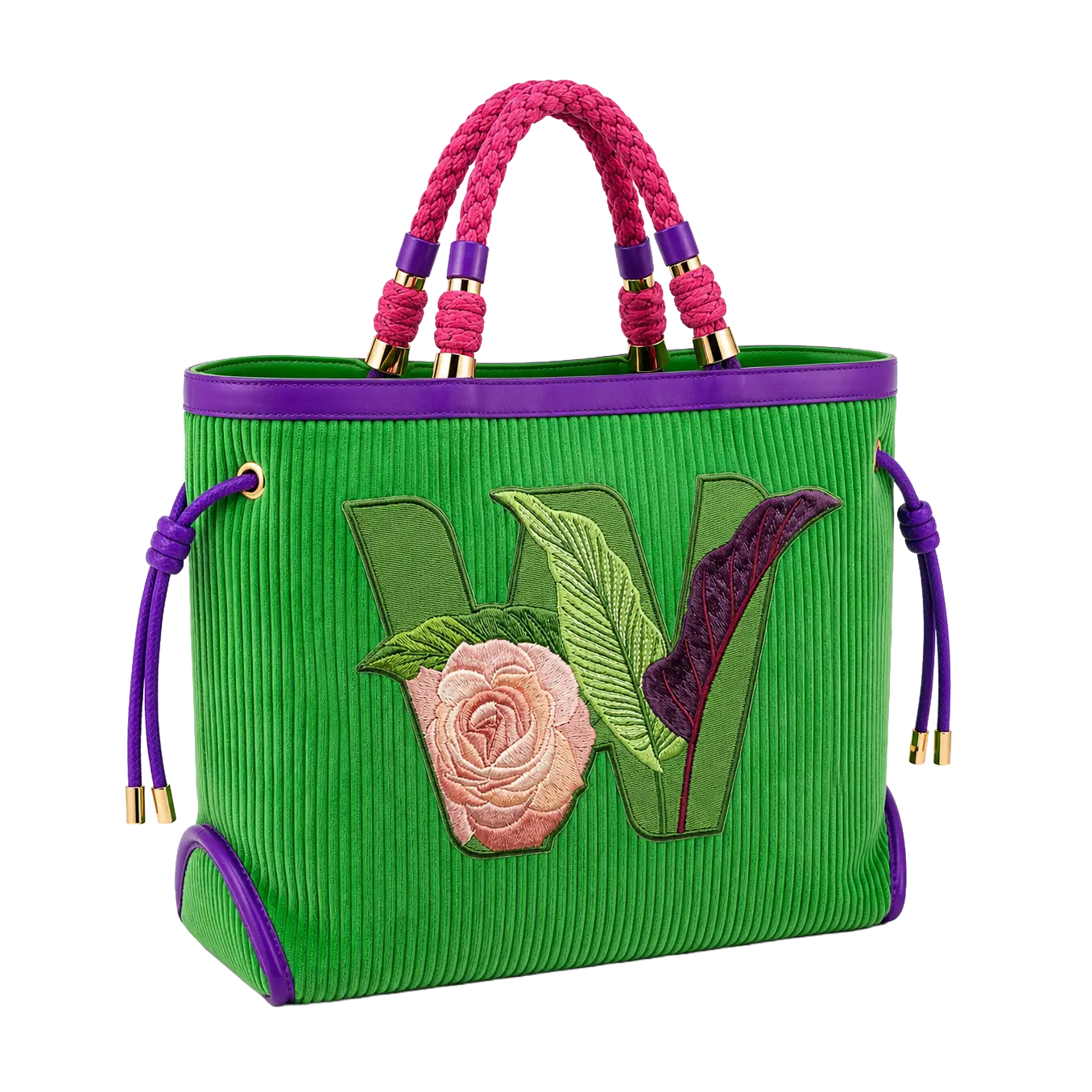
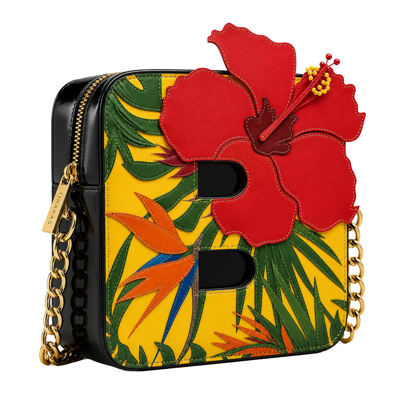
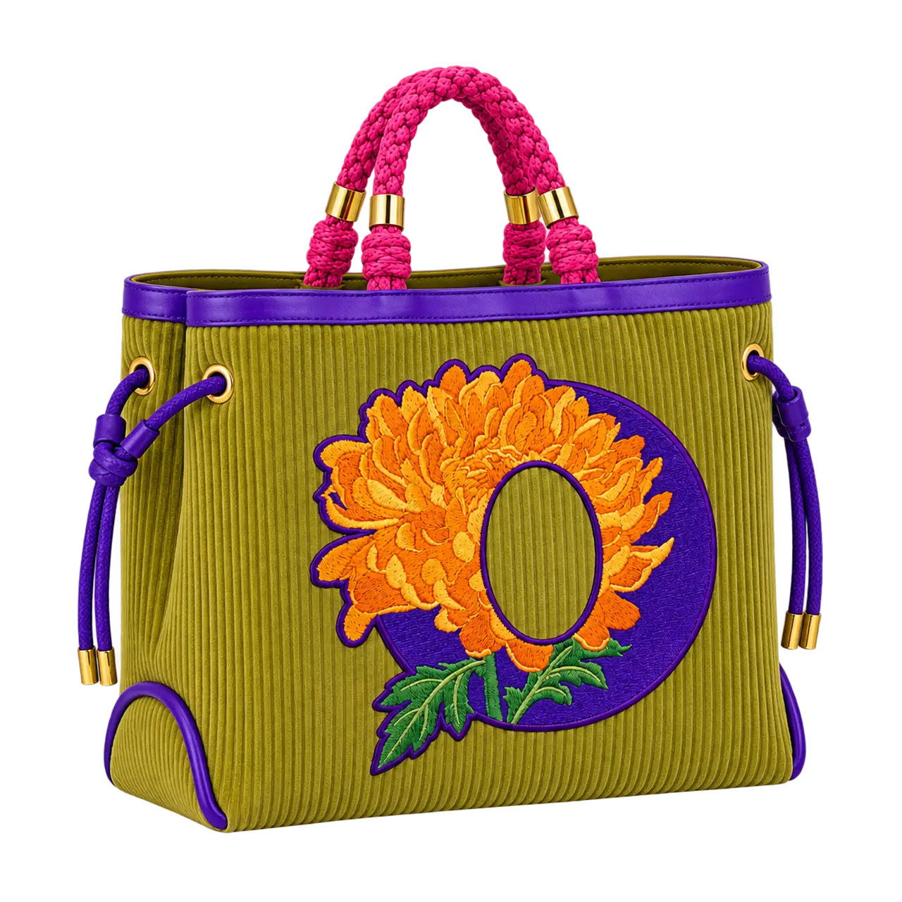
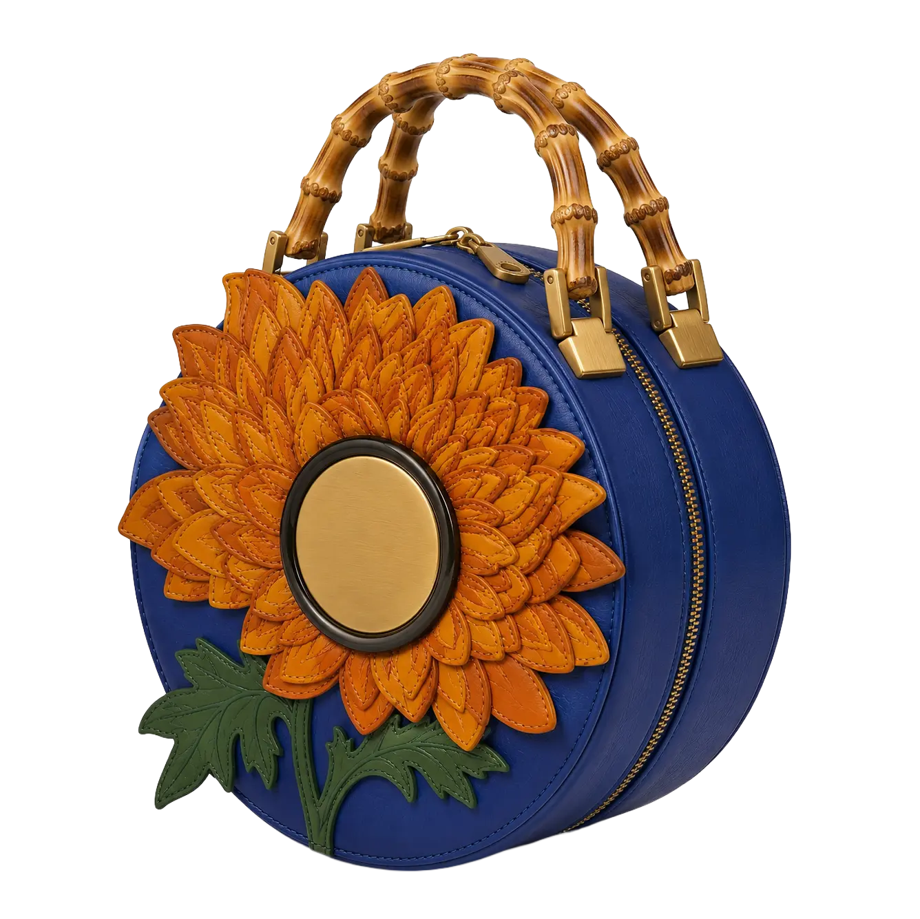
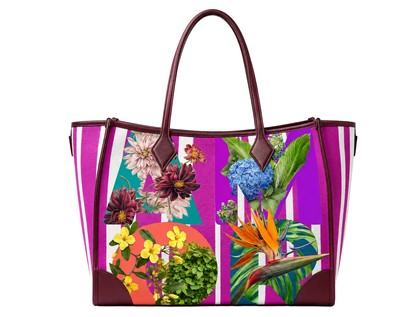
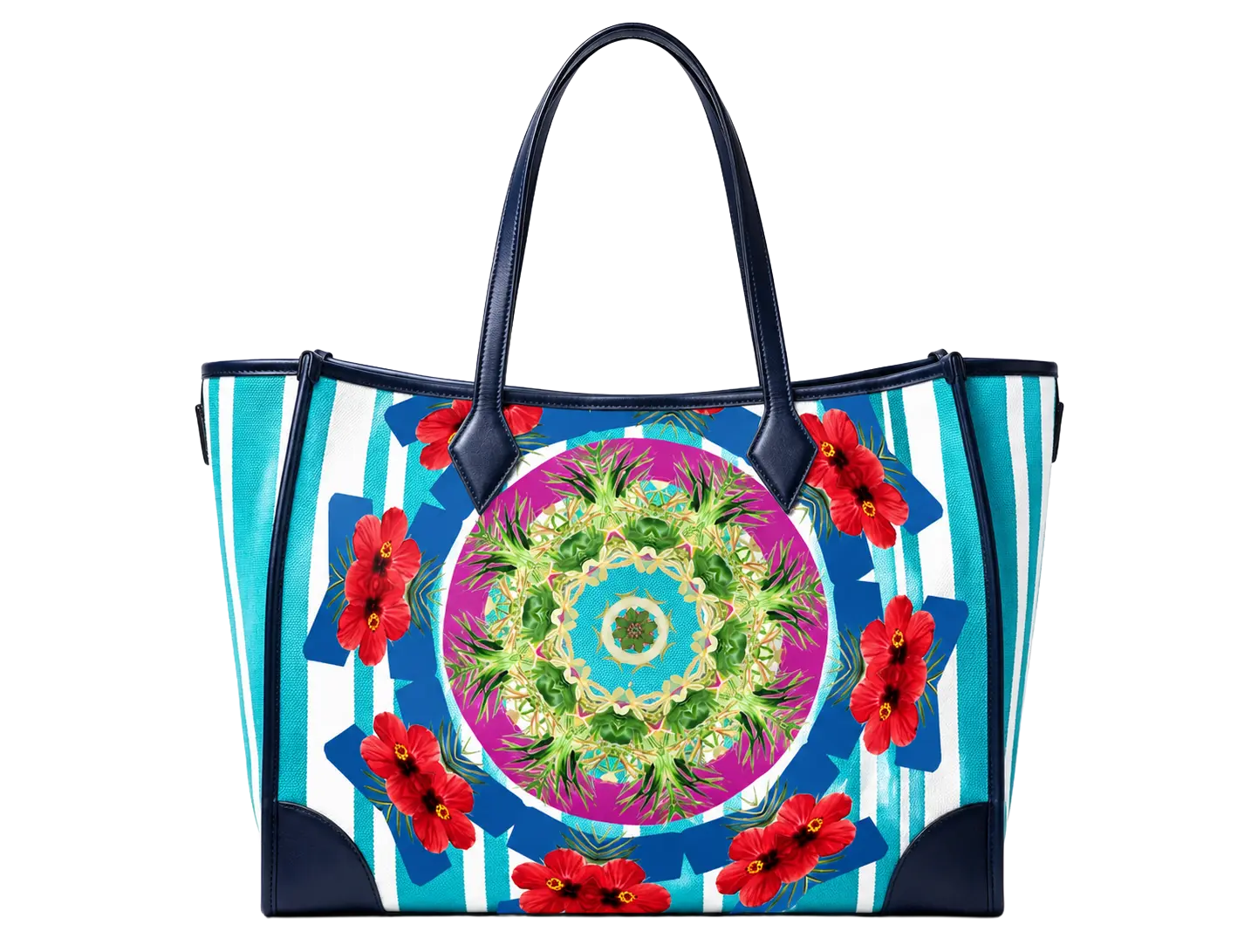
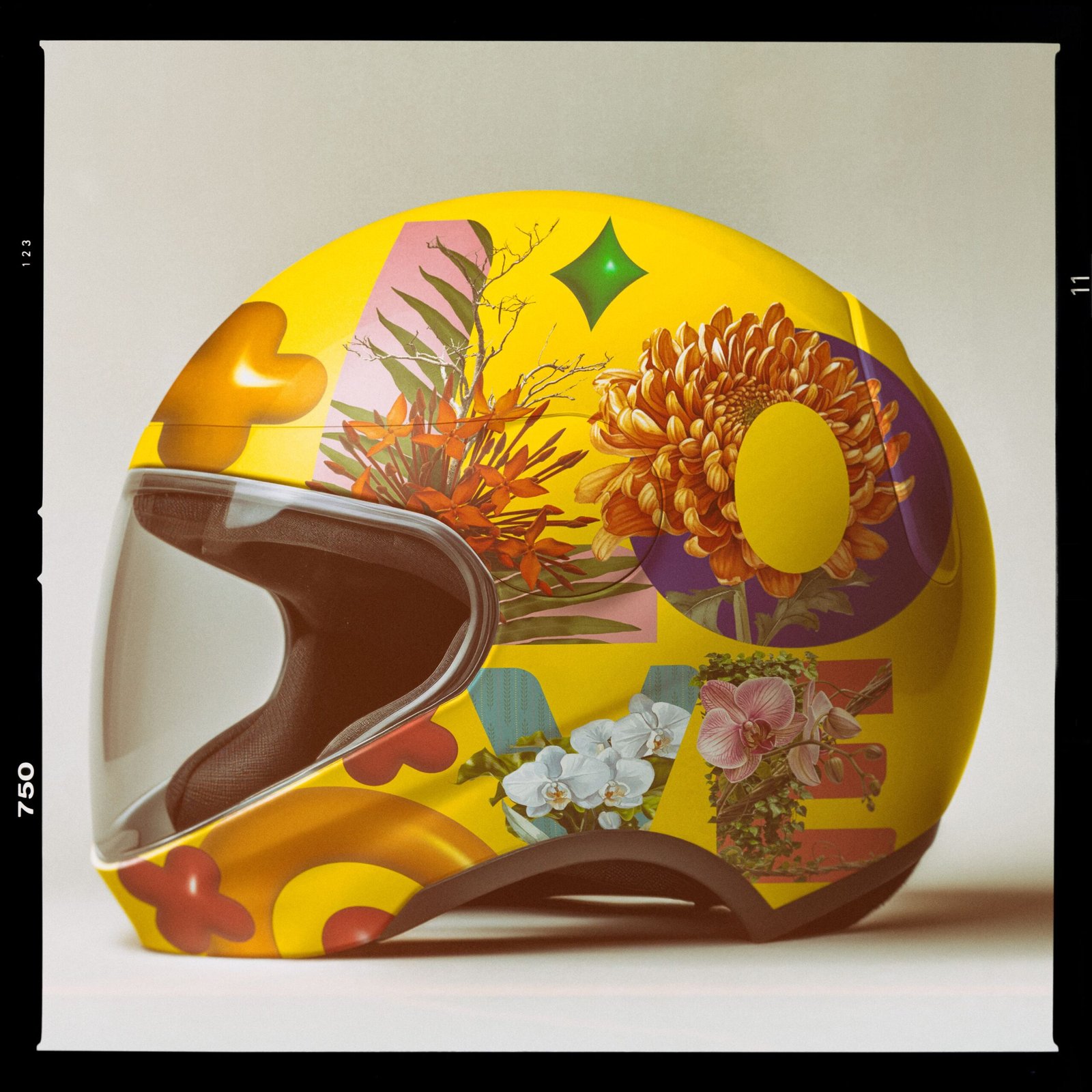
Though Typorganik Display currently focuses purely on letterforms, spanning both clean, conventional sans-serifs and expressive typographic art without numbers, symbols, or accents. Its detailed, trompe-l'œil style makes it perfect for industrial and lifestyle products. Applied to tote bags, t-shirts, shoes, hoodies, or pillowcases, each letter becomes a piece of wearable art, turning everyday items into bold, nature-inspired statements.
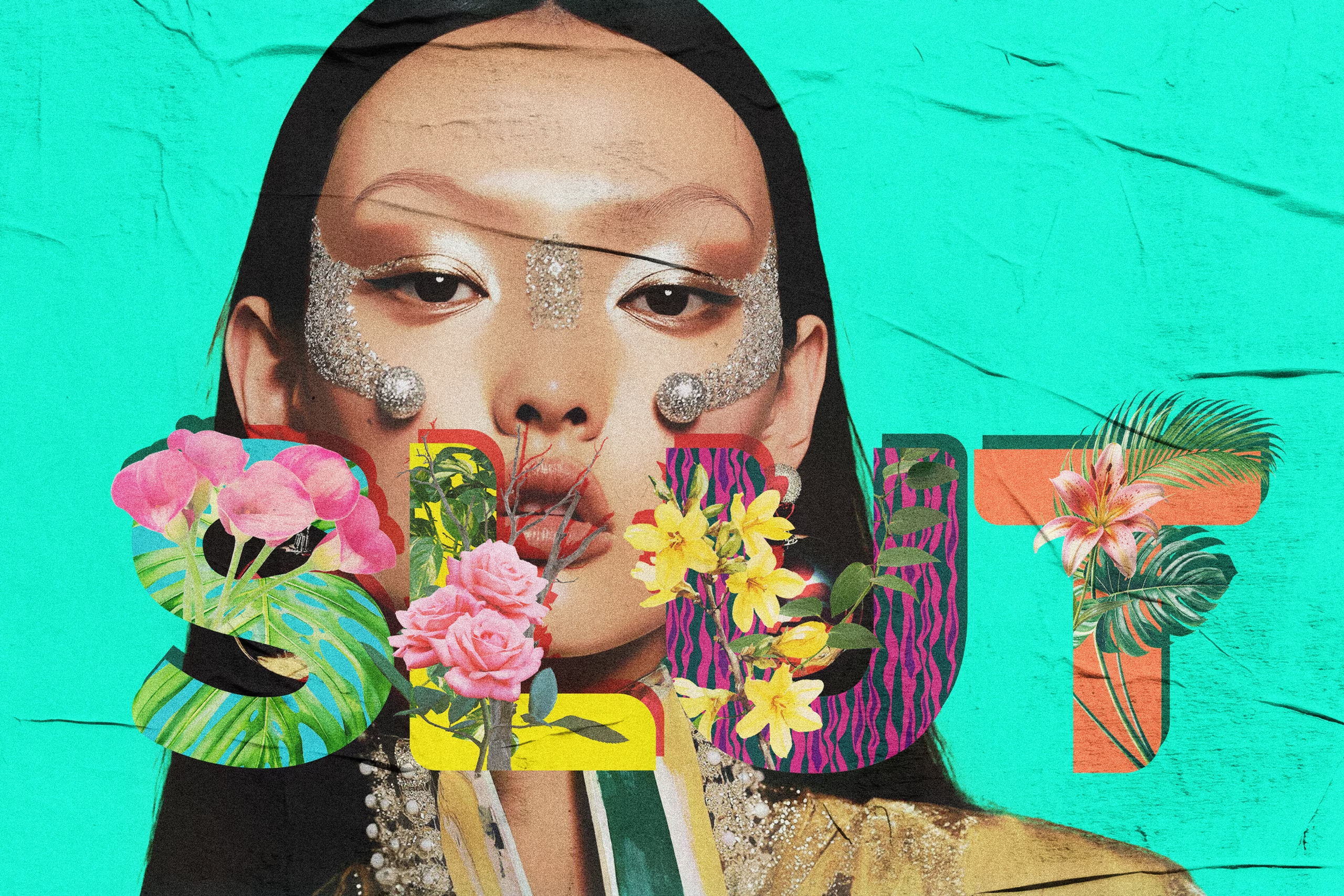
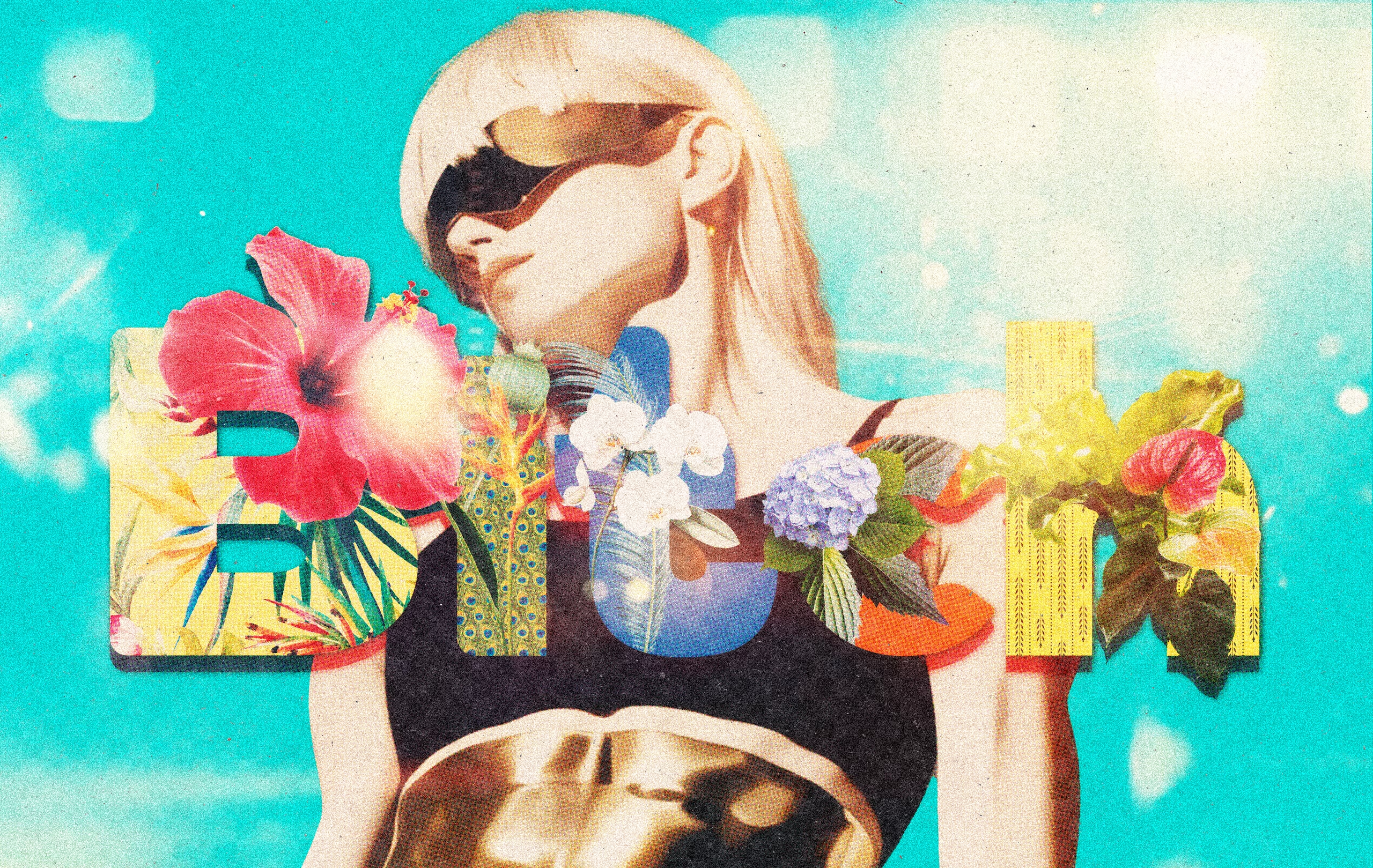
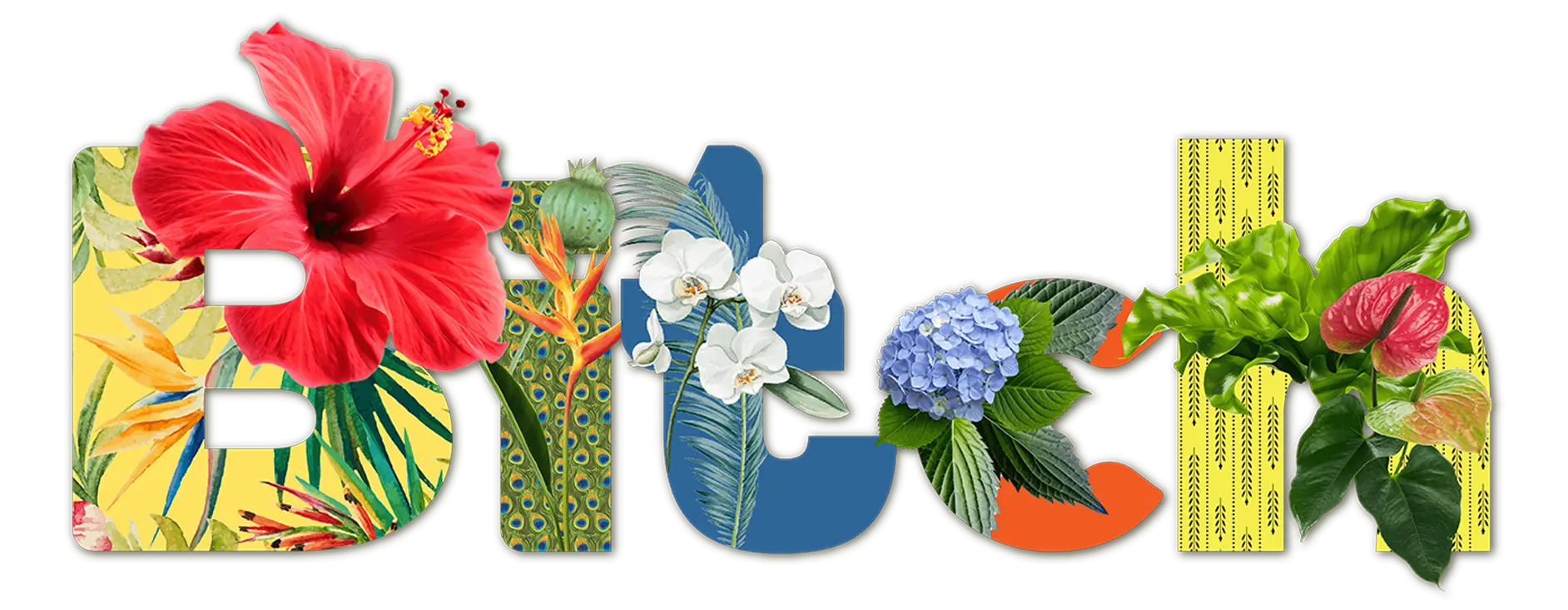
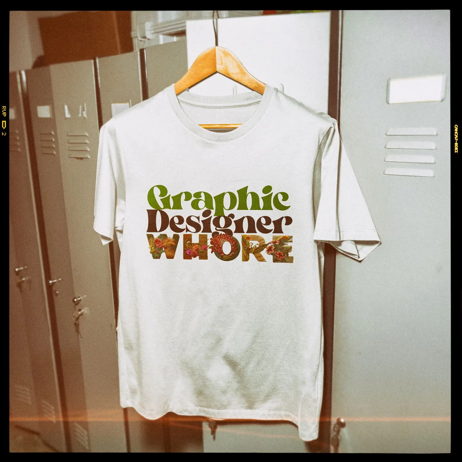
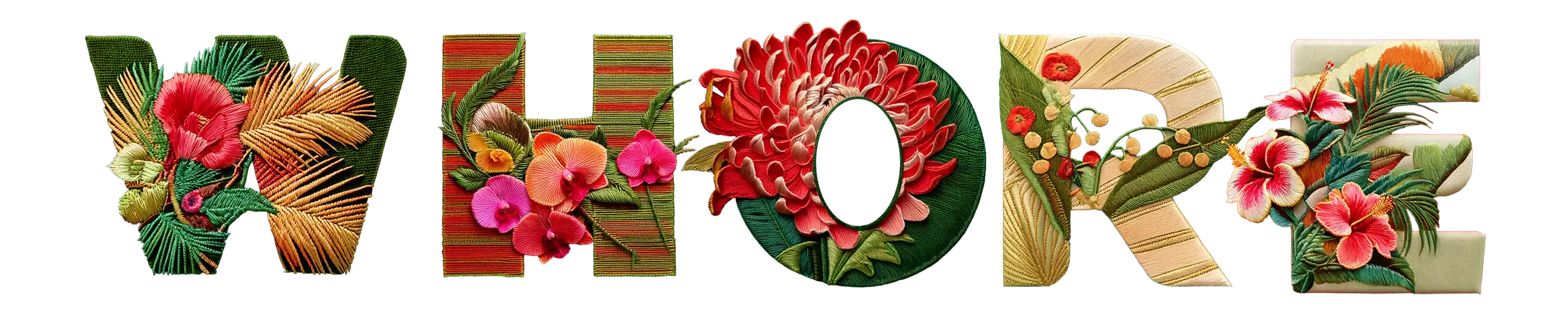
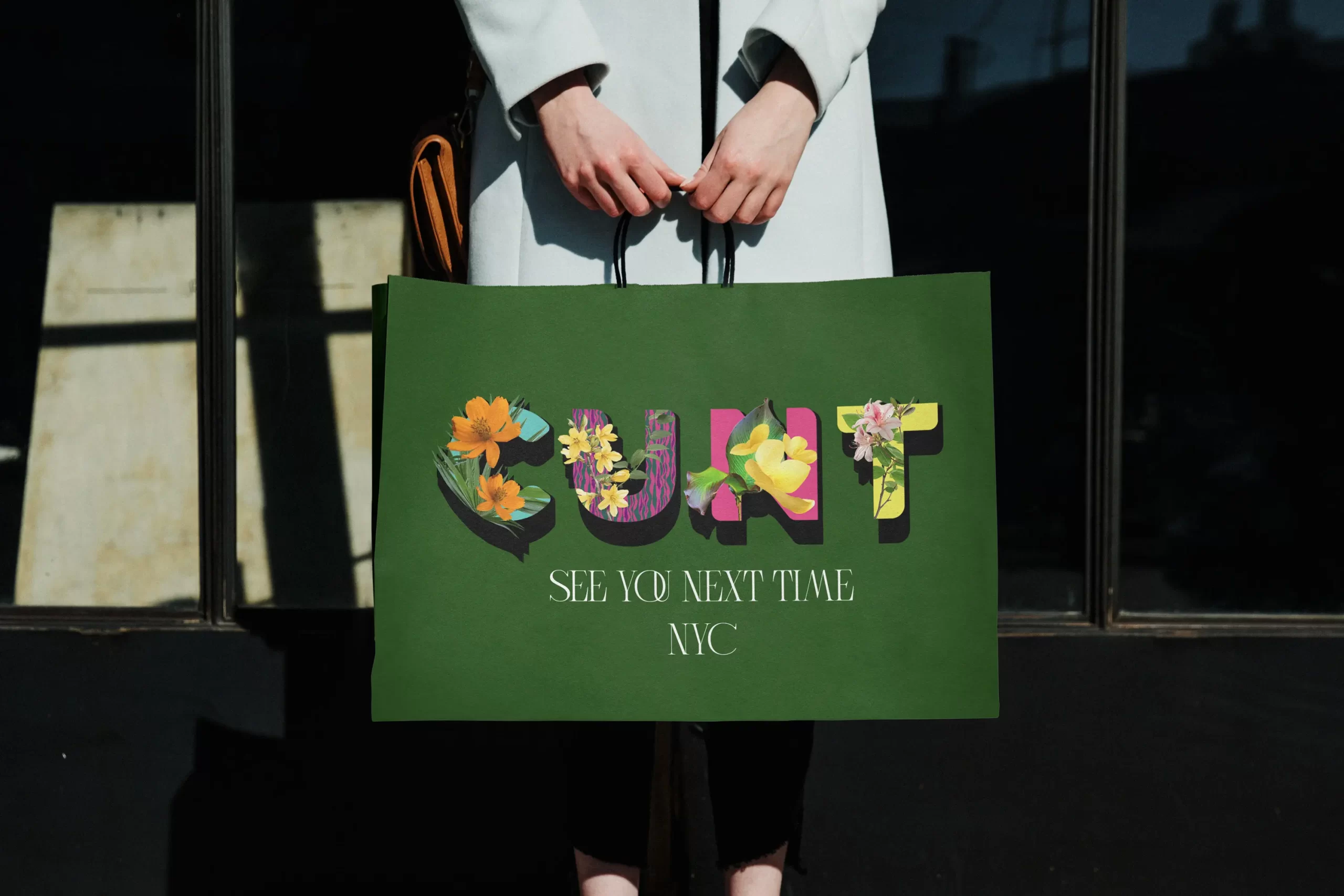
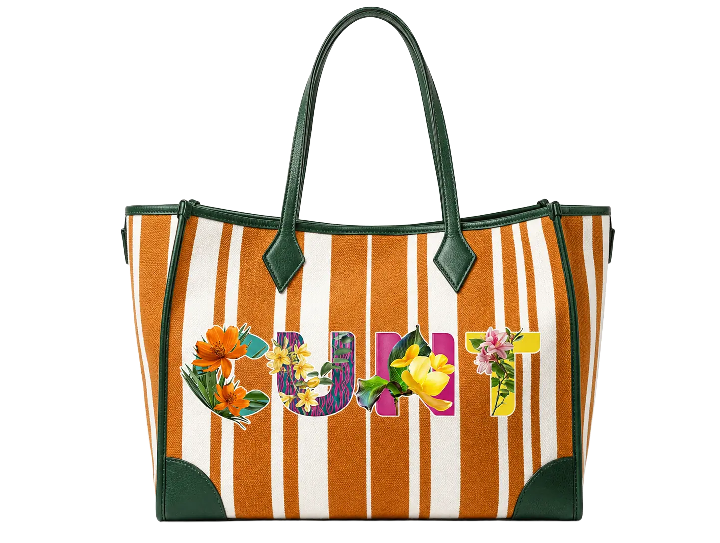
Industrial design featuring Typorganik Display typeface; the composition blends high-contrast themes—vulgarity and natural beauty—through Trompe-l'œil botanical elements layered over reclaimed profane language. The piece reflects cultural confrontation, where activists and artists reframe offensive words into symbols of empowerment and expressive resistance.

These designs featuring Typorganik Display typeface; the composition blends high-contrast themes (vulgarity and natural beauty) through Trompe-l’œil botanical elements layered over reclaimed profane language. The piece reflects cultural confrontation, where numerous activists and artists have reframed offensive words into symbols of empowerment and expressive resistance. 

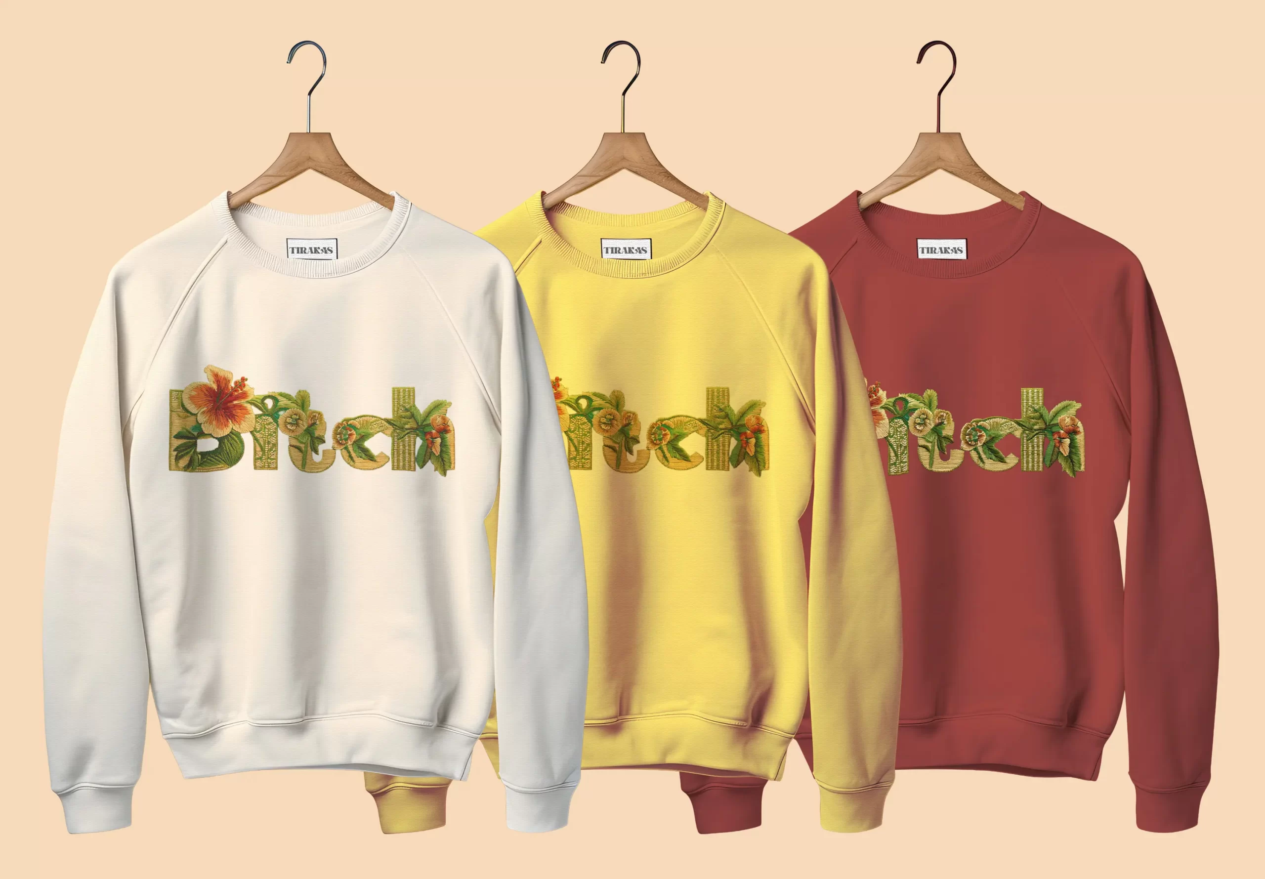
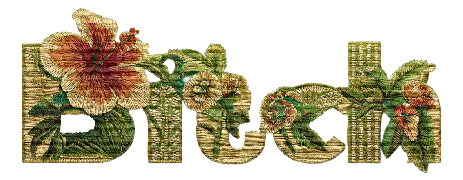
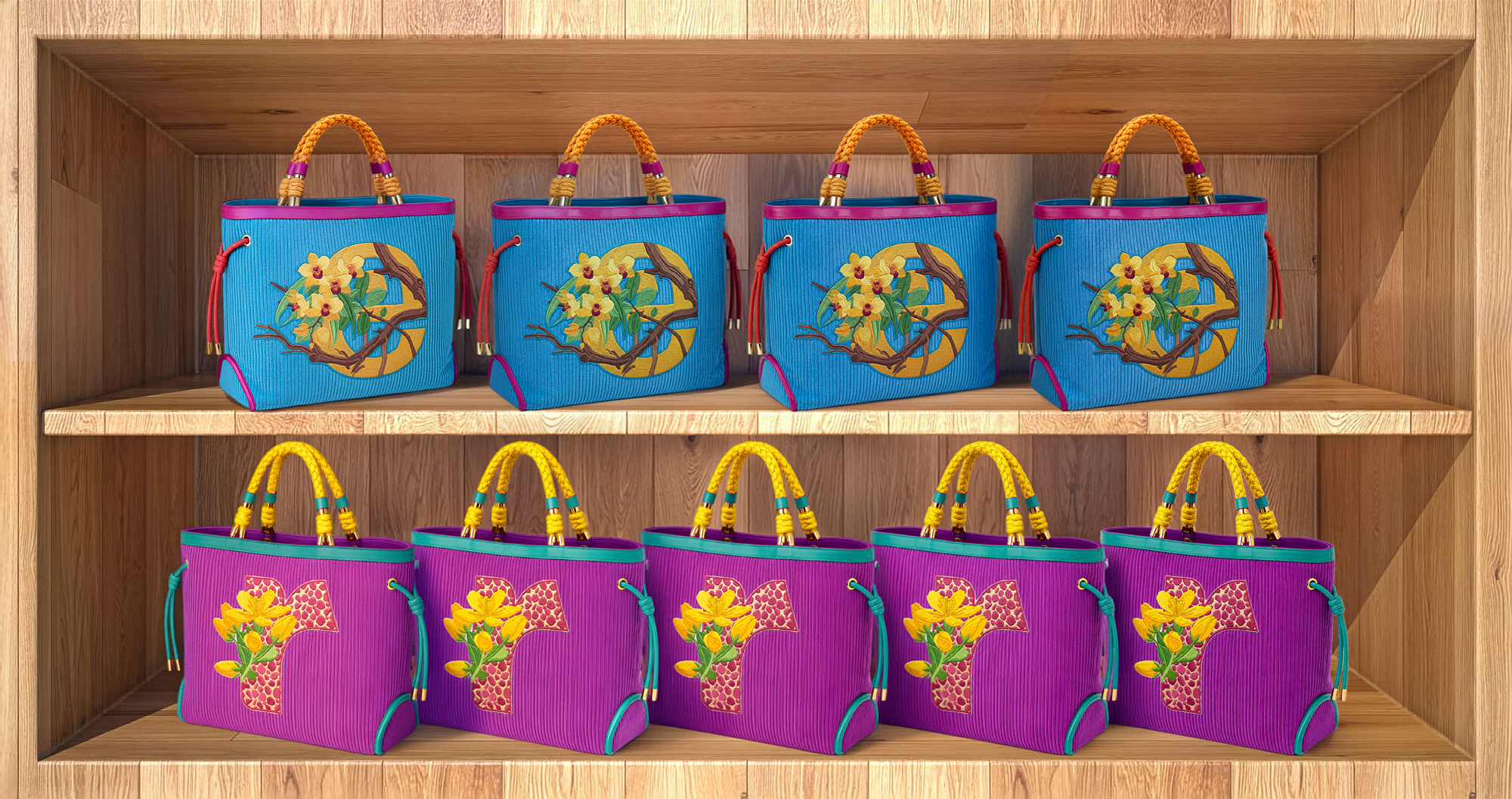
These mockups utilize an embroidered Chinoiserie aesthetic, a style traditionally synonymous with high-fashion couture. By merging this heritage craftsmanship with modern digital innovation, the work elevates the typeface into a new realm of artisanal expression. It demonstrates how intricate, traditional aesthetics can be scaled through technology, offering both commercial viability and a unique sensory depth.

Vulgarity++
++Sublimity

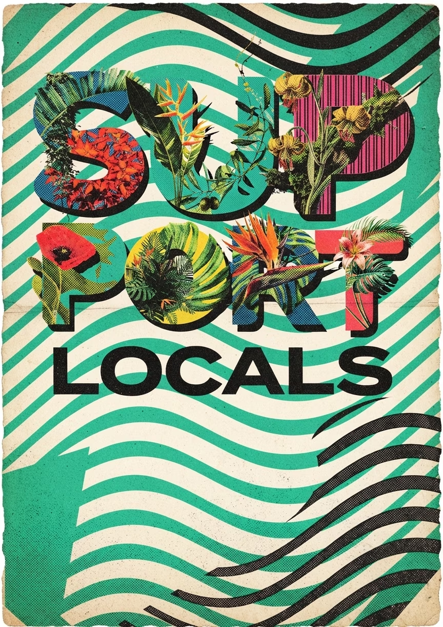
Featuring more than 200 variations, Typorganik Display allows for countless design possibilities. Whether pairing a single floral letter with clean sans-serif text or combining full words, the system highlights the true range and diversity of the typeface.

Endless Possibilities Across 200+ Letterforms
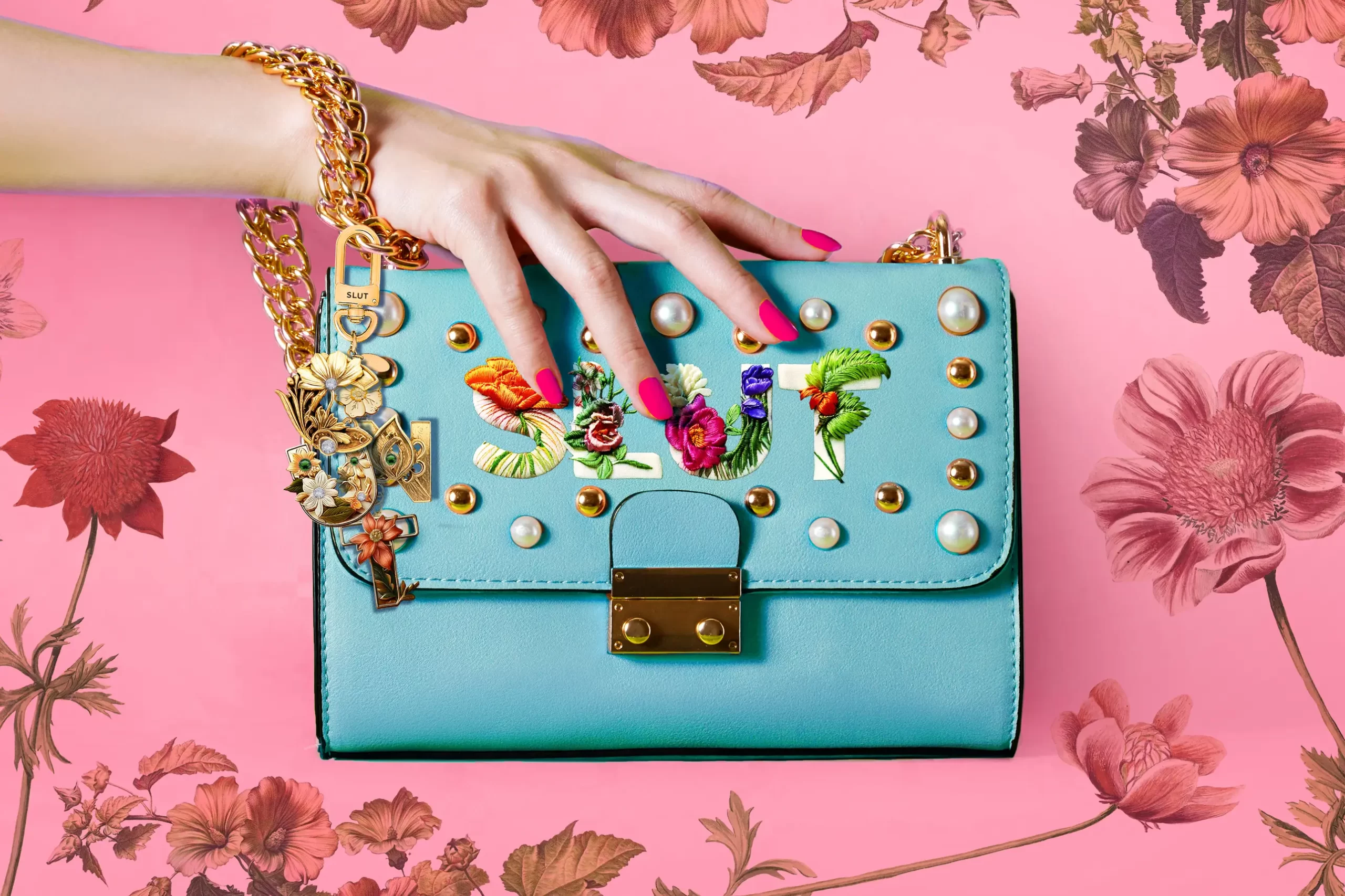
This clutch was designed to integrate with my custom floral typeface, showcasing words that cross the fine line between vulgarity and high art, or haute couture. Through this piece, I explore how pervasive language can be recontextualized into a luxurious new meaning, transforming everyday expression into elevated visual form.

Floral Forms
in High Fashion

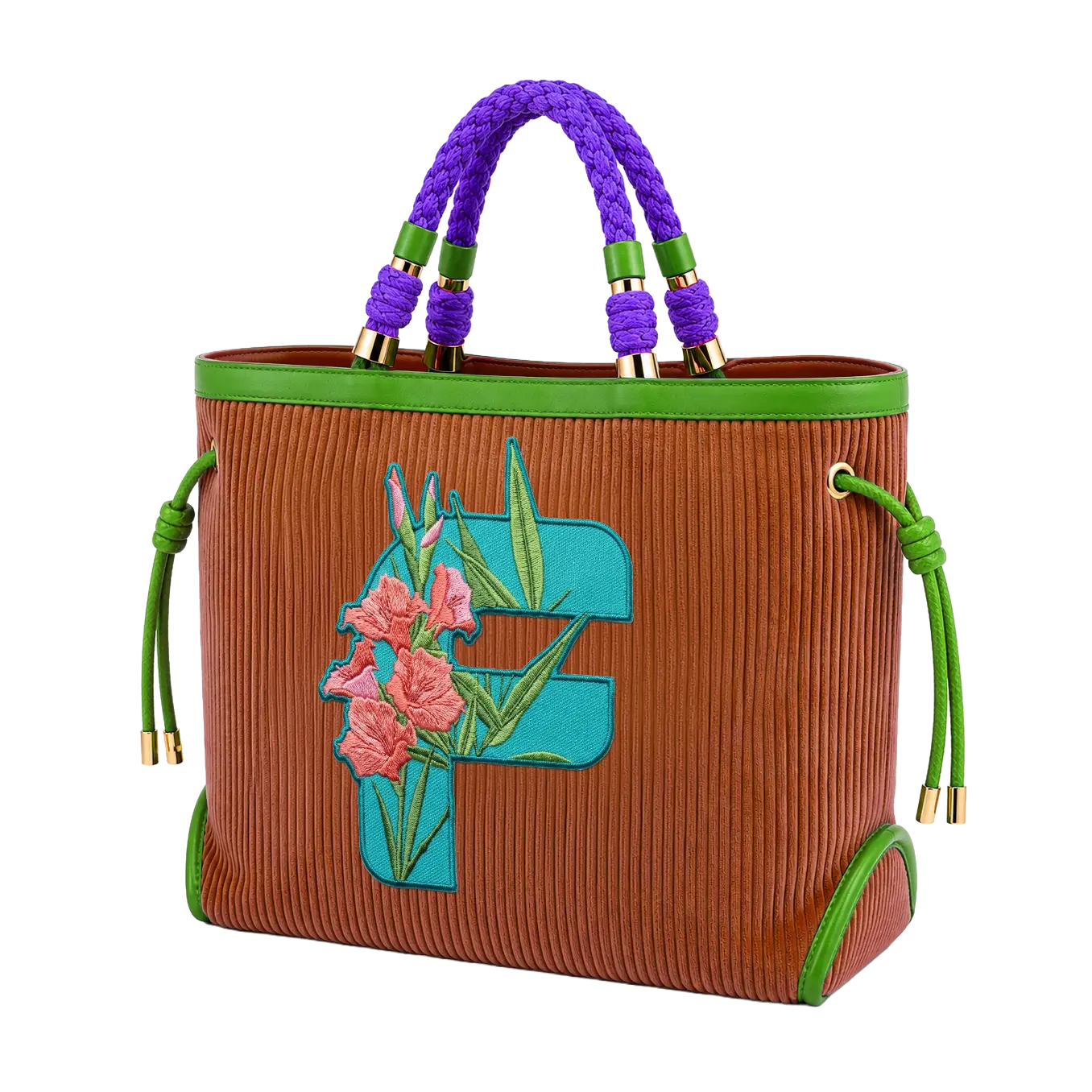
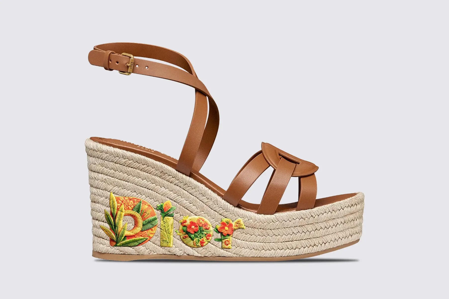
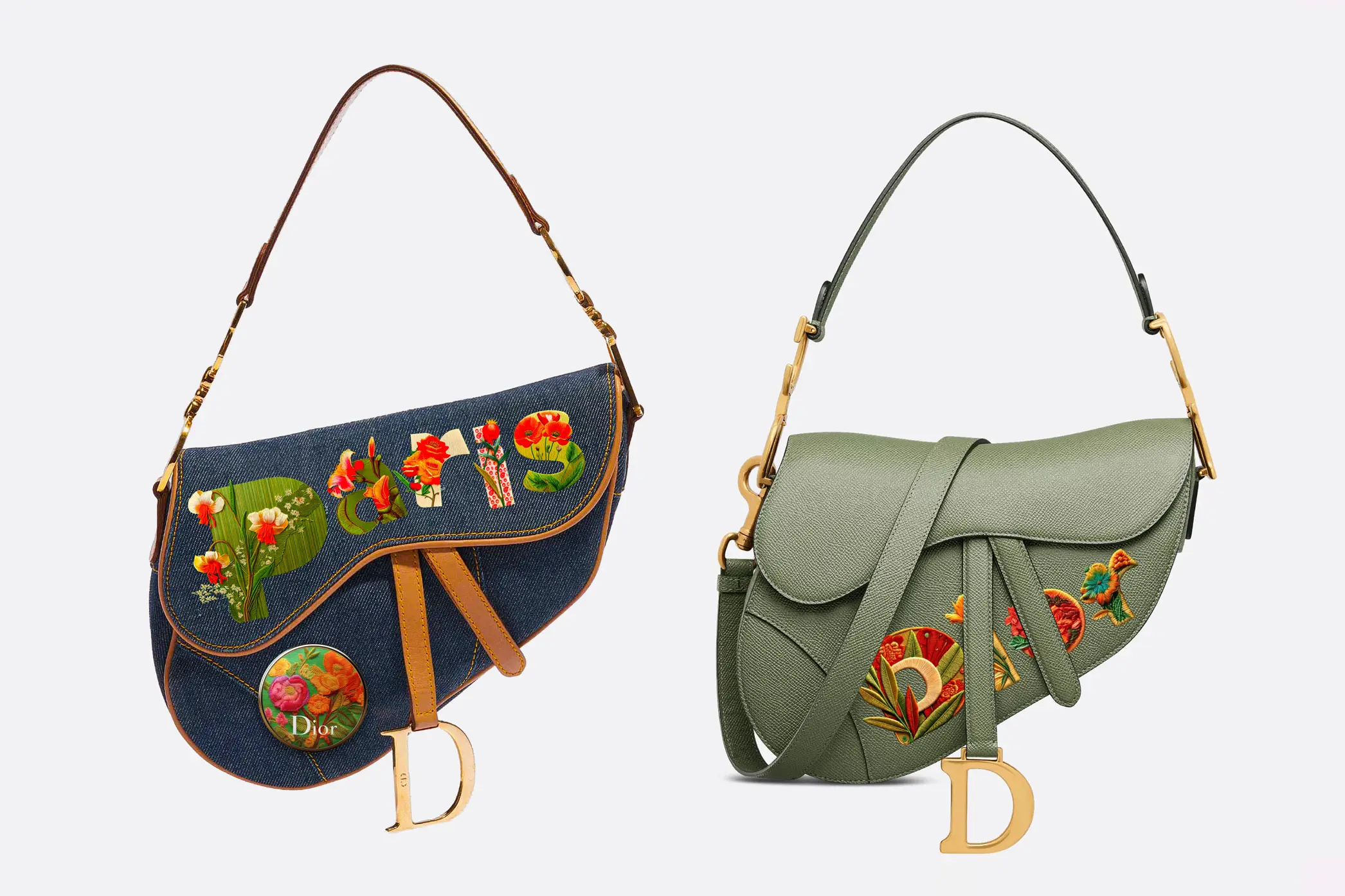
With its elaborate floral aesthetics, Typorganik Display lends itself to embroidery on luxury items such as Dior bags and sandals, Hermès Birkins, and other couture accessories.
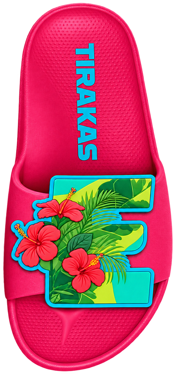
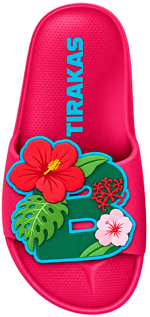
The typeface’s sculptural detail and organic elegance make it a natural fit for high fashion, where craftsmanship and concept converge. As fashion houses embrace hand-sewn Chinoiserie and botanical motifs, Typorganik offers both commercial potential and a new direction for typographic artistry in couture.

Dior D-Club Wedge Sandal in Camel Calfskin, featuring Chinoiserie floral detailing and the word “Dior” embroidered in Typorganik Display typeface.
ior Saddle Bag with Strap in Cedar Green Grained Calfskin, featuring the word 'Dior' embroidered in Typorganik Display typeface with Trompe-l'œil Chinoiserie floral motifs. Dior Saddle Medium in Denim Blue with Strap, featuring the word 'Paris' embroidered in Typorganik Display typeface, pinned with with an enamel floral button that echoes the botanical embroidery.
Hermès Picnic Birkin 25 in Naturel Wicker and Fauve Barenia with Palladium Hardware, featuring Chinoiserie floral detailing and the letter “H” embroidered in Typorganik Display typeface.
Hermès Epsom Birkin 35 in Rose Tyrien, featuring the word 'Hermès' embroidered in Typorganik Display typeface; Trompe-l'œil Chinoiserie floral motifs—vines, blossoms, and layered botanical textures—integrate with the letterforms, blending luxury craftsmanship with organic typography.
Back
0:00
0:00