You Know What!

This website looks so stunning on desktop! It’s like a visual masterpiece on a bigger screen!

Experimental Graphic Design Experiential Immersive Visuals Web Design Type Motion Graphics
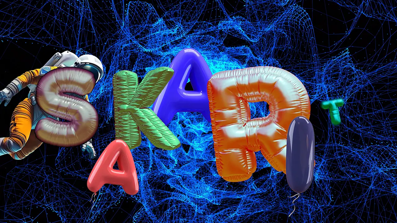
Hi!, I am Sakarit, a graphic designer & visual artist, based in Brooklyn, NYC.
I am a senior pursuing a BFA in Communications Design (Emphasis in Graphic Design) at Pratt Institute.

Sakarit (sa-ka-rit), my name is a combination of Pali and Sanskrit. “Sāka” or “Sagga” in Pali, derived from the Sanskrit “svarga,” generally refers to heaven. For “rit” or “ritha,” in Sanskrit, can relate to “Ṛta,” meaning order, rhythm, rule, power, or truth.

Focusing on Experimental & Experiential Design, I craft immersive visuals that transform brand identity and audience engagement. I blend bold aesthetics with compelling narratives, using diverse styles, media, and materials. My approach embraces a multi-medium framework, ensuring a fully interactive experience that embodies “total work of art” (Gesamtkunstwerk).

Innovative Storytelling Through Experimental & Immersive Design

Experiential Design MR Experience Concept Design VR Experience

VR Experience | Prototyping | Concept Design | Sustainability

This prototype leverages experimental & experiential design to create a gamified virtual reality experience. It replicates Prospect Park’s Long Meadow in Brooklyn, visualizing the potential impact of geodesic domes in preserving native bee populations. By engaging all stakeholders in native bee conservation, it enables them to envision real-world possibilities

VR Experience | Prototyping | Concept Art & Design | Speculative Design

NIMECO is a concept art and speculative design elevate Experimental & Experiential Design, using a gamified virtual experience to envision Earth 300 years from now, shaped by extreme natural disasters. As a response, some native bee conservation efforts have led experts and scientists to establish an institute dedicated to studying and protecting the planet’s remaining native bee colonies within controlled, protective environments of a massive greenhouse.

Branding Identity | Illustration | Collage | Motion Graphics | UI/UX | VR Experience

Inspired by The Sims and GTA, this immersive, gamified VR experience enhances Experimental & Experiential Design, unveiling the grand opening of eco-conscious, bee-related products. It serves as a visionary tool for all stakeholders—including clients, investors, designers, and the brand itself. By enabling a virtual preview, it highlights the transformative potential of VR in crafting detailed mockups and conceptualizing physical spaces before they come to life.
Nidaria Undersea Forest (WIP)

MR Experience | Experiential Design

This concept design for a virtual reality experience of an ethereal undersea forest is constructed using Meta Quest 3. It showcases the ongoing development of an experiential design project set in one of Sakarit’s projects, the fictional world, “The Sea Seas.”

Transforming Brand Identity with Experiential Storytelling & Bold Design

Branding & Identity UI-UX Web Design

Branding Identity | UI/UX | Web Design | Publication Design

I have the privilege of collaborating with the Womanifesto’s team to redefine e its online presence, expanding its reach to broader audiences. My contributions focus on enhancing branding and design, crafting a sleek and contemporary identity, developing an enriched web archive, and producing impactful artwork and digital content—creating an engaging online experience for audiences.

“Nectarist” is an identity project for a brand focused on offering a wide range of products sourced from local bee communities. These include honey, hygiene products, cosmetics, and skincare, all designed to provide high quality while supporting local economies and promoting bee conservation efforts. This 'Illuminati' candle is a refined addition to a larger project that supports locally-produced bee materials, extending commodities beyond honey to include candles, honey tea, honey beer, soap, and more. I not only designed the exquisite packaging but also crafted the actual candle using locally-sourced beeswax and essential oils derived from flowers that serve as a food source for native bees.

Branding Identity | UI/UX | Web Design | Publication Design

“Nectarist” is an identity project for a brand focused on offering a wide range of products sourced from local bee communities. These include honey, hygiene products, cosmetics, and skincare, all designed to provide high quality while supporting local economies and promoting bee conservation efforts.

KitchenPal is a mobile app prototype focused on UI/UX design to revolutionize kitchen management. It helps users organize their fridge, create healthy meals from available items in their fridge and online recipes, and compost expired food. This concept promotes efficient food use, supports a healthy diet, and reduces waste.

Pushing Boundaries with Eccentric Types & Print Aesthetics

Typographic Art Typography Typeface & Font Design
This typeface embodies Experimental & Experiential Design, integrating striking visuals and conceptual elements to showcase its potential applications.

The Banana Peel font draws from Wabi-Sabi, celebrating imperfection and transience. Mockups showcase its adaptability in branding for luxury items, apparel design, and other creative merchandise, blending elegance with an organic aesthetic.

This typeface embodies Experimental & Experiential Design, integrating striking visuals and conceptual elements to showcase its practical applications.

Influenced by the mysterious and astonishing of Octopus’s tentacles one of my beloved biormophic and organic elements in the wild, Cephalopo Type is a unique fonts and perfect for display, logo design, and creative projects.

This typeface embodies Experimental & Experiential Design, integrating striking visuals and conceptual elements to showcase its potential applications.

Otoño" (Spanish for "Autumn") is a serif font inspired by the 1920s Art Nouveau era and the essence of autumn.

This typeface embodies Experimental & Experiential Design, integrating striking visuals and conceptual elements to showcase its potential applications.

This unique font, titled in Italian as "Il Sublime Inverno di Tirakas" (translated as "The Sublime Winter of Tirakas," or simply "Inverno") is inspired by early mornings in Rome, capturing the cold, crisp air balanced by the warmth and energy of an espresso.

Publication Design Highlights

ART & DESIGN FOR ALL POSSIBLE WORLD
0:00
0:00